 Stratum
The Diamond Paradox: Why "Better" Diamonds Cost Less
A full analysis of 53,940 real diamonds — three quality grades that all run backwards, one hidden variable, and the five tools that crack it. No code.
diamonds — 53,940 real diamonds (carat, cut, color, clarity, dimensions, price), the public ggplot2 dataset.
Download the CSV and follow along in Stratum — every figure below is a real screenshot from this file.
Grab any diamond price guide and it will tell you the "4 Cs" drive value: carat, cut, color, clarity. So here's a fact that should be impossible. In a dataset of nearly 54,000 real diamonds:
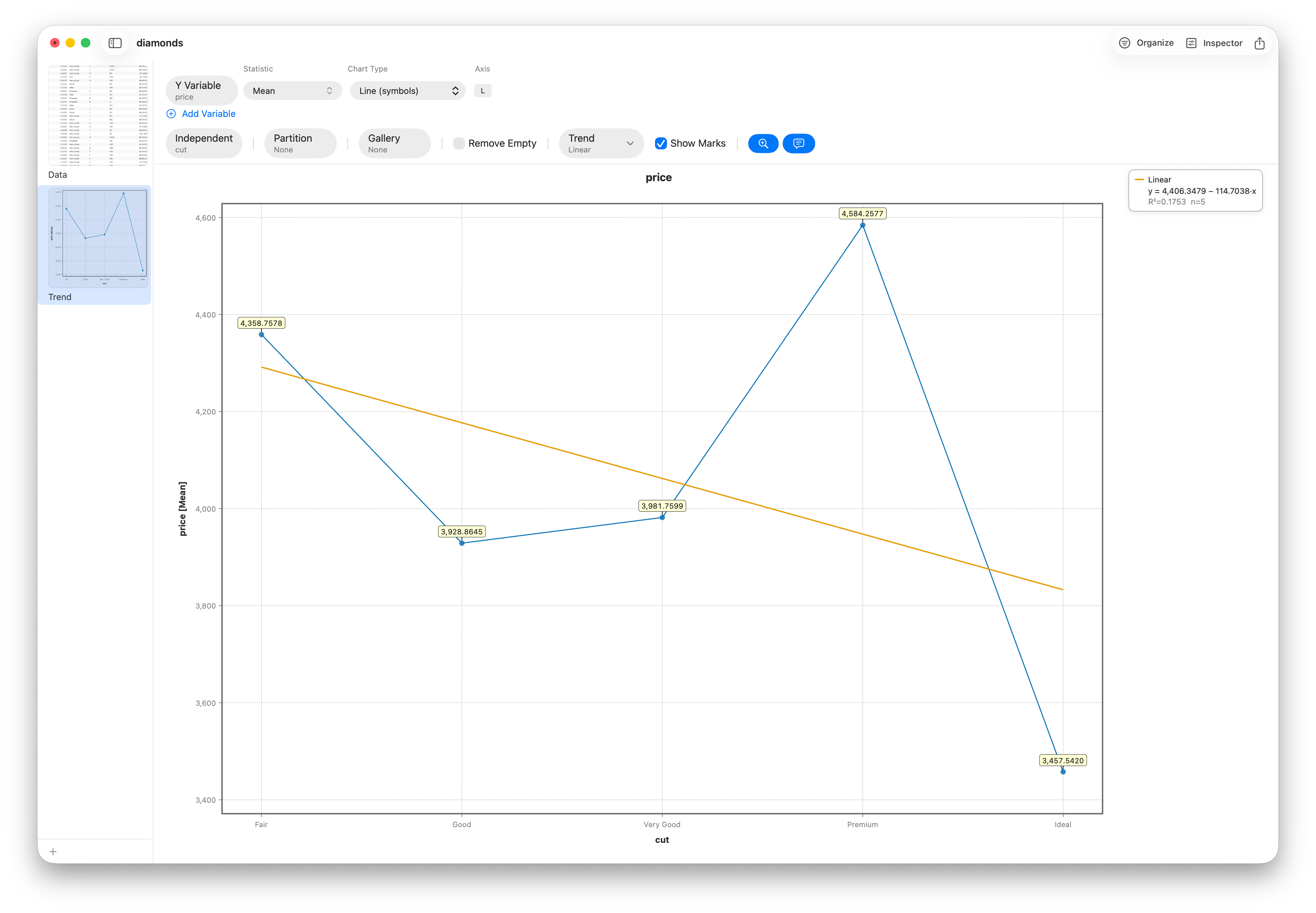
- Ideal-cut diamonds — the best cut grade — average $3,458. Fair-cut stones average $4,359. The worse cut costs more.
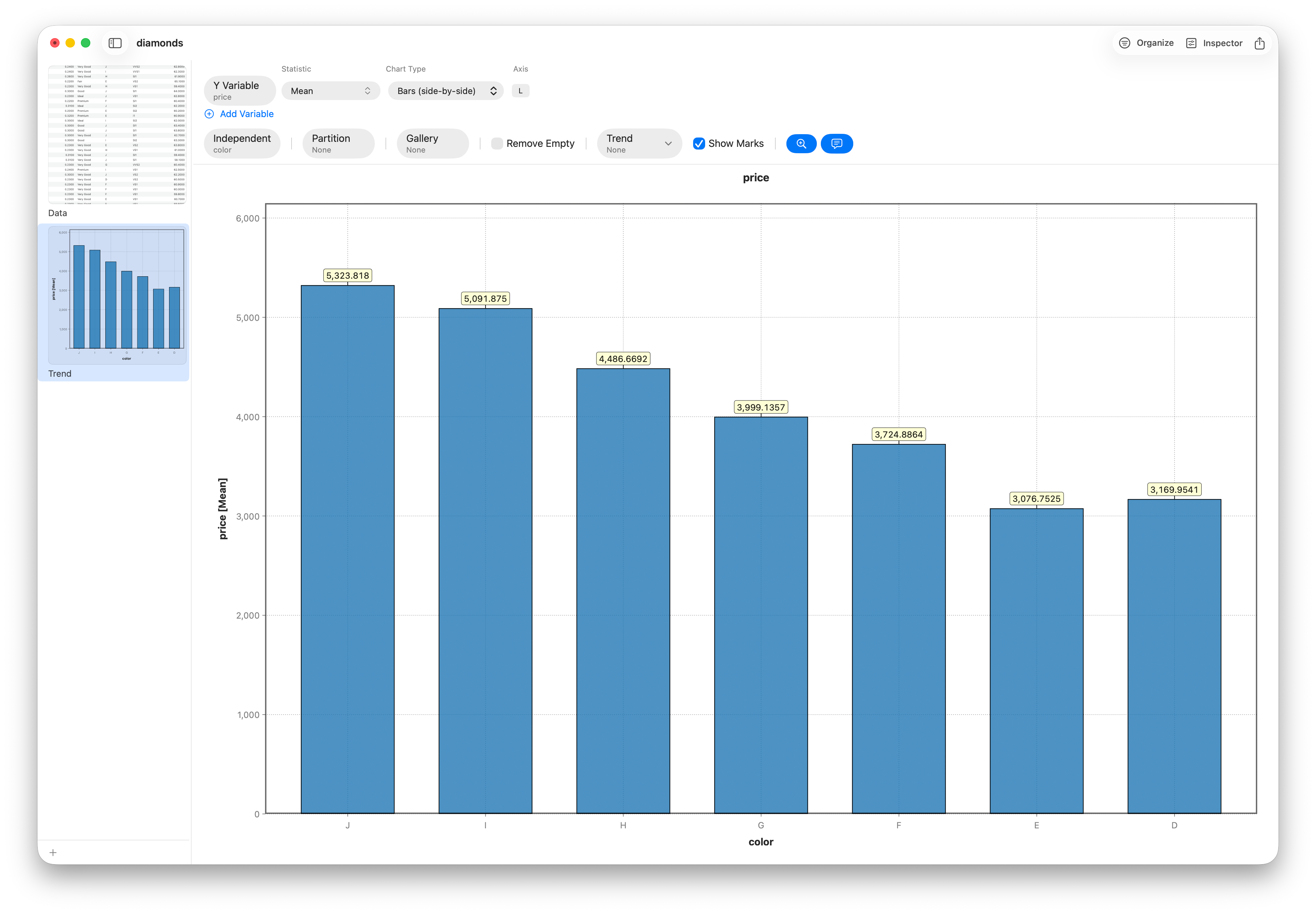
- D color (flawlessly colorless, the top grade) averages $3,170. J color (visibly tinted, the bottom) averages $5,324 — 68% more for worse color.
- Internally Flawless clarity averages $2,865. SI2 — second from the bottom — averages $5,063.
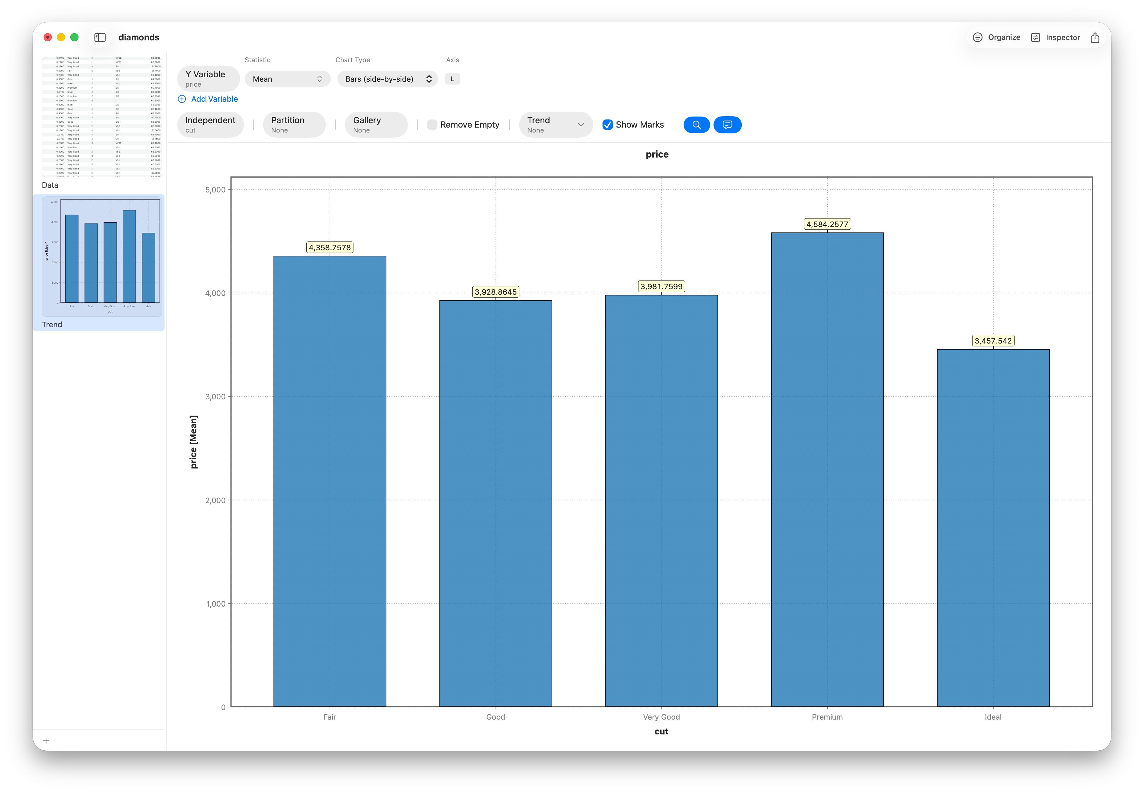
Three quality scales. All three running backwards. A rushed analyst looks at this, writes "diamond pricing is irrational," and ships a slide deck that is confident, defensible-looking, and completely wrong.
A good analyst gets suspicious. When three independent things all point the wrong way at once, you're not looking at three mysteries — you're looking at one hidden variable pulling every string. This is the story of finding it, and a tour of the tools — charts, ANOVA, regression, PCA and a decision tree — you need to catch this kind of thing in your own data.
Step 1 — Look before you model
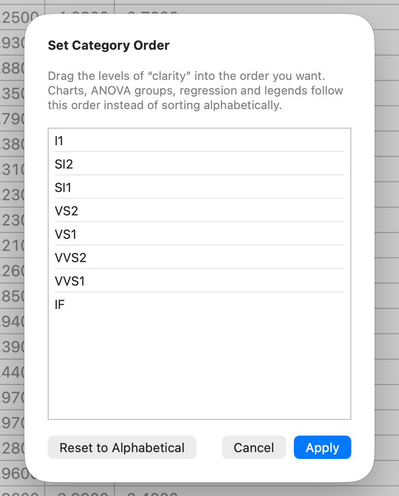
Before a single model, two minutes of housekeeping that pays for itself all the way down. Cut, color and clarity are ordinal — Fair < Good < Very Good < Premium < Ideal — but a computer sorts them alphabetically into nonsense (Fair, Good, Ideal, Premium, Very Good) unless you tell it otherwise. In Stratum you drag the levels into their real order once (Data ▸ Set Category Order), and every chart, table and regression from here on reads in quality order automatically.
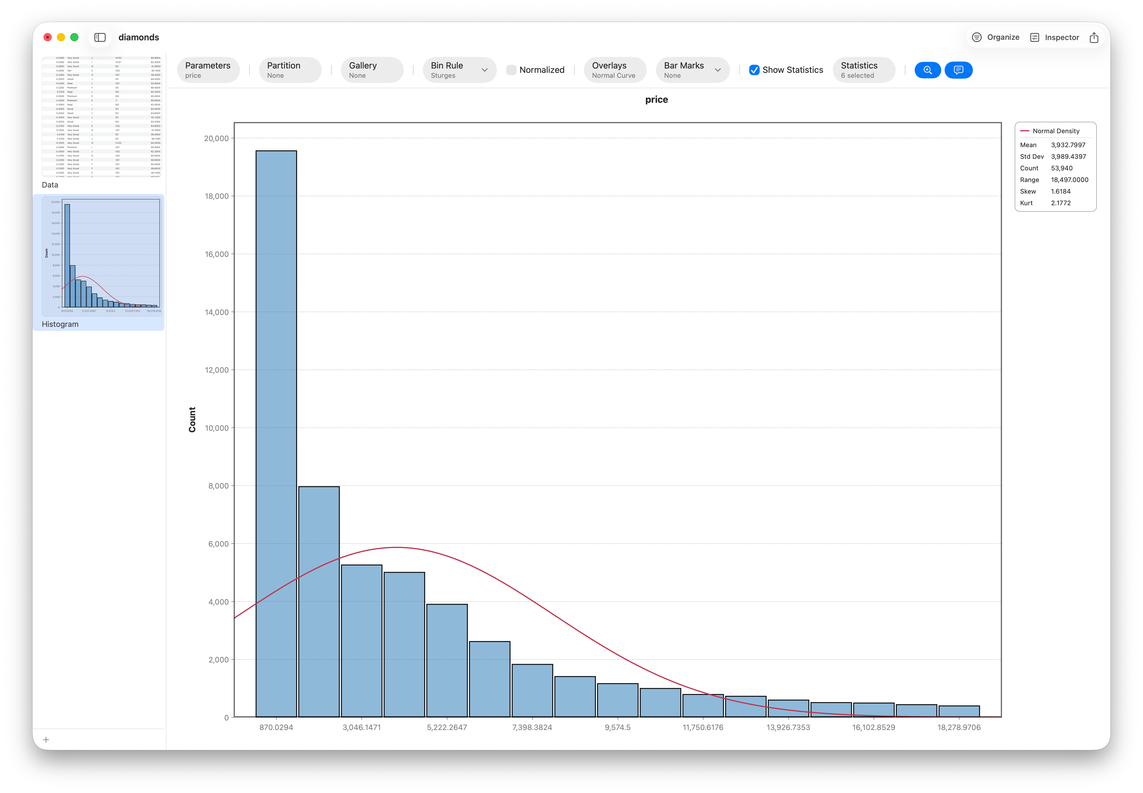
Now look at the variables themselves. Price is heavily right-skewed (skewness ≈ 1.62) — a wall of affordable stones and a long tail of expensive ones. Carat is skewed the same way. Both get a log transform (more on why in When to Log-Transform Skewed Data), which pulls the tail in and makes the relationships linear and readable.
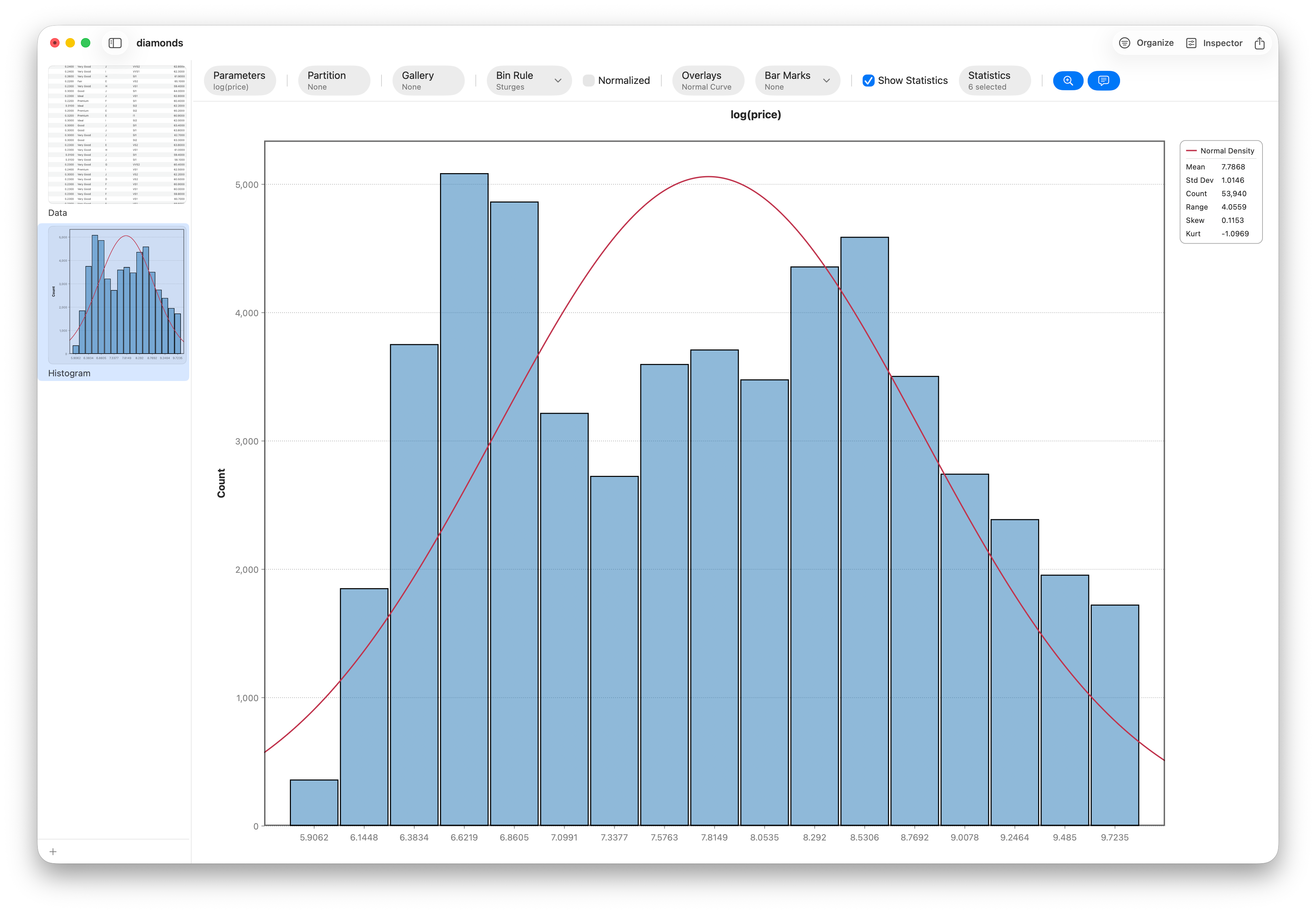
On the logs, the relationship between carat and price collapses onto a near-perfect straight line — correlation 0.97. First clue: size tracks price almost perfectly.
Step 2 — The paradox, charted three times
The cold-open chart wasn't a fluke. Plot the average price of each grade — as a trend across the ordered cut axis — and then do it again for color and again for clarity. All three run the same wrong way.
Color and clarity tell the identical story — every step up in grade is a step down in average price.
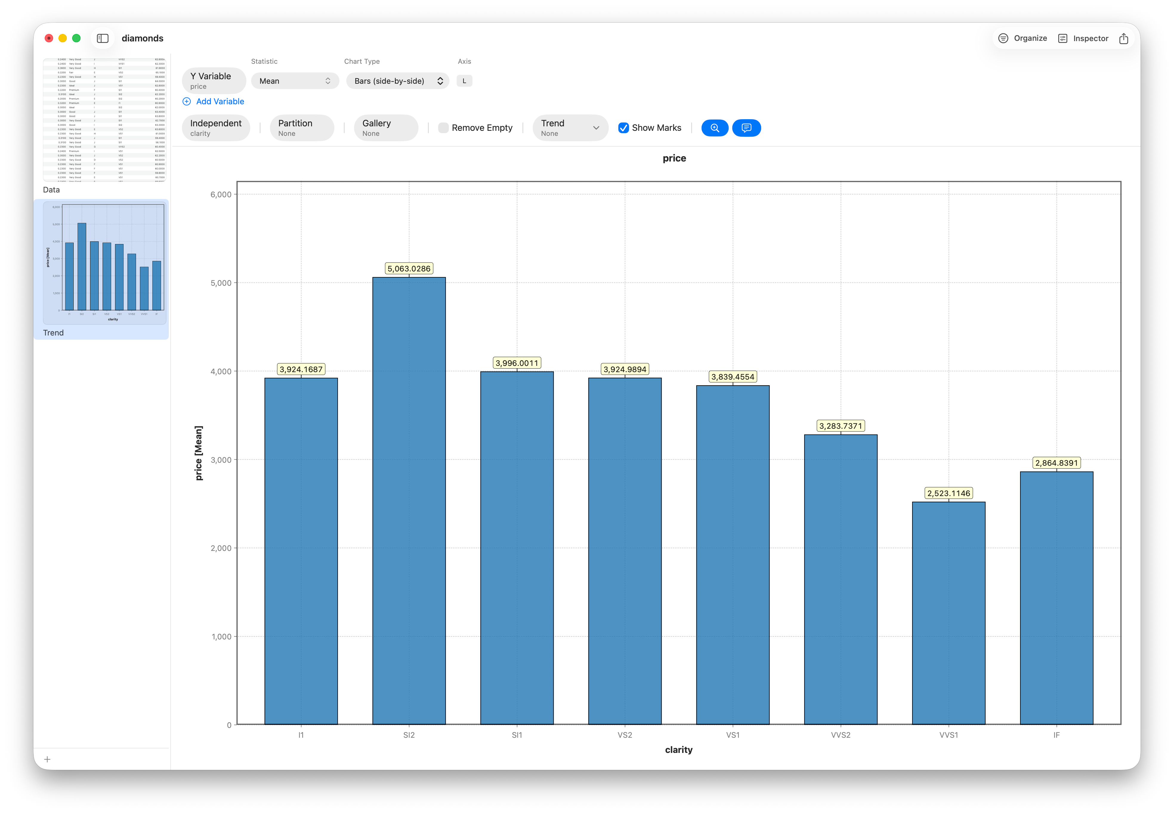
One backwards number is noise. Three, in lockstep, is a pattern with a cause.
Step 3 — Follow the size
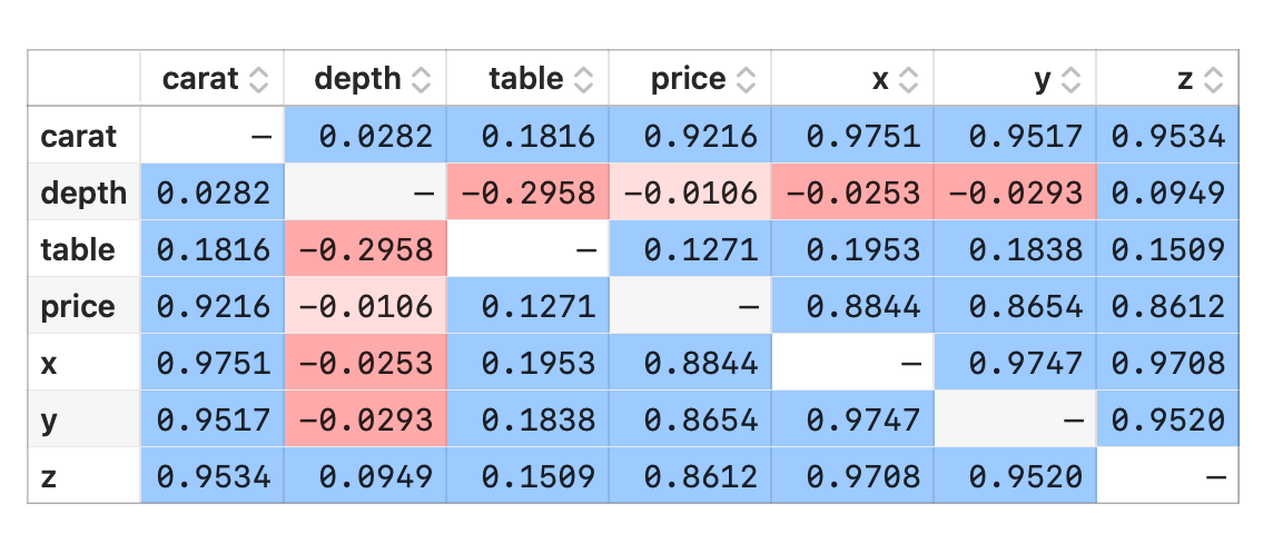
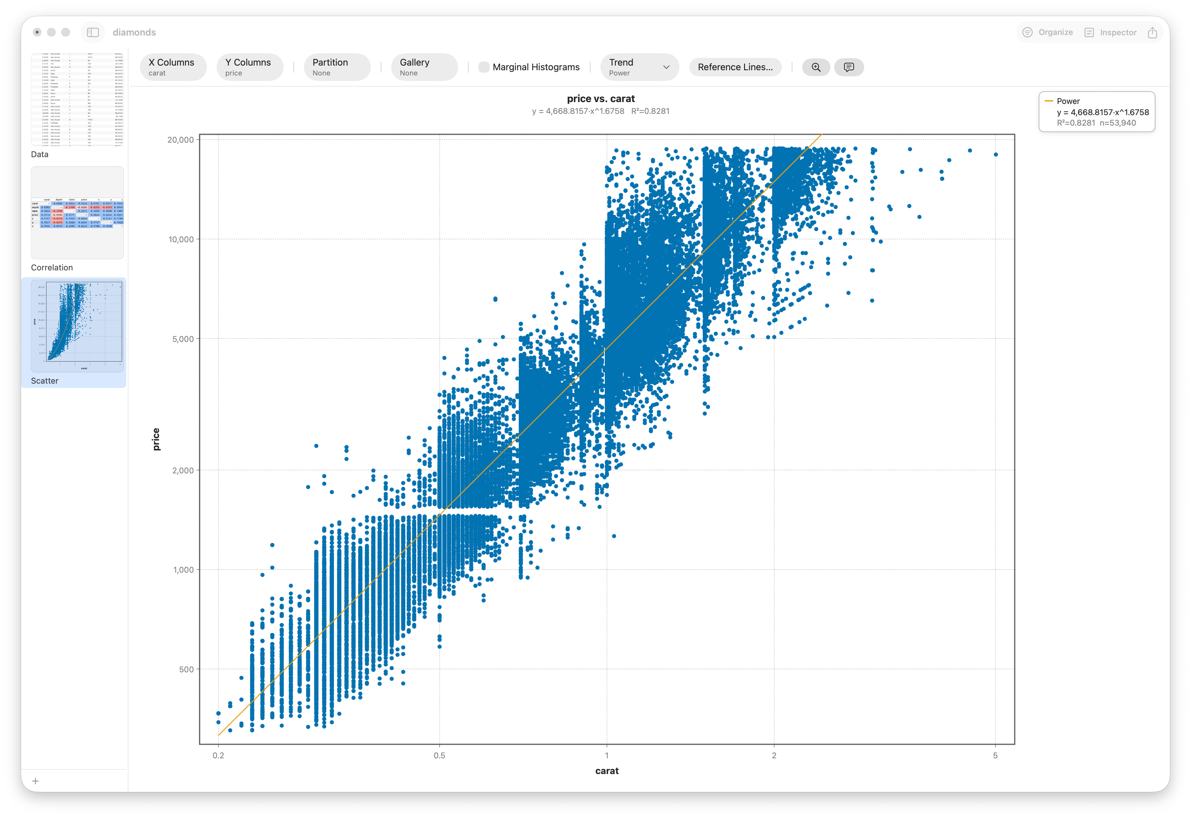
Start with a correlation matrix of the numeric columns. Carat and price are joined at the hip (r ≈ 0.92), and carat is itself tangled with the physical dimensions x, y, z. Then draw carat against price directly — a curved, fanning cloud — and fit a Power trend (price = a · caratᵇ, the pricing power law). The curve snaps to the data (R² ≈ 0.93), and on log–log axes it's a straight line. Size isn't a driver of price; it's the driver.
Now the tell. Line up average carat next to those same quality grades:
| Grade | "Best" avg carat | "Worst" avg carat |
|---|---|---|
| Cut | Ideal: 0.70 | Fair: 1.05 |
| Color | D: 0.66 | J: 1.16 |
| Clarity | IF: 0.51 | SI2: 1.08 |
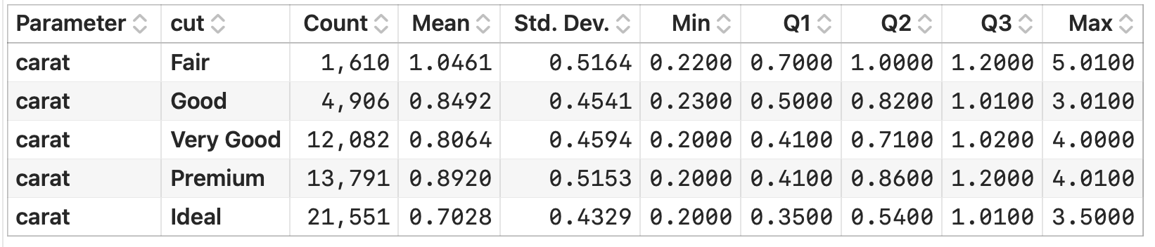
The top-graded stones are systematically small — and small is cheap. Nobody cuts a flawless three-carat rock down to an Ideal half-carat; the rough is too valuable, so cutters chase top grades on small stones and maximize weight on big ones. "Ideal" is quietly a proxy for "small." Quality wasn't lowering price; carat was driving everything, and it happened to correlate with the grades.
Step 4 — Prove it — first with rigor, then by holding size still
Eyeballing bars isn't proof. A one-way ANOVA of price by cut returns a massive F and a vanishing p-value — the cut groups really do differ — and a MANOVA on the dimensions x, y, z confirms the grades differ in size, not just price. The groups are real; the question is what actually separates them.


The fix for a confounder is to stop letting it move. Bin the stones by carat and look at price by cut within each size band — small multiples that hold size roughly constant:
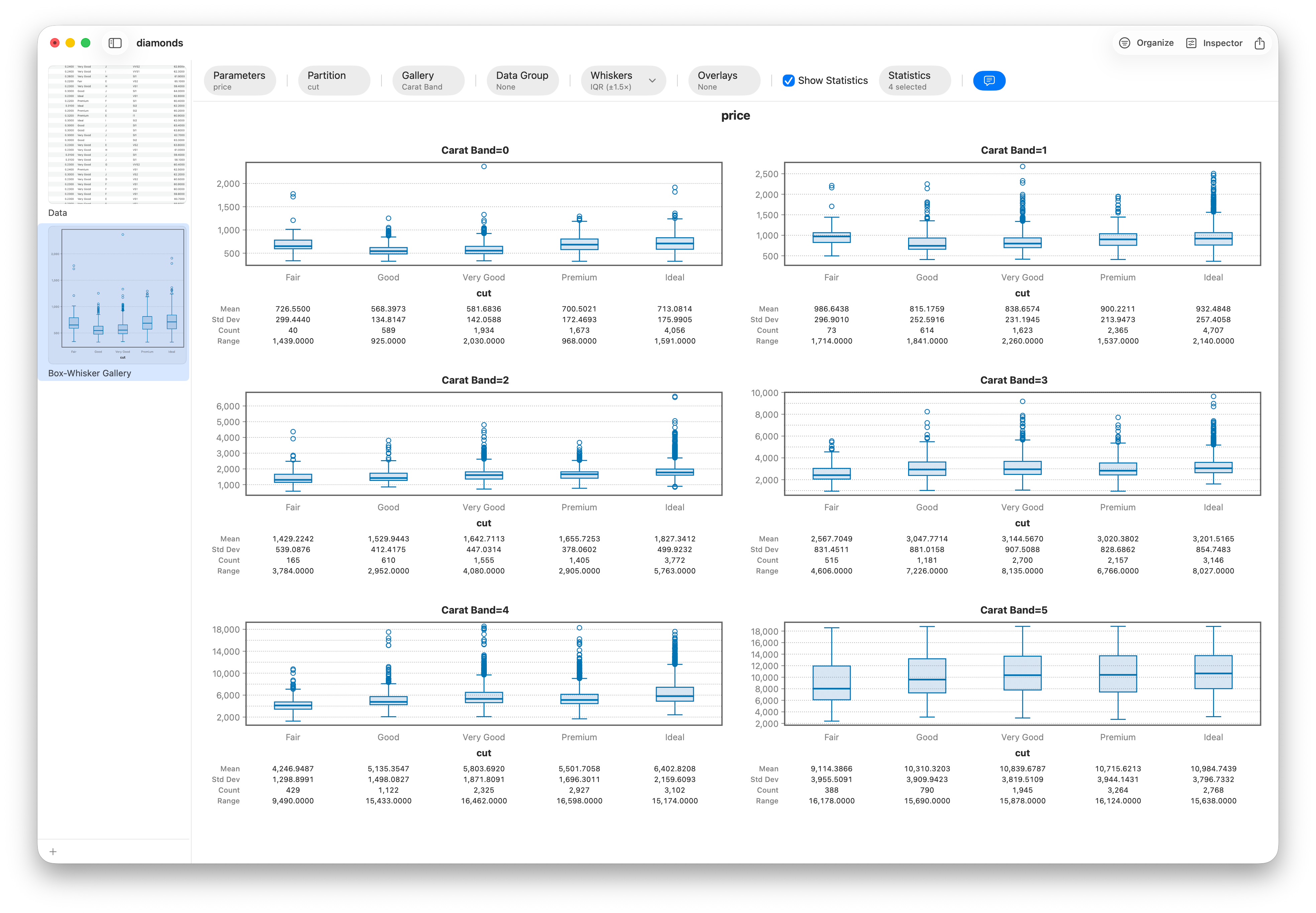
| Carat band | Fair cut | Ideal cut |
|---|---|---|
| 1.0–1.5 ct | $5,003 | $7,055 |
| 2.0 ct + | $11,920 | $15,589 |
In every size band above half a carat, the order flips back: at equal size, a better cut is worth more. The paradox didn't weaken — it reversed. That's the signature of a real confounder.
Step 5 — One model to hold everything at once
Binning by hand proves the point; a regression does the conditioning cleanly and all at once. Model log(price) and watch the R² climb as predictors go in:
| Model | R² |
|---|---|
| Cut alone | 0.0181 |
| log(carat) alone | ≈ 0.93 |
| + cut | ≈ 0.94 |
| + cut + color + clarity | 0.9826 |
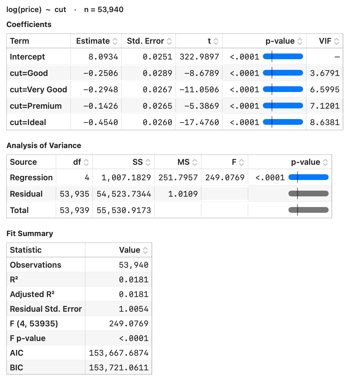
Cut in isolation explains under 2% of price — and its coefficients are all negative, Ideal most negative of all: the paradox restated as a model. Size alone explains ~93%. But add carat, color and clarity and something flips.
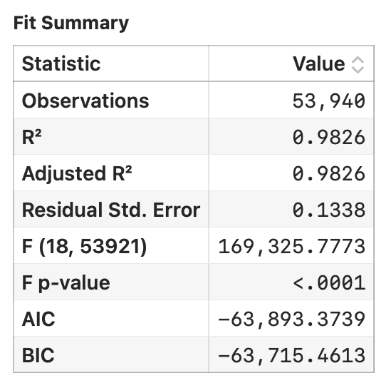
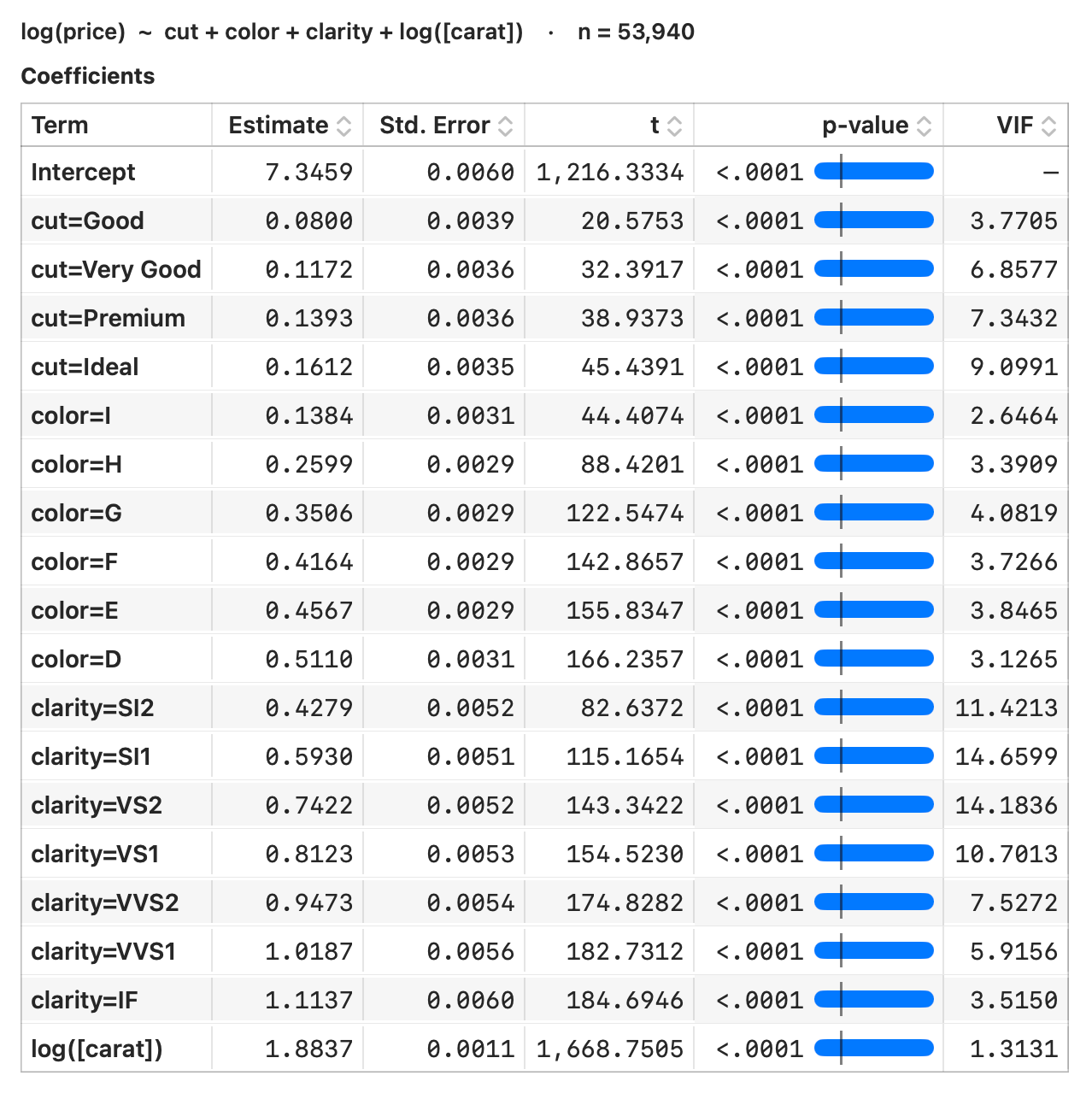
The full model reaches R² = 0.9826, and once size is held constant the quality coefficients line up exactly the way a gemologist would predict — each grade worth more than the last:
| Cut (vs Fair) | Good | Very Good | Premium | Ideal |
|---|---|---|---|---|
| log-price coefficient | +0.0800 | +0.1172 | +0.1393 | +0.1612 |
That last number is the payoff. Holding size and everything else fixed, moving Fair → Ideal is worth e0.1612 − 1 ≈ +17.5% on price — a sentence you can put in front of a buyer. Ideal cut went from apparently the cheapest to a precise, defensible 17.5% premium (how to build a regression that isn't fooled).
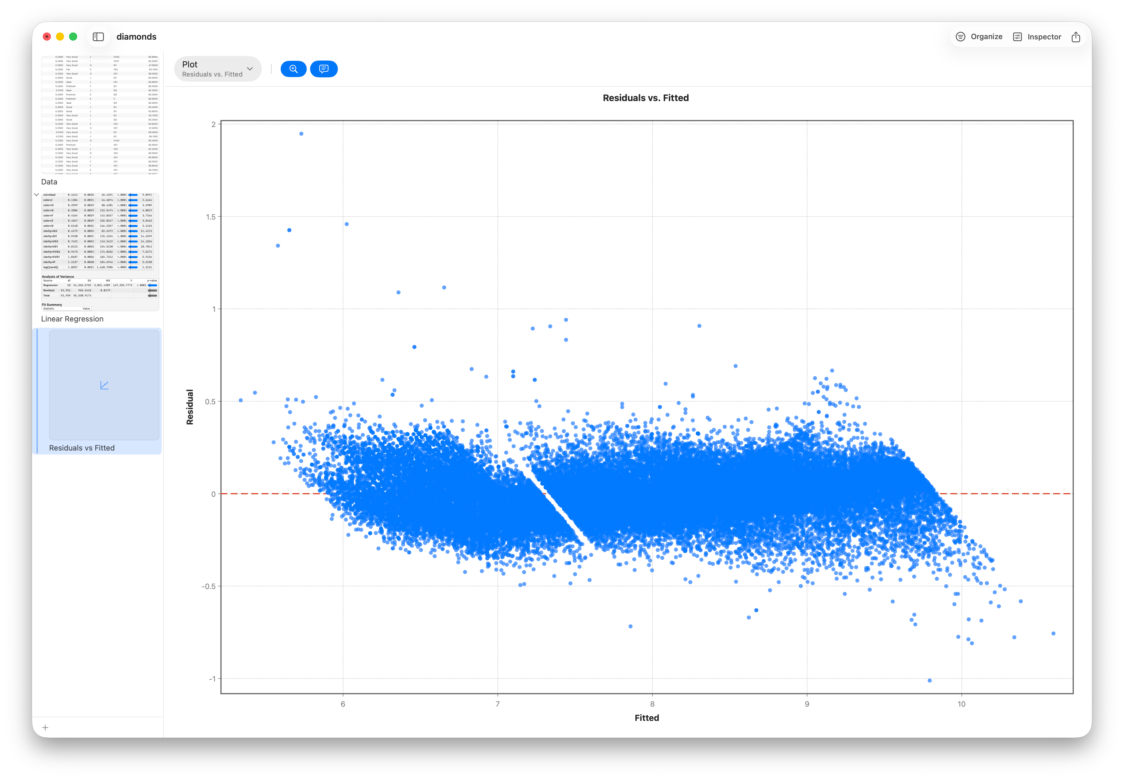
And because we modeled log-price, the diagnostics hold up: the residuals sit flat and even across the fitted range — no funnel — so those coefficients are trustworthy, not an artifact of a bad functional form.
Step 6 — The data's own X-ray: PCA
Principal components turns the whole thing into a picture. Feed in the six physical measurements (carat, x, y, z, depth, table) and let Stratum find the axes the data actually varies along:
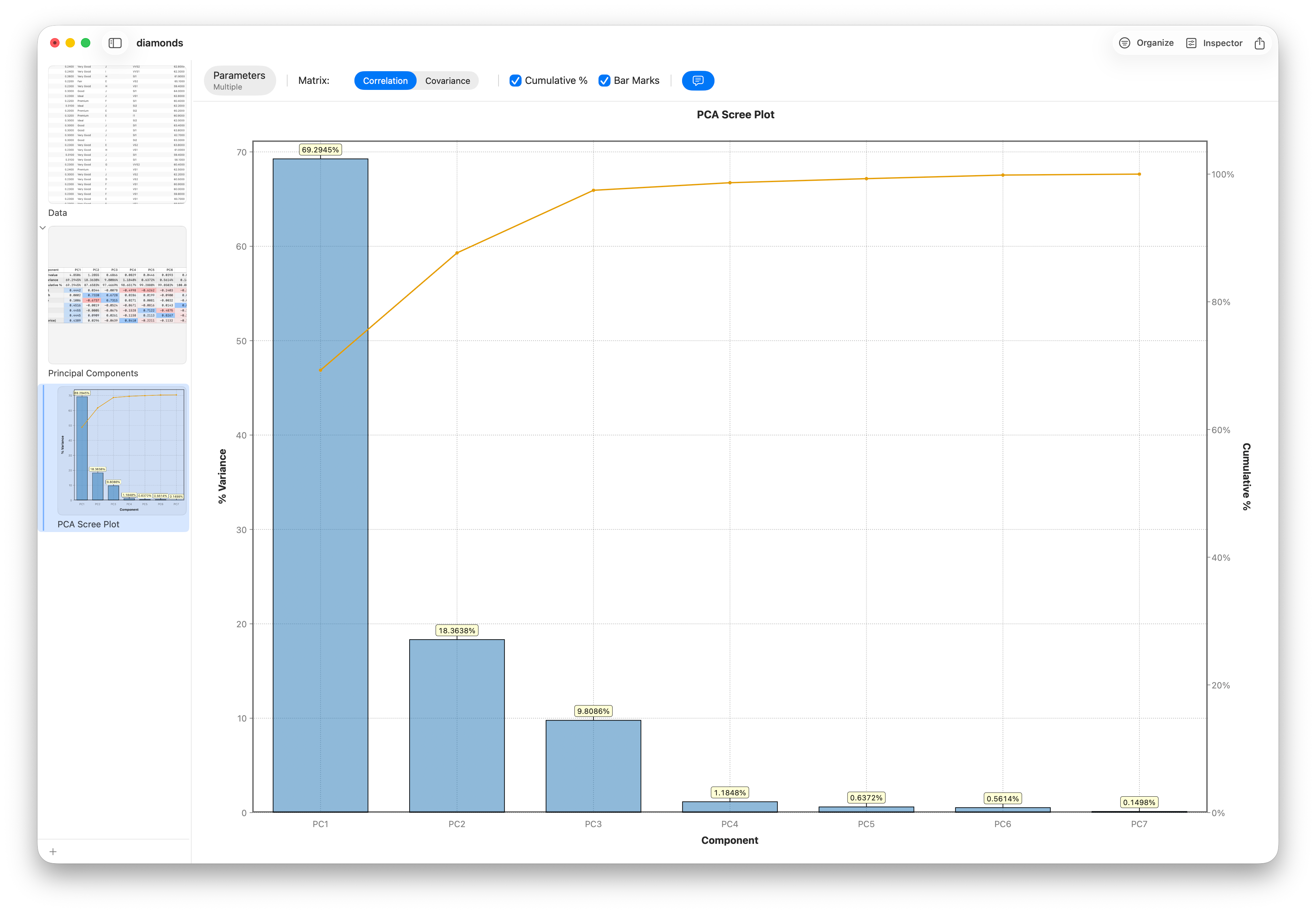
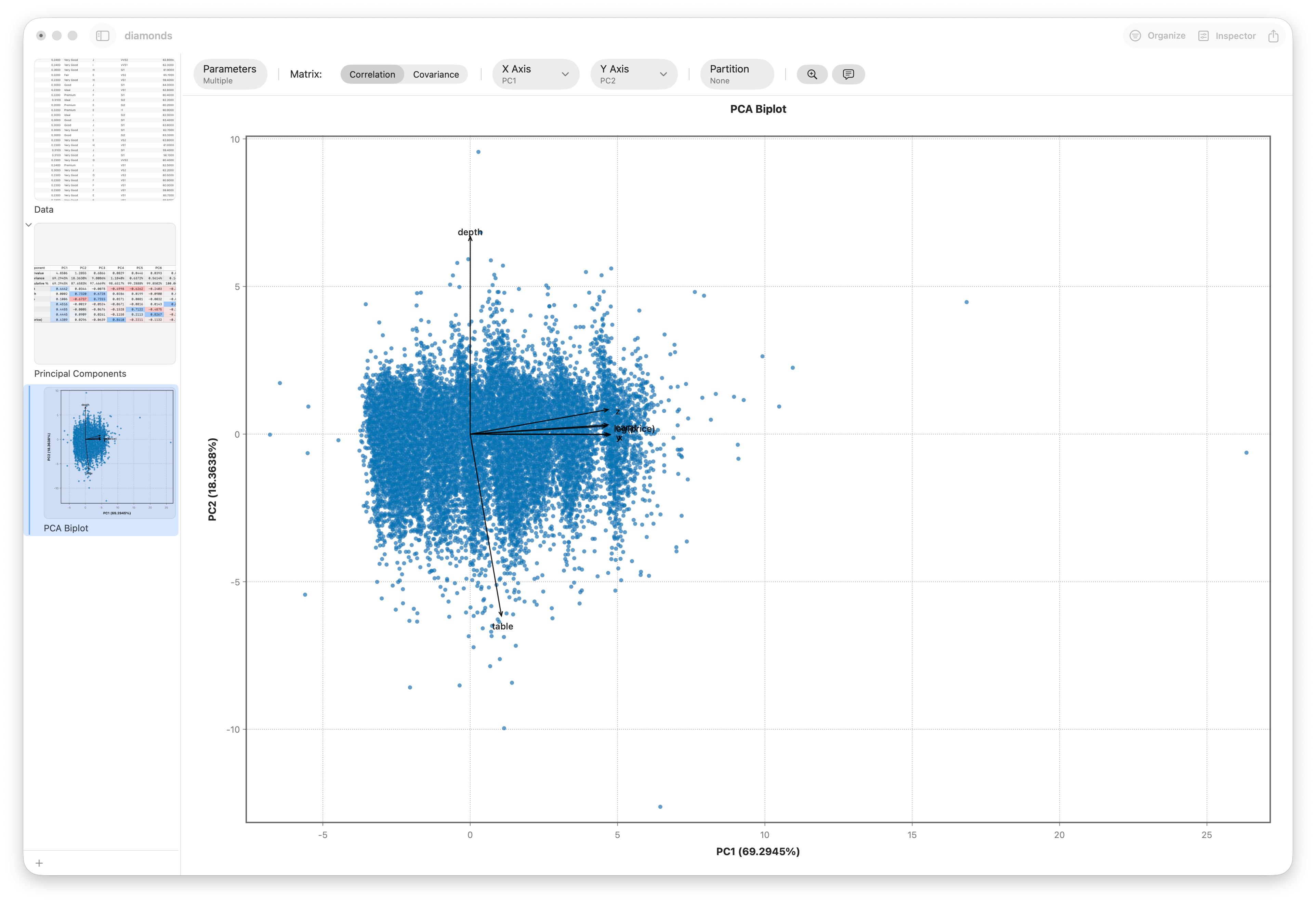
- PC1 = 65.5% of all variation — loads on carat, x, y, z together. Stratum rediscovers "size" from the raw numbers. That component is the confounder, drawn as an axis.
- PC2 = 21.4% — loads on depth (−0.73) and table (+0.67), the proportions gemologists use to define cut. The second axis is quality.
The entire paradox in one line: price lives on axis one (size); quality lives on axis two. Grade on one axis, price on the other, and of course they look unrelated until you pull them apart (reading a PCA you didn't write).
Step 7 — A second opinion from a decision tree
Finally, let the data carve its own rules — no formula, just recursive splits. A CART decision tree predicting cut grade from the raw measurements reaches first for table, then depth — the exact proportion variables PCA flagged as the cut axis. The tree hits 73.5% accuracy, nearly double the ~40% you'd get by always guessing the most common grade (Ideal).
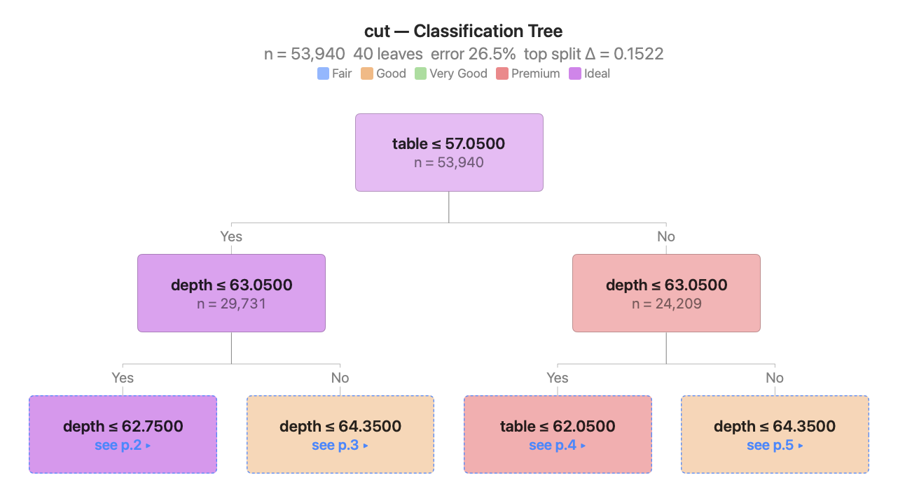
table and depth, the proportion vars.Two completely different methods — an unsupervised rotation and a greedy tree — landing on the same truth. That convergence is how you know a finding is real, not an artifact of one technique (decision trees on real data).
What we actually did
Category ordering, distributions, charts, a correlation matrix and a power fit, ANOVA and MANOVA, a conditioning step, a multivariable regression, PCA, and a decision tree — a dozen lenses on one dataset, no code, about twenty minutes — to turn "diamond pricing is irrational" into "size dominates price; quality is a second, independent axis worth a precise 17.5% premium at equal size."
That's the difference between a chart and an analysis.
depth column.