 Stratum
Histograms & Distribution Shape
Before any test or model, look at the distribution. The histogram answers the most fundamental question about a variable — how are its values spread out? — and it's where most good analyses really begin.
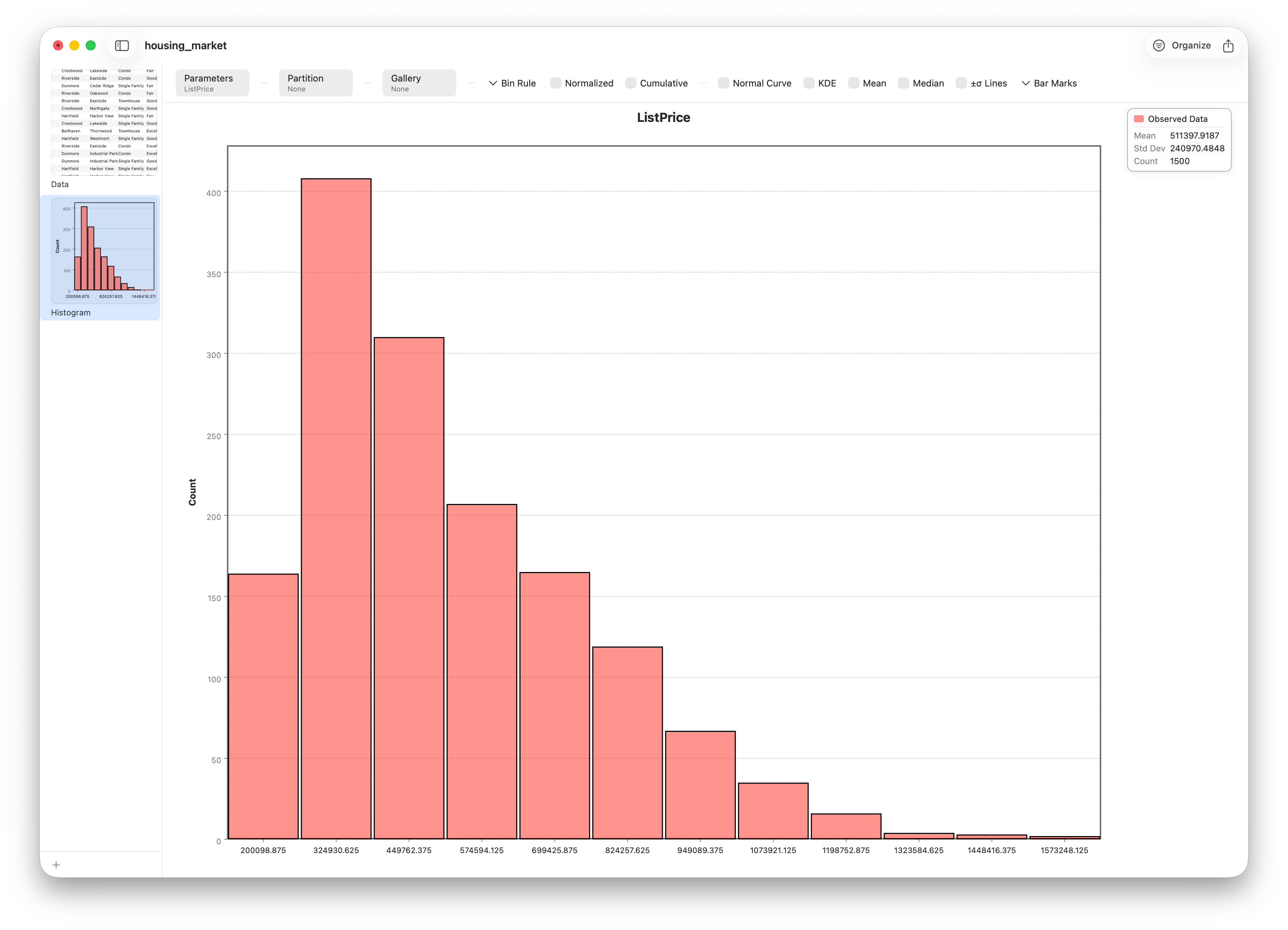
In Lesson 1 we read that list prices have a mean higher than their median. That single fact hinted at something, but a number can't show you a shape. A histogram can. It takes a variable, slices its range into bins, and draws a bar for each bin whose height is the count of values that fall inside. The result is a picture of the entire distribution — and learning to read that picture is one of the most transferable skills in statistics.
Reading the shape
From a histogram you read four things, almost at once:
- Center — where the bulk of the values sit.
- Spread — how wide the distribution is.
- Shape — is it symmetric or skewed? One peak (unimodal) or several (multimodal)?
- Outliers — isolated bars stranded far from the main mass.
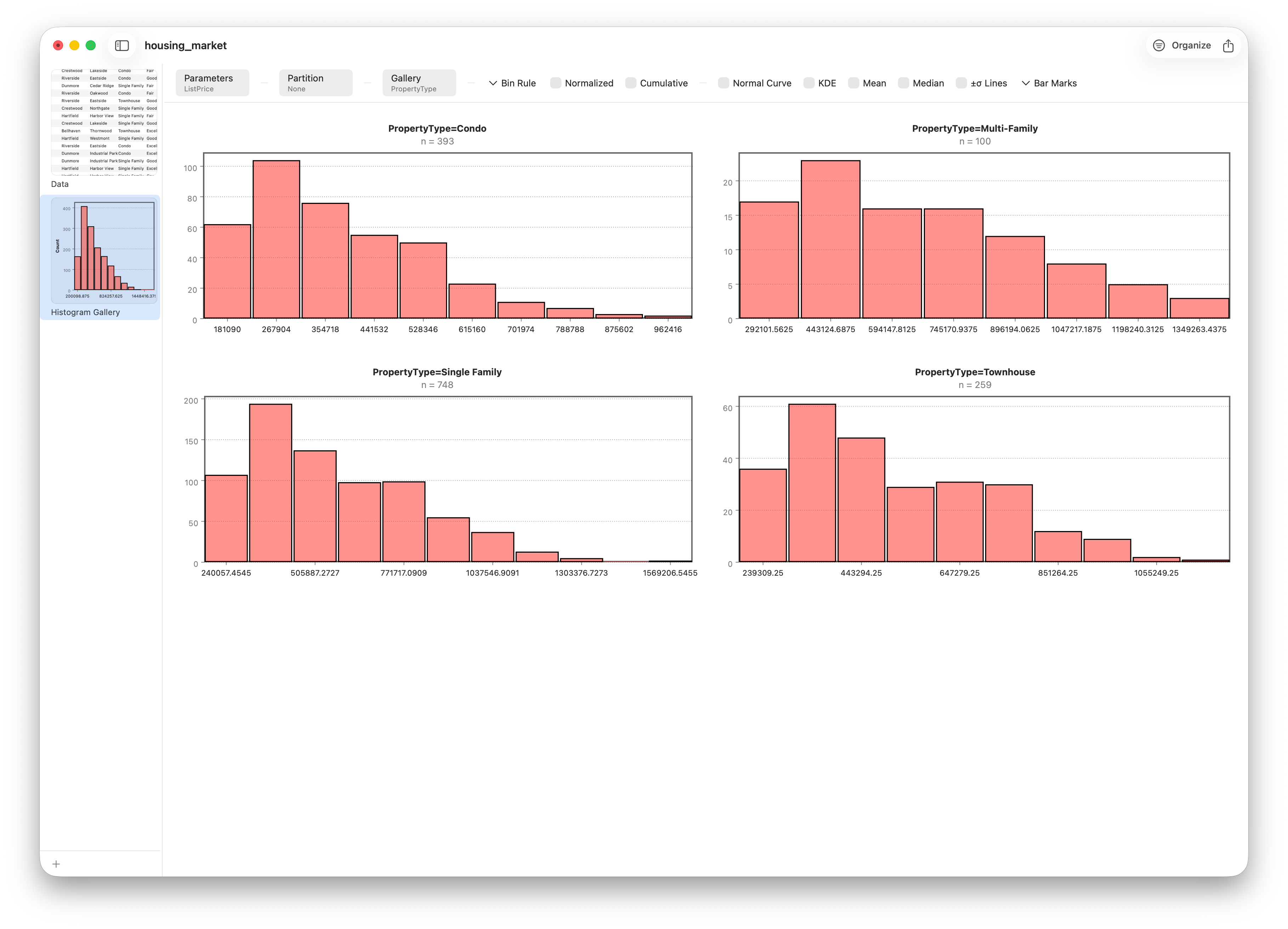
For list price, the story is unmistakable: a single tall peak at the lower end and a long tail stretching right. That's a right-skewed distribution — exactly what the mean-above-median clue predicted. A few very expensive homes stretch the tail and drag the average upward.
The bin-width knob
A histogram has one crucial setting: how many bins. It's a genuine trade-off. Too few bins and you over-smooth, blurring real structure into a couple of fat bars. Too many and every bar becomes noise. Stratum puts this control right in the chart's control bar, so you can feel the trade-off by dragging it.
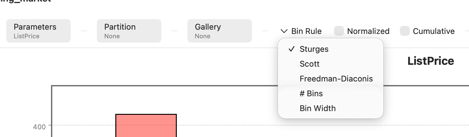
You don't have to guess. Statisticians have devised rules that pick a sensible number for you:
| Rule | Idea | Best when |
|---|---|---|
| Sturges | bins ≈ log₂(n) + 1 | Small, roughly normal data |
| Rice | bins ≈ 2·n1/3 | A simple default for larger samples |
| Freedman–Diaconis | width ∝ IQR / n1/3 | Skewed data and outliers (robust) |
For right-skewed prices, Freedman–Diaconis usually behaves best, because it keys off the interquartile range rather than the outlier-sensitive full range.
Smoothing it out with a density curve
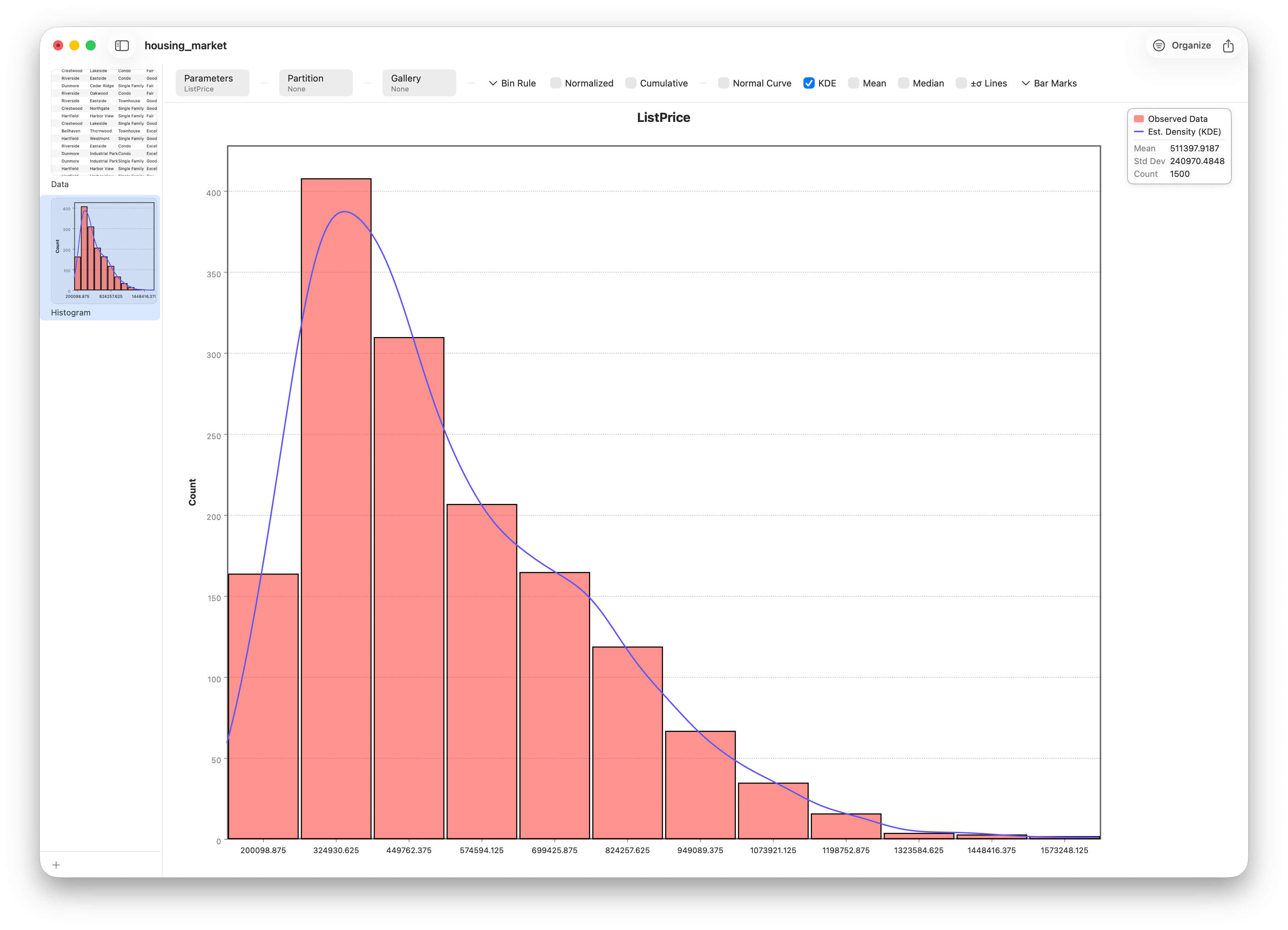
Bins are a blunt instrument — shift their edges and the picture wobbles. A kernel density estimate (KDE) replaces the bars with a smooth curve, giving you a bin-independent view of the same shape. Switch it on and the distribution's contour comes into focus.
How normal is it?
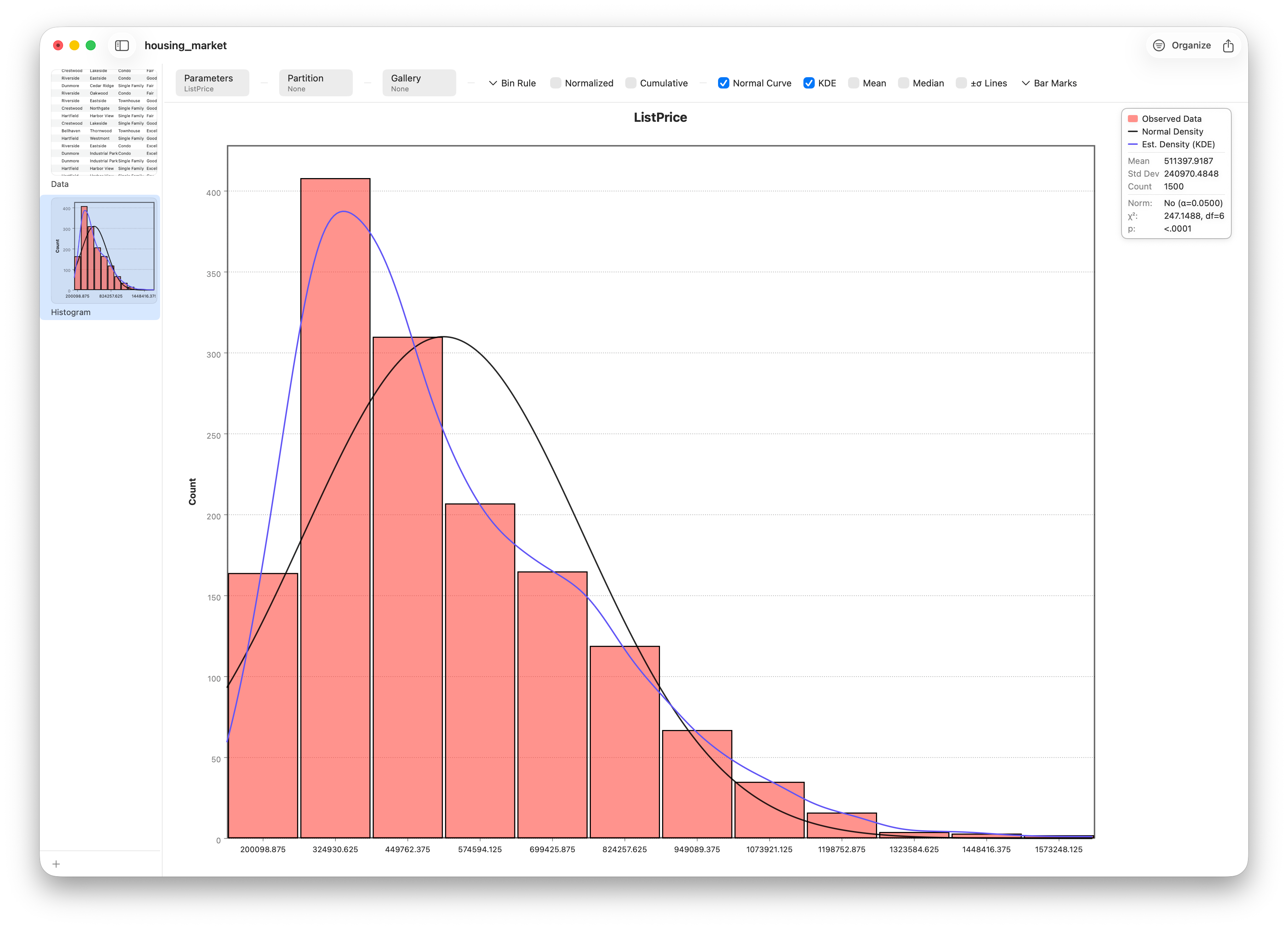
Many statistical methods assume data is roughly normal — the familiar bell curve. Stratum can overlay a normal curve with the same mean and standard deviation as your data, turning "is this normal?" into a visual question. If the bars hug the curve, you're close. If a long tail pulls away from it, you're not.
Comparing groups with small multiples
One distribution is useful; several side by side is often more revealing. Facet the histogram by PropertyType and Stratum draws a gallery of small multiples — one panel per category, on shared axes — so you can compare the price distributions of condos, townhouses, and detached homes at a glance.
Ready to share
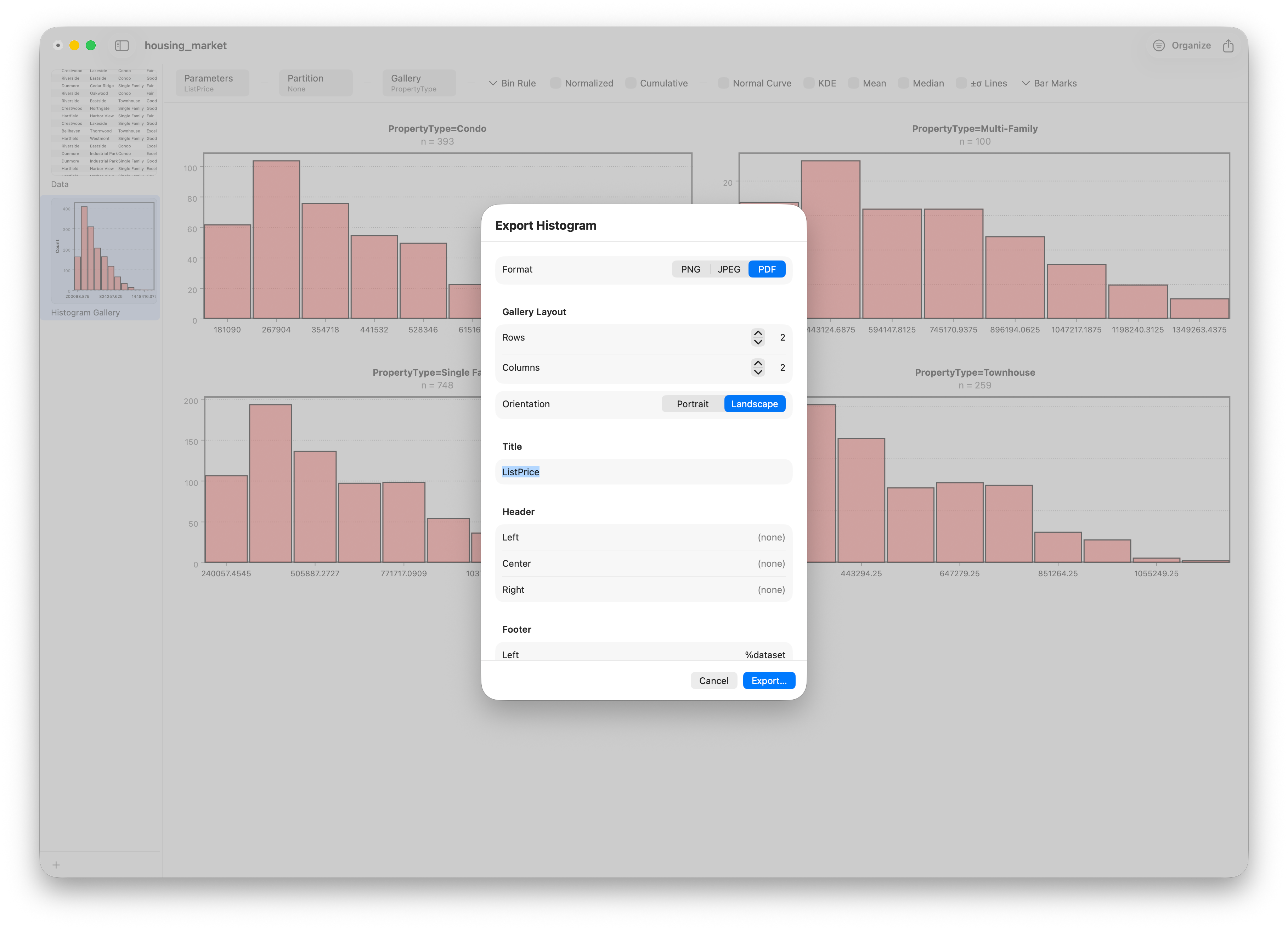
When the chart says what you need it to, export it. Stratum renders charts to PNG, JPEG, or vector PDF — drop them straight into a report or slide deck.
Follow along
- Dataset
- housing_market.csv
- You'll use
- The Histogram chart, bin controls, KDE and normal overlays, faceting, and export
- Up next
- Lesson 6 — Box-Whisker & Violin Plots
The histogram shows one variable's shape beautifully, but it's awkward for comparing many groups at once. In the next lesson we'll meet two charts built for exactly that — the box-and-whisker plot and its richer cousin, the violin.