 Stratum
Box Plots & Violin Plots: Compare Groups and Spot Outliers
A histogram shows one variable beautifully, but the moment you want to compare several groups it runs out of room. The box plot was built for exactly that — a compact summary of a distribution that lines up neatly, group beside group.
In the last lesson you read the shape of a single price distribution. Now the question changes: do prices differ across neighborhoods? You could draw a histogram for each one, but stacking five or ten of them gets unwieldy fast. The box plot condenses each distribution into a handful of robust numbers and renders them as one tidy box — so a dozen groups fit on a single axis, easy to scan and easy to compare.
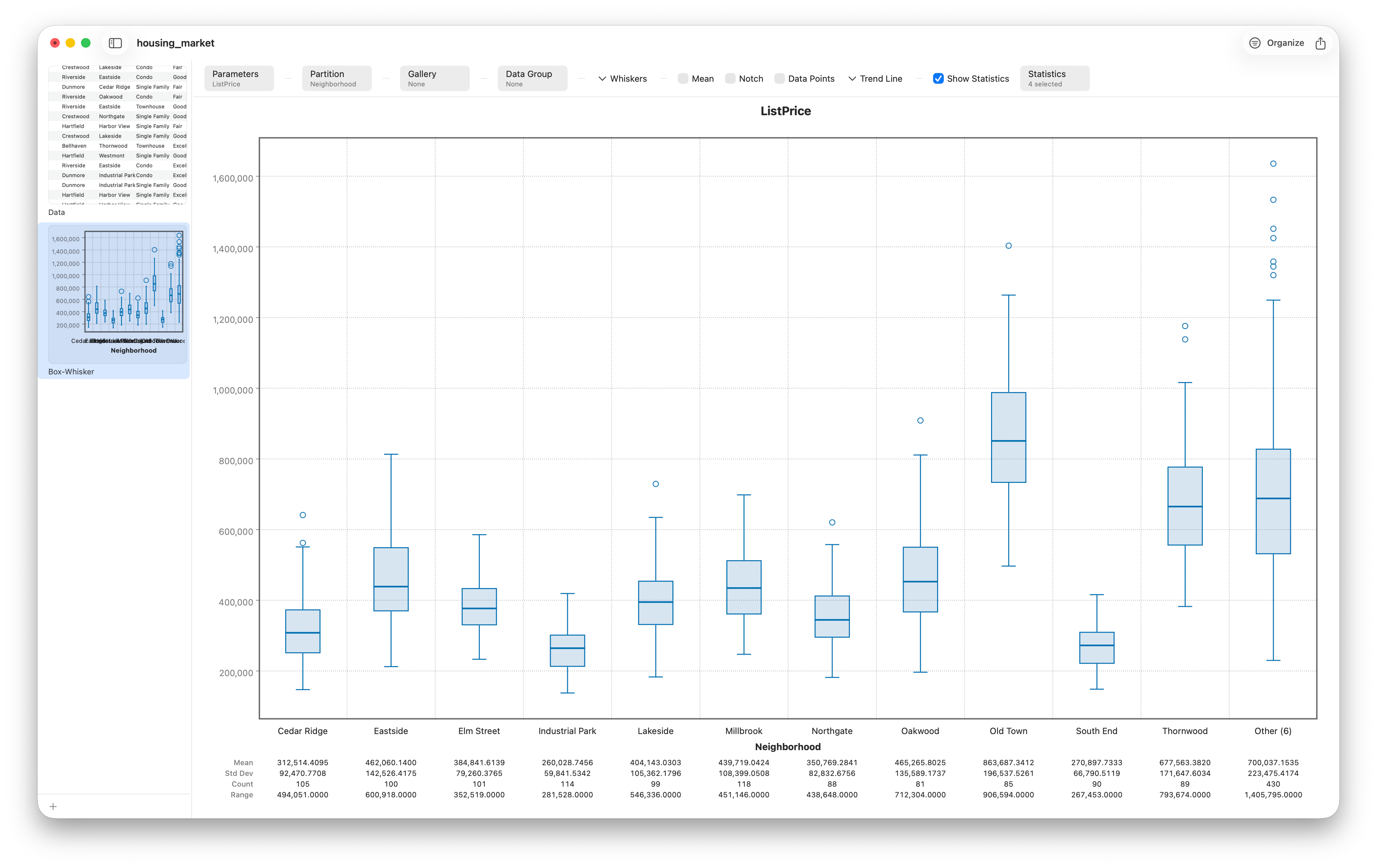
How to read a box plot
Every box plot is built from five numbers — the five-number summary. Learn these once and you can read any box plot ever drawn:
- The line inside the box is the median — the middle value, the typical home.
- The box itself spans the first quartile (Q1) to the third quartile (Q3) — the middle 50% of the data. Its height is the interquartile range, or IQR.
- The whiskers reach out to the most extreme values that still fall within a reasonable distance of the box.
- Dots beyond the whiskers are flagged as potential outliers.
Because the box plot is built on the median and quartiles rather than the mean and standard deviation, it is robust — a single ultra-luxury listing can't blow the box out of shape the way it can yank a mean around. That makes box plots ideal for the skewed, outlier-prone data you saw in the housing set.
Where the whiskers stop, and what counts as an outlier
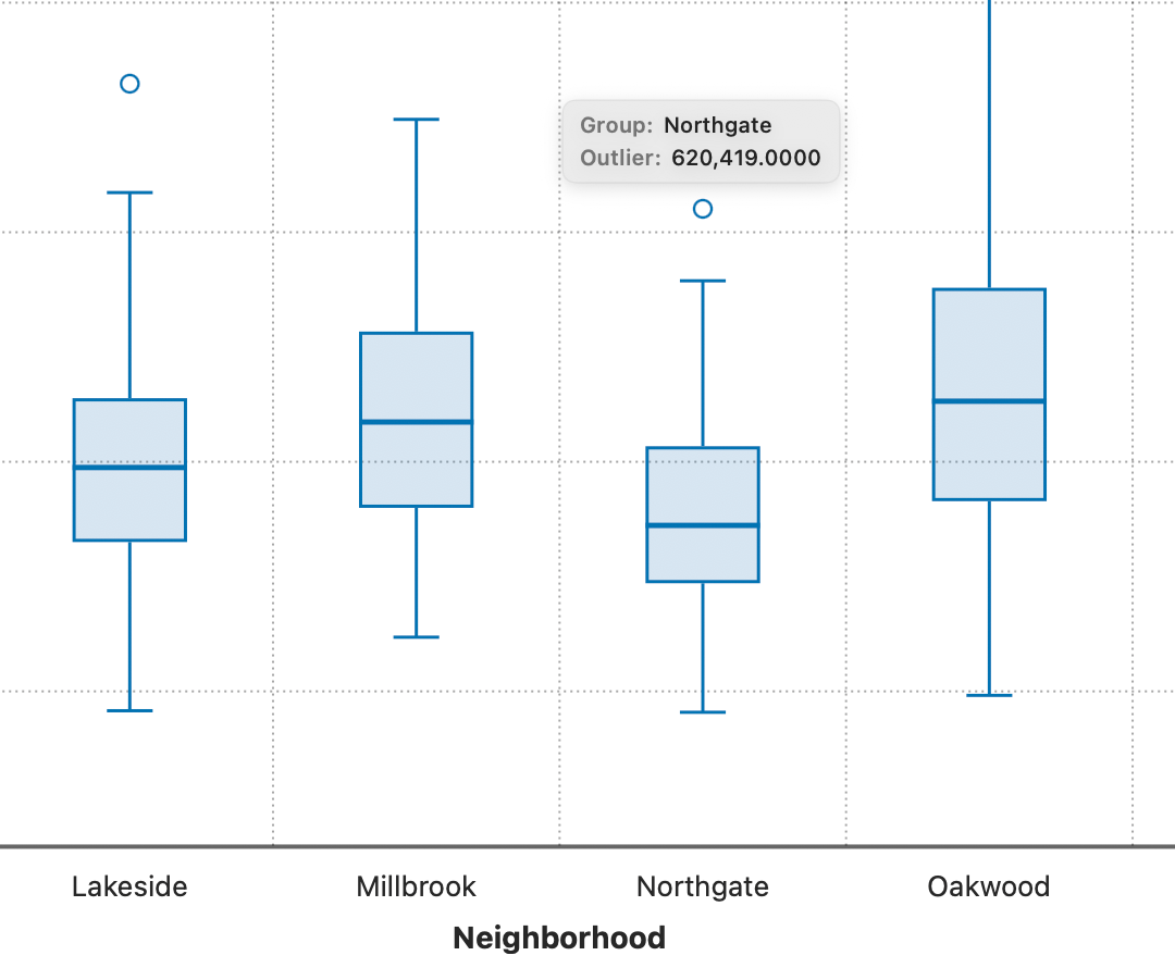
The whiskers don't just run to the minimum and maximum. By default Stratum uses the Tukey rule: the whiskers extend to the furthest points within 1.5 × IQR of the box edges, and anything past that line is drawn as an individual outlier point. (You can change the fence with the Whiskers control if you prefer a different rule.) Best of all, hover any outlier dot and Stratum identifies it on the spot — its value, labeled as an outlier — so you can see exactly which listings to investigate.
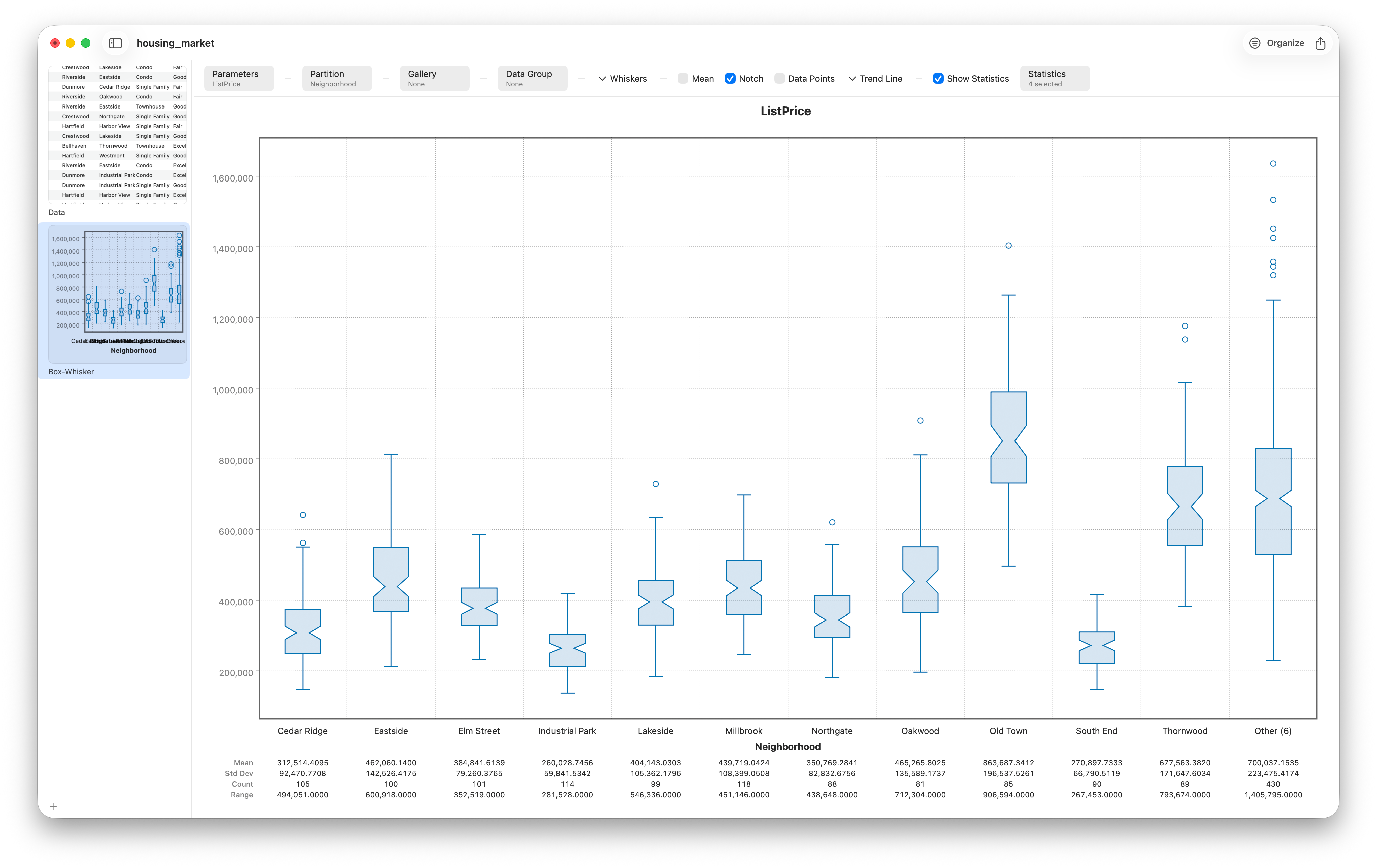
Notches: a confidence interval you can see
Two medians can look different just by chance. A notched box plot answers "is the difference real?" visually. Turning on notches pinches each box around its median to show an approximate 95% confidence interval for that median. The rule of thumb is simple: if two notches don't overlap, the medians are very likely genuinely different.
When a box hides too much: the violin plot
A box plot compresses a distribution down to five numbers, and most of the time that's a feature. But five numbers can't tell you whether a group has one peak or two. A distribution with two clusters — say, a neighborhood split between modest condos and grand houses — produces exactly the same box as a smooth single-peaked one. The violin plot fixes that. It replaces each box with a mirrored kernel density curve, so the full shape of every group is on display.
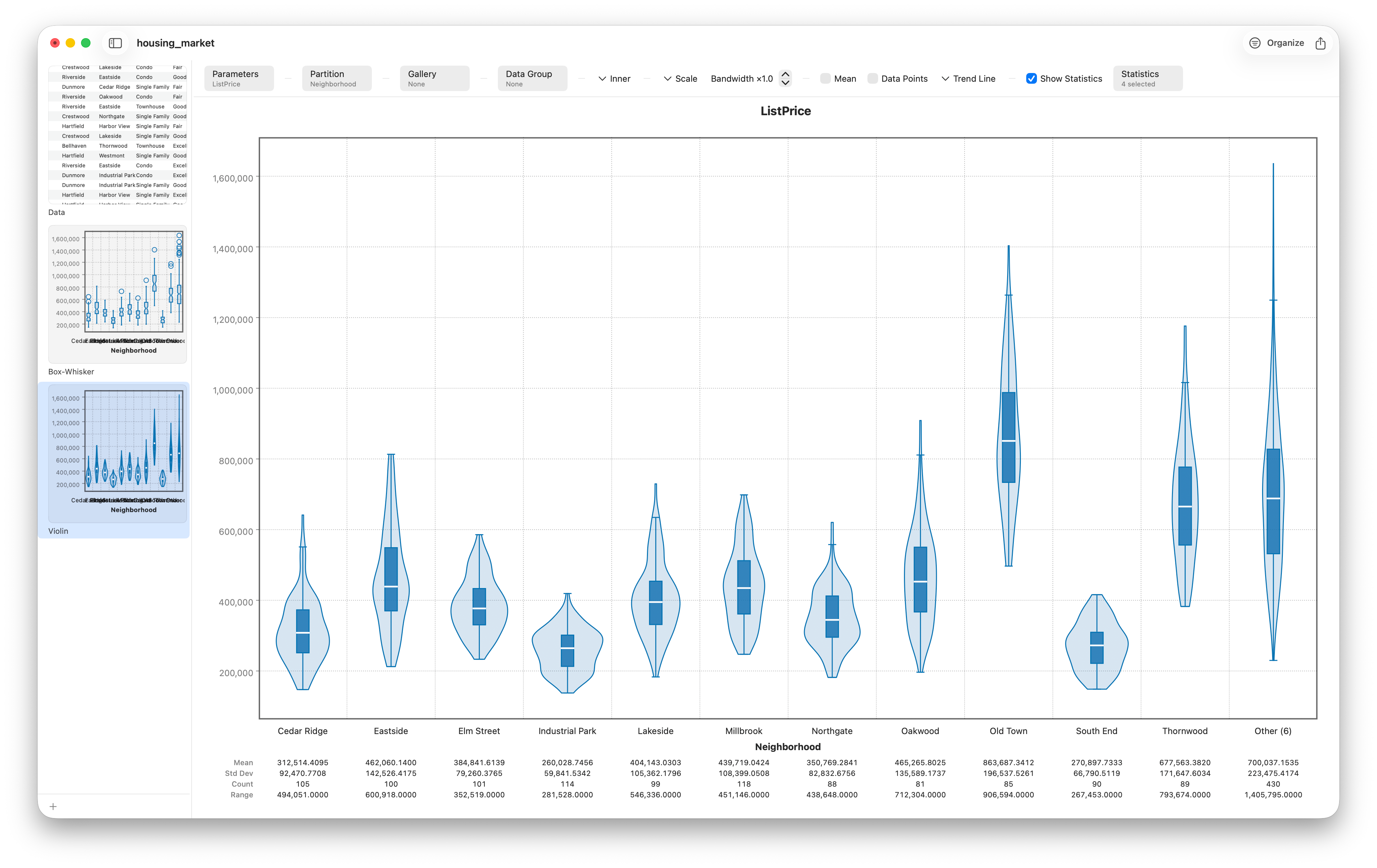
Read a violin like a contour map: where it bulges, values cluster; where it pinches, they thin out. A violin with two bulges is bimodal, a structure a box plot would completely hide. You can keep the best of both worlds by drawing the quartiles or a scatter of jittered points inside the violin, marrying the violin's shape with the box plot's precise landmarks.
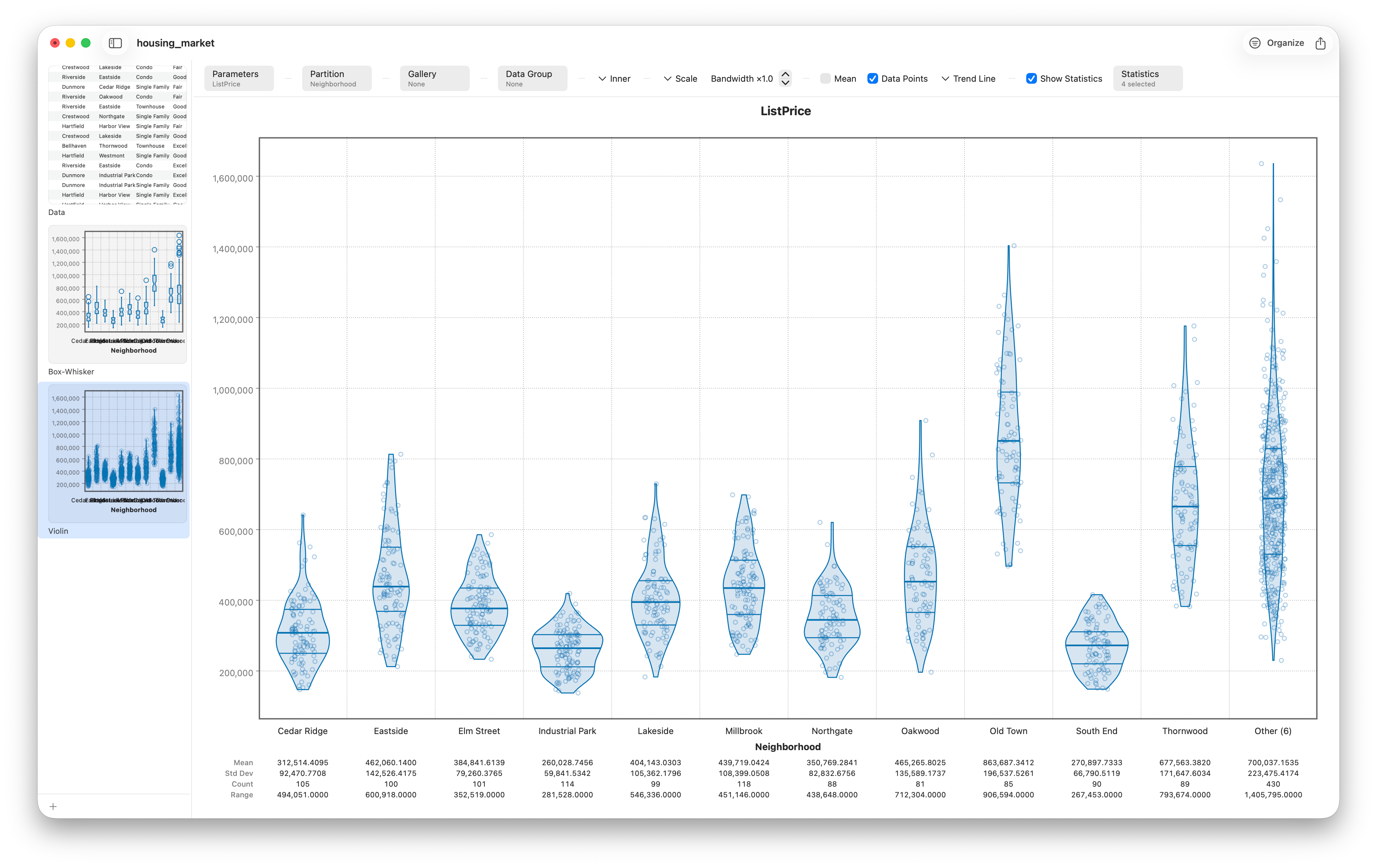
Box or violin — which should I reach for?
Use a box plot when you have many groups, want a clean comparison of centers and spreads, or need to flag outliers explicitly. Reach for a violin when the shape of each group matters — when you suspect bimodality or want to show the full distribution — and when each group has enough points for the density estimate to be trustworthy. For tiny groups, a box or even a dot plot (Lesson 9) is the more honest choice.
Ready to share
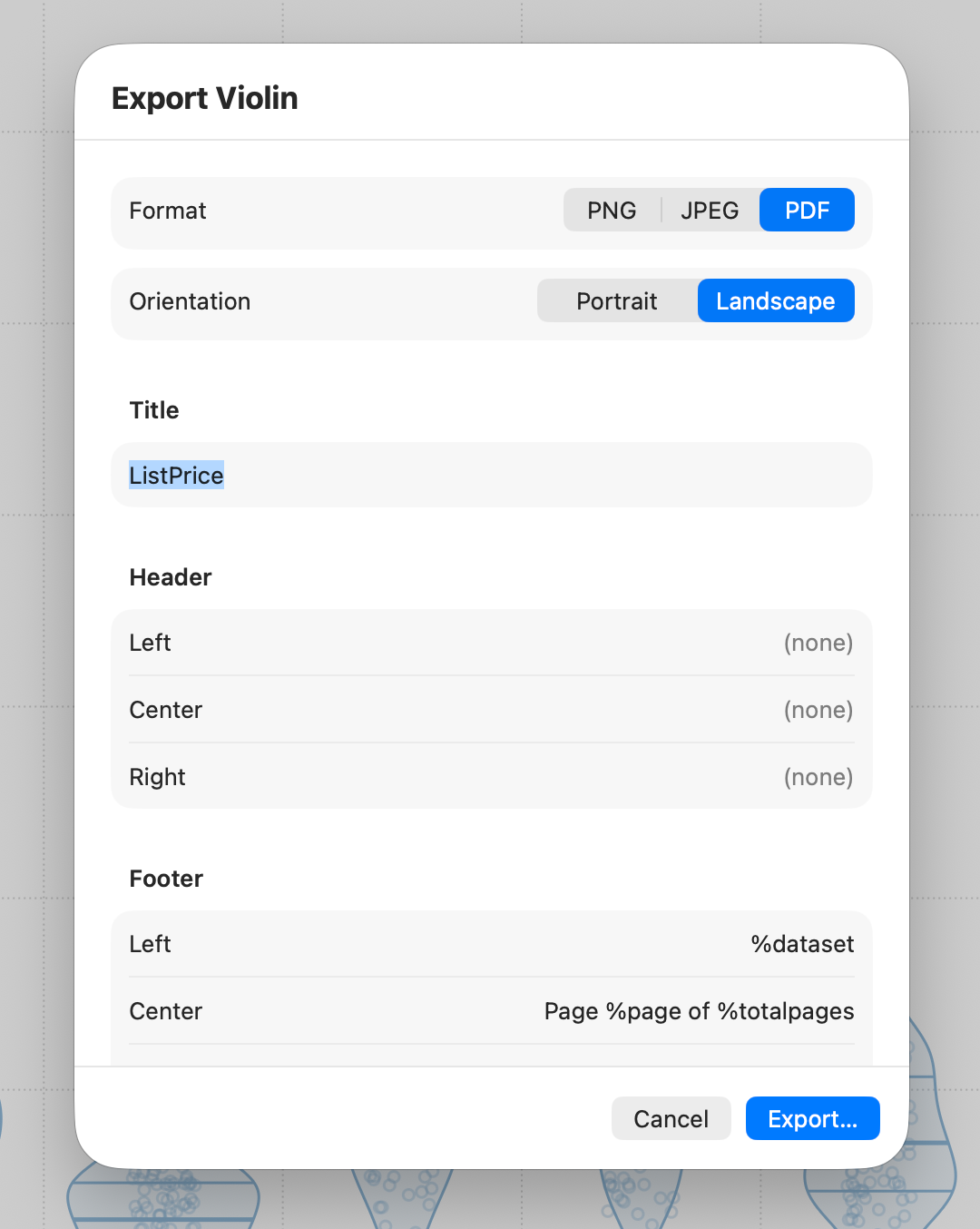
As with every chart in Stratum, when the comparison says what you need it to, export it to PNG, JPEG, or vector PDF and drop it straight into a report.
Follow along
- Dataset
- housing_market.csv
- You'll use
- The Box-Whisker chart grouped by neighborhood and property type, outlier fences, notches, the Violin variant, and export
- No install?
- Sketch a quick one in the free box plot maker
- Up next
- Lesson 7 — Density, Ridgeline & ECDF
Box and violin plots summarize groups, but they still smooth the data into a shape. Sometimes you want the smoothing dialed in by hand, or you want to read an exact percentile off a curve. That's where density and cumulative plots come in — our next stop.