 Stratum
Density, Ridgeline & ECDF Plots: Smooth and Cumulative Views
Histograms and box plots both summarize a distribution, but each throws something away. Density and cumulative plots fill the gaps — one gives you a smooth, bin-free contour you control by hand, the other lets you read any percentile straight off a curve.
A histogram's shape depends on where you put the bin edges; nudge them and the picture wobbles. The kernel density estimate (KDE) solves that by replacing bars with a single smooth curve. We'll use it here on a manufacturing dataset — wafer thickness measurements grouped by recipe — where a clean view of shape, and the ability to compare recipes, matters.
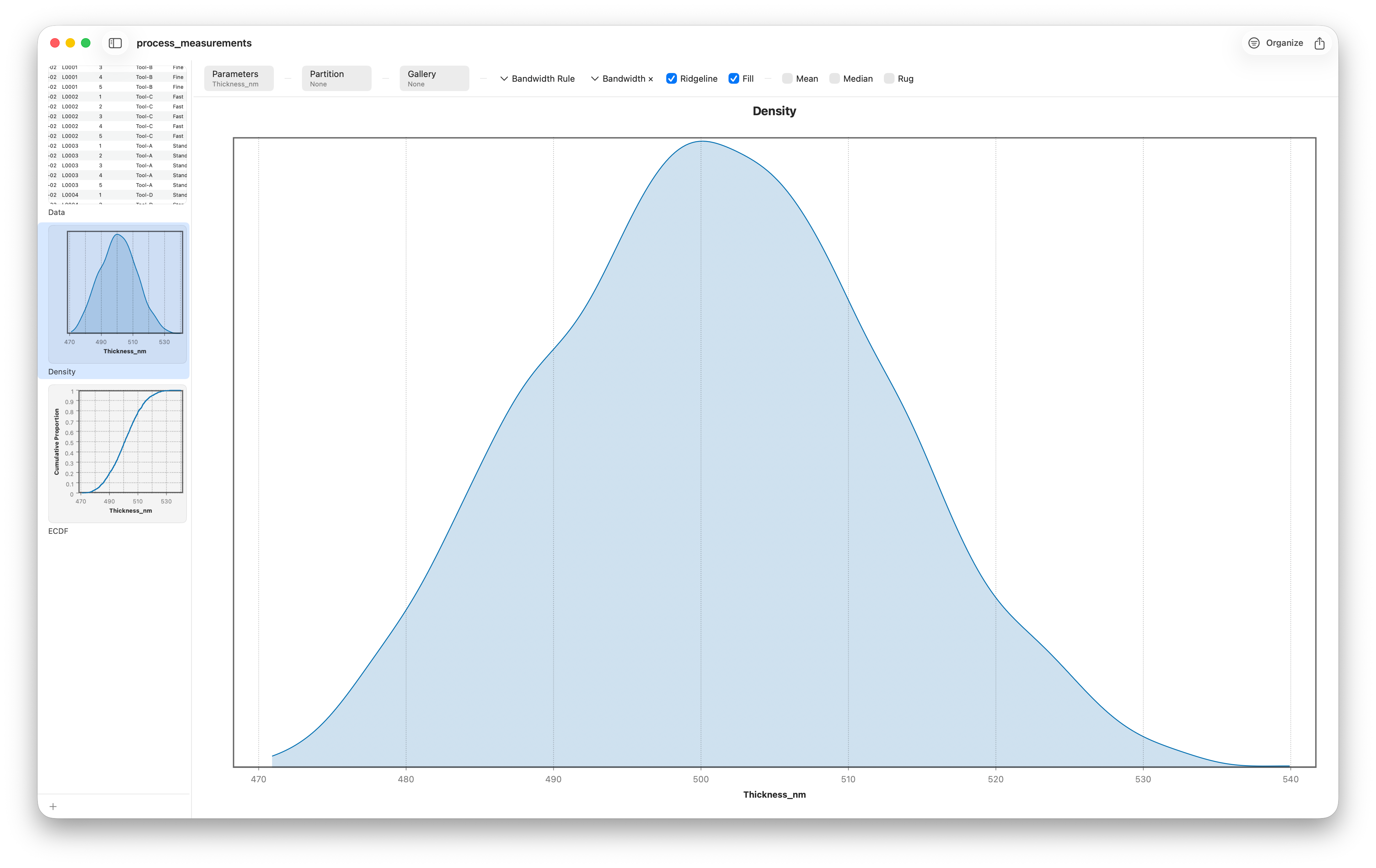
What a kernel density estimate actually does
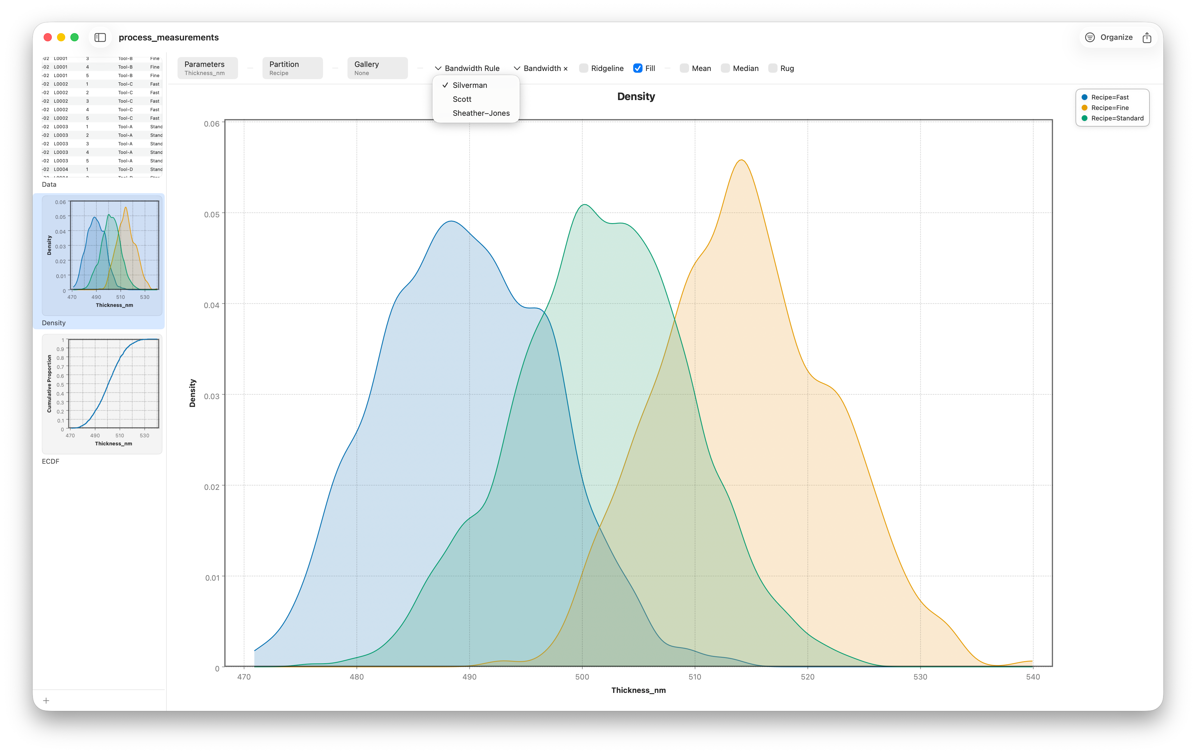
The idea is gentler than the name. For every data point, the KDE drops a tiny smooth bump — a "kernel" — centered on that value. Add all the bumps together and you get a curve that's tall where points crowd together and low where they're sparse. It's a histogram with the jagged edges smoothed away, and unlike a histogram it doesn't depend on arbitrary bin boundaries. Because density curves are translucent and bin-free, you can overlay several recipes on one axis and compare their shapes directly.
Bandwidth: the one knob that matters
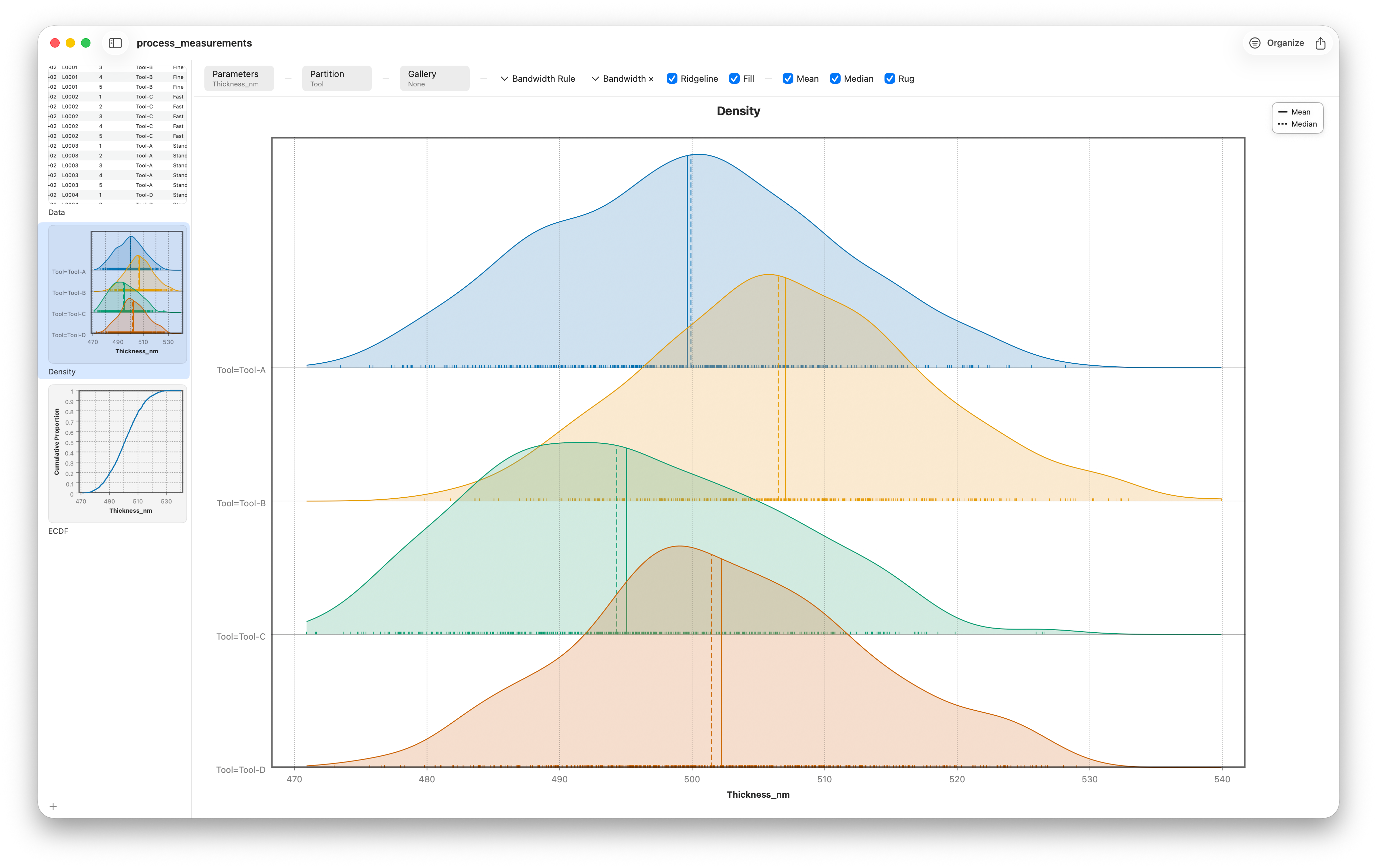
A KDE has a single critical setting: the bandwidth, which controls how wide each bump is. It's the smoothing knob, and it's a real trade-off. Too narrow and the curve turns spiky, inventing peaks out of random noise. Too wide and it washes everything into one bland hump, hiding real structure. Stratum exposes the bandwidth directly so you can feel the trade-off live.
Many groups at once: the ridgeline plot
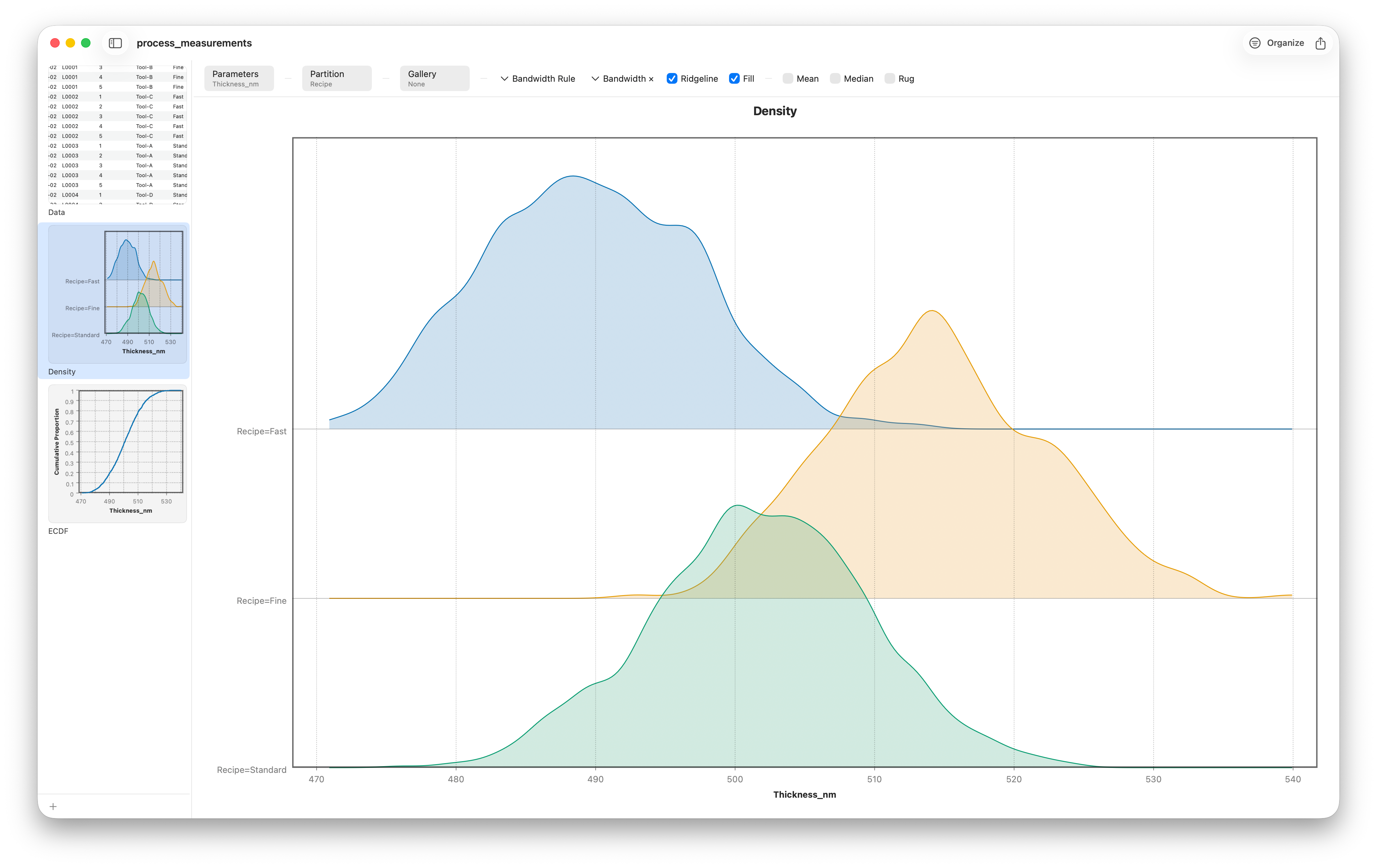
Overlaying three or four densities is fine; overlaying ten is a tangle. The ridgeline plot solves the crowding by giving each group its own row, stacking the density curves vertically with a slight overlap — like a mountain range receding into the distance. It's the most compact honest way to compare the full shapes of many groups, and patterns like a steady upward drift across tools or shifts jump right out.
The ECDF: read any percentile off the curve
Density plots are about shape. When you need exact quantities — medians, percentiles, "what fraction is below the spec limit?" — reach for the empirical cumulative distribution function, or ECDF. It's a rising staircase: at any value x on the horizontal axis, the curve's height tells you the proportion of the data that is less than or equal to x. It starts at 0, climbs to 1, and uses no bins and no smoothing at all — it's the raw data, plotted faithfully.
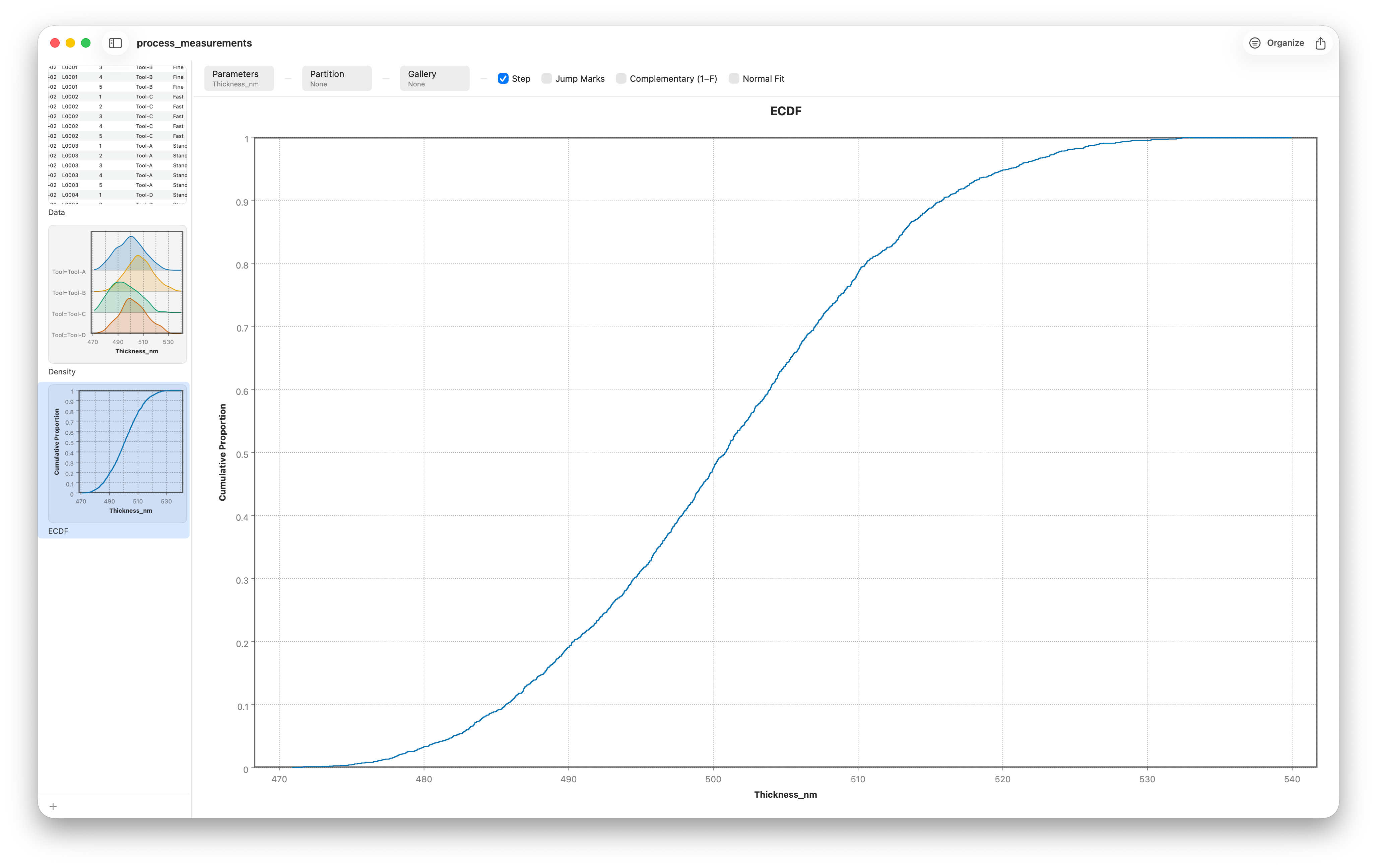
This makes percentiles a matter of reading the graph. To find the median, slide across from 0.5 on the vertical axis until you hit the curve, then drop down to the value. Want the 90th percentile? Cross from 0.9 instead. Going the other way is just as easy: pick a spec limit on the horizontal axis, read up to the curve, and you have the fraction of units that meet it — no binning, no interpolation guesswork.
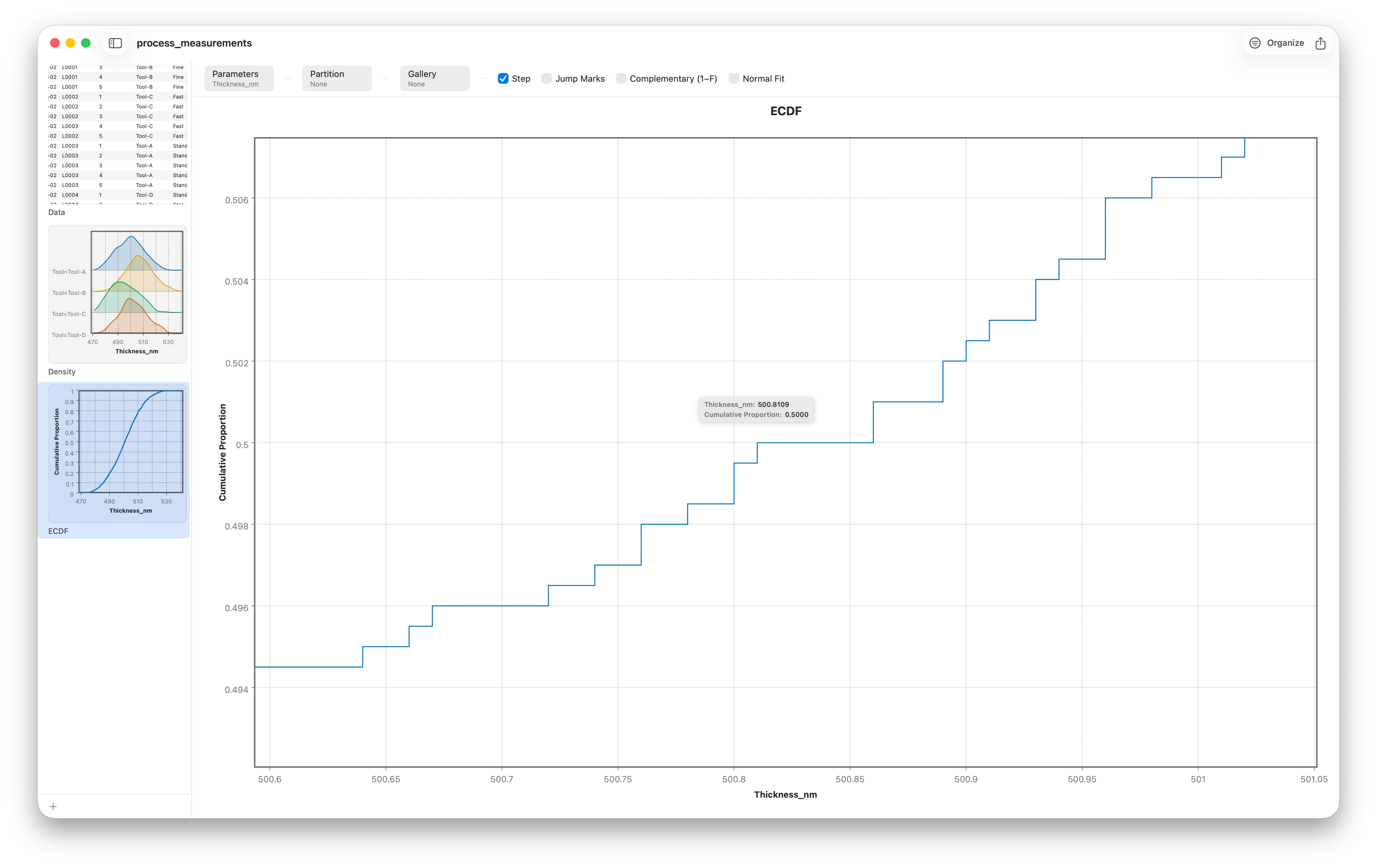
The ECDF is also the cleanest way to compare two groups. Plot both staircases together: if one sits consistently to the right of the other, that group simply has larger values across the board — a shift you can see without any test at all. (It's also the visual heart of the Kolmogorov–Smirnov test we'll meet next lesson.)
Finishing touches
To keep the smoothed curve honest, add a rug — little tick marks along the axis showing where the actual observations fall — and overlay the mean and median so the summary statistics sit right on top of the shape they describe.
Follow along
- Dataset
- process_measurements.csv
- You'll use
- The Density chart with bandwidth control, the Ridgeline variant, the ECDF chart, and a rug with mean/median overlays — thickness and conductivity grouped by recipe or tool
- Up next
- Lesson 8 — Q-Q Plots & Normality
Density and cumulative plots tell you the shape of your data and where its percentiles fall. But a recurring question lurks underneath: is this distribution normal enough for the tests you're about to run? The Q-Q plot answers that directly — next.