 Stratum
Pie, Bar, Treemap & Comparison Charts: Visualize Categorical Data
Numbers have histograms; categories have their own family of charts. When your variable is a label rather than a measurement, you reach for pies, bars, and treemaps to show composition — dot plots and dumbbells to compare values — and, when you want to see how two categories relate, the mosaic plot.
Not every column is a number. Region, Plan, Satisfaction, whether a customer would recommend you — these are categorical variables, and you can't take their mean. What you can do is count them, compare a measure across them, and look for relationships between one category and another. This lesson walks through the chart types Stratum gives you for exactly that: the composition family (pie, bar, treemap), two comparison charts that put a value against each category (the dot plot and the dumbbell), and finally the one most people have never met — the mosaic plot.
Composition: pie and donut charts
The simplest categorical question is what share of the whole is each part? A pie chart answers it by slicing a circle in proportion to each category's count. Point Stratum at the Plan column and you instantly see how the customer base splits between Basic, Pro, and Enterprise.
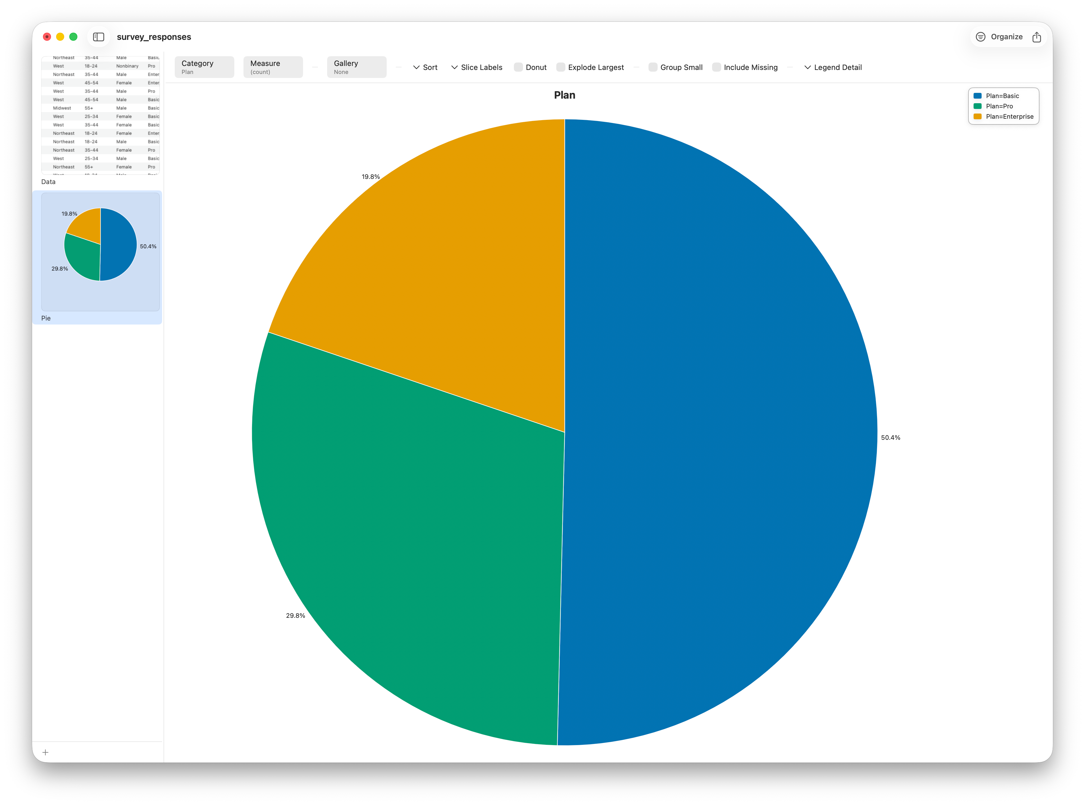
Pies are tempting, but use them with care. The human eye is poor at comparing angles and areas, so a pie works only when you have a few slices of clearly different sizes. With many categories, or several of nearly equal size, the slices blur together and the chart misleads more than it informs. When that happens — and it happens often — switch to a bar chart, where everything sits on a common baseline and your eye compares lengths instead of wedges.
Comparison: grouped and stacked bar charts
Bars are the workhorse — but it's worth knowing exactly what Stratum's bar chart does: it aggregates a number across categories (a sum, mean, count, and so on), rather than counting a category outright. (Counting the levels of a single category is the Pareto chart's job, from the last lesson.) So bars shine when you have a measure to total — which our all-categorical survey doesn't. We'll borrow the retail sales data for a moment, where Revenue is a number we can add up. Sum Revenue by ProductCategory and a grouped bar lays the categories side by side, so you compare them by length.
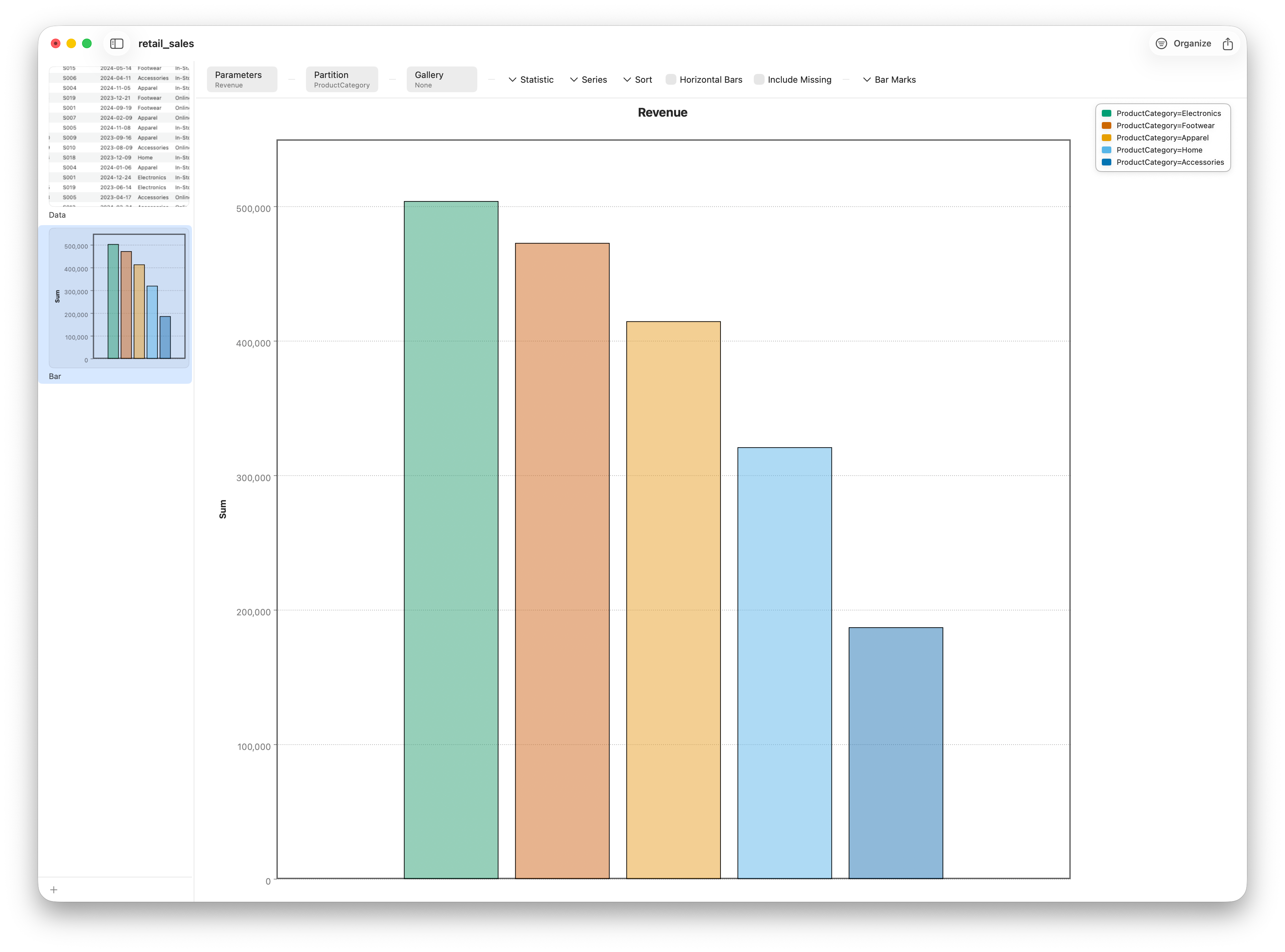
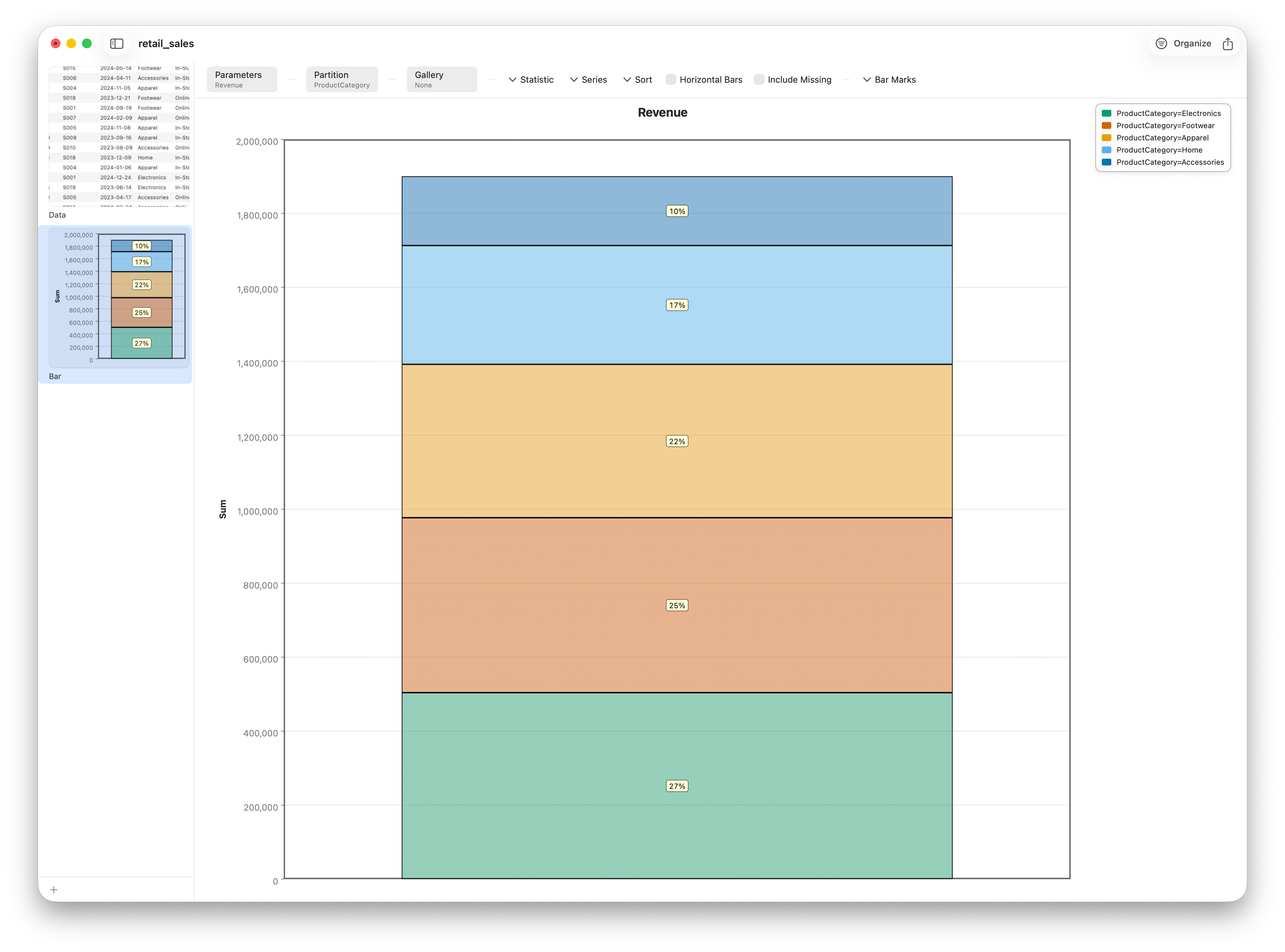
Switch the layout to stacked and the categories pile into a single bar — now the full bar is total revenue and each segment is one category's contribution. Stacking is great for reading the total and its overall makeup; grouping is better for comparing the individual pieces. Switch once more to 100% and every bar is the same height, turning the chart into a pure composition view: each category's share of the top line.
A leaner bar: the dot plot
A bar draws a whole rectangle to encode a single number — its length. The dot plot keeps the length and throws the rest away: it marks each category's value with one dot on a common axis. Same comparison, a fraction of the ink, and when you have many categories it stays readable where a forest of bars turns to clutter. Reach for it from Charts ▸ Dot Plot and set it up exactly like the bar — Parameters = Revenue, Statistic = Sum, Partition = ProductCategory. The dot plot always lays categories out side by side (there's nothing to stack), and sorting them by value turns the chart into an instant ranking.
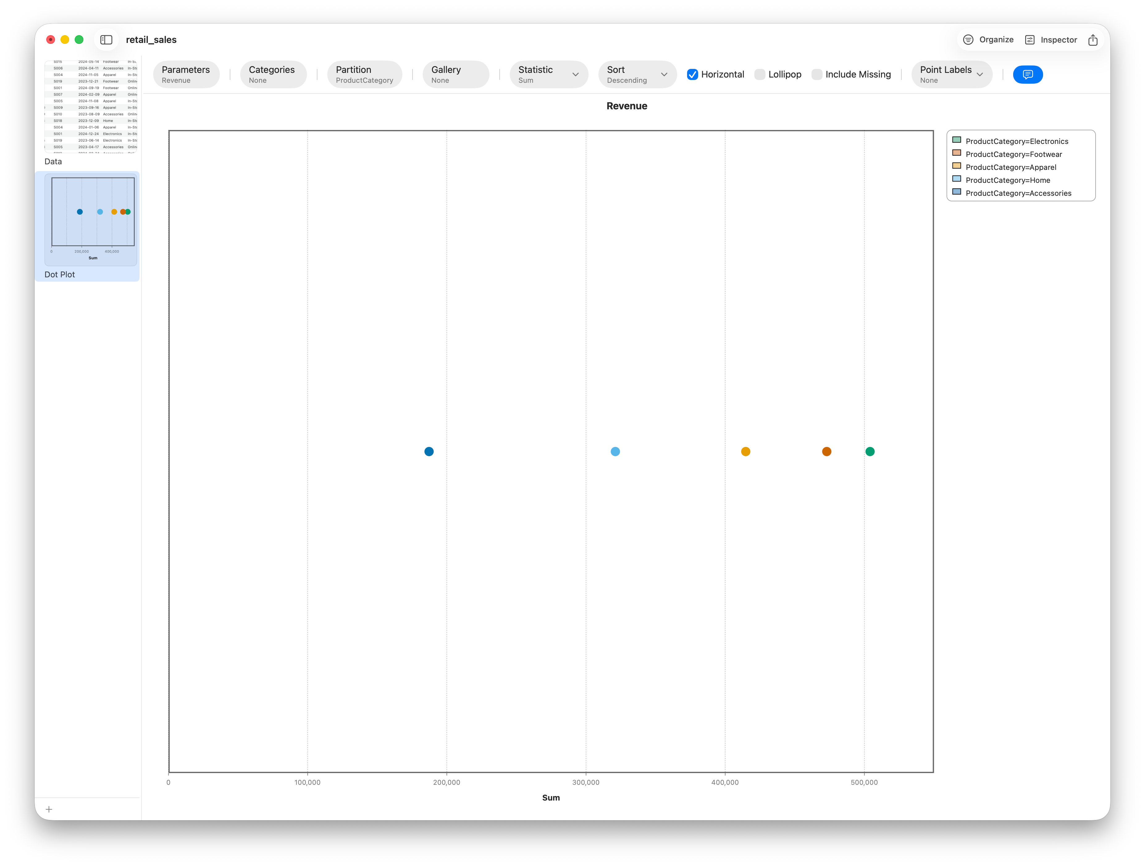
Turn on Point Labels to print each value next to its dot, and the chart reads like a tidy leaderboard. Prefer the classic lollipop look? The dot plot can draw a thin stem from the axis to each dot — a middle ground between the featherweight dot and the heavy bar.
Two numbers per category: the dumbbell
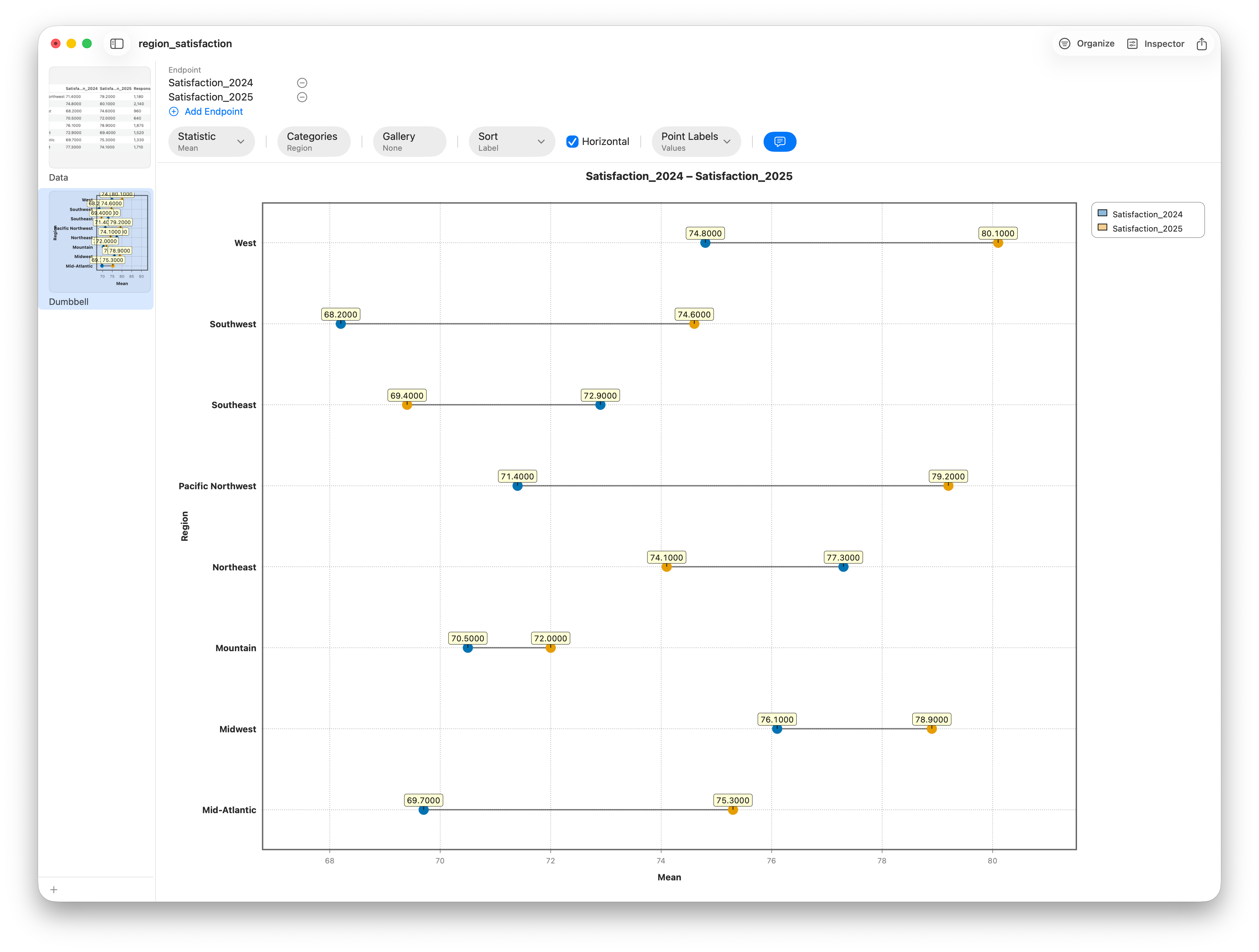
A dot plot puts one value against each category. A dumbbell chart puts two — a dot for each, joined by a connecting bar — so the gap between them becomes the thing you read. It's the natural chart for a before-and-after, a this-year-versus-last, or any two comparable measures per category. Our cross-sectional survey has no such pair, so we'll load a small companion table, region_satisfaction.csv, which records each region's mean satisfaction score for 2024 and for 2025.
Open it, then choose Charts ▸ Dumbbell. Set the Label to Region and add two Endpoints — Satisfaction_2024 and Satisfaction_2025. Each region becomes one horizontal track with two dots; the connector's length is the year-over-year change, and its direction tells you at a glance who improved and who slipped.
Nested composition: the treemap
Back to composition — but with a twist a pie can't manage. A treemap shows parts of a whole as area-proportional rectangles, and it can nest: split the canvas by one category, then split each of those tiles by a second. Where a pie breaks down past a handful of slices, a treemap stays legible with dozens, and it shows hierarchy for free. From Charts ▸ Treemap, set Category to Region and Nest by to Plan: the outer tiles are regions sized by how many respondents they hold, and each region subdivides into its plan mix.
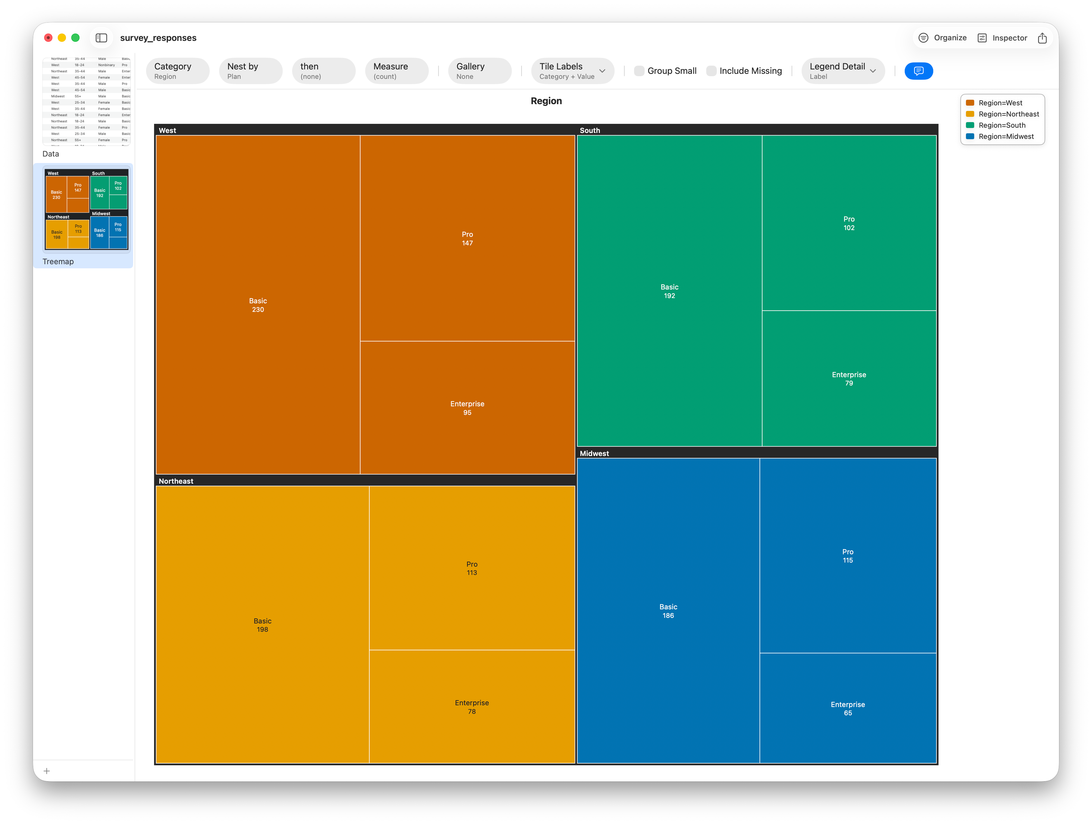
By default tiles are sized by count, which keeps this a pure composition view; point Measure at a numeric column instead and the tiles size by that total — revenue by category and sub-category, say. The treemap is the chart to reach for when "what's the makeup, and the makeup within the makeup?" is the question.
Association: the mosaic plot
Now for the chart built specifically to reveal relationships between two categories. A mosaic plot draws a two-way table as a grid of rectangles, where the area of each tile is proportional to the count of that combination. Cross Plan with Satisfaction and you get a wall of tiles whose widths and heights together tell you, at a glance, which plan–satisfaction pairings are common and which are rare.
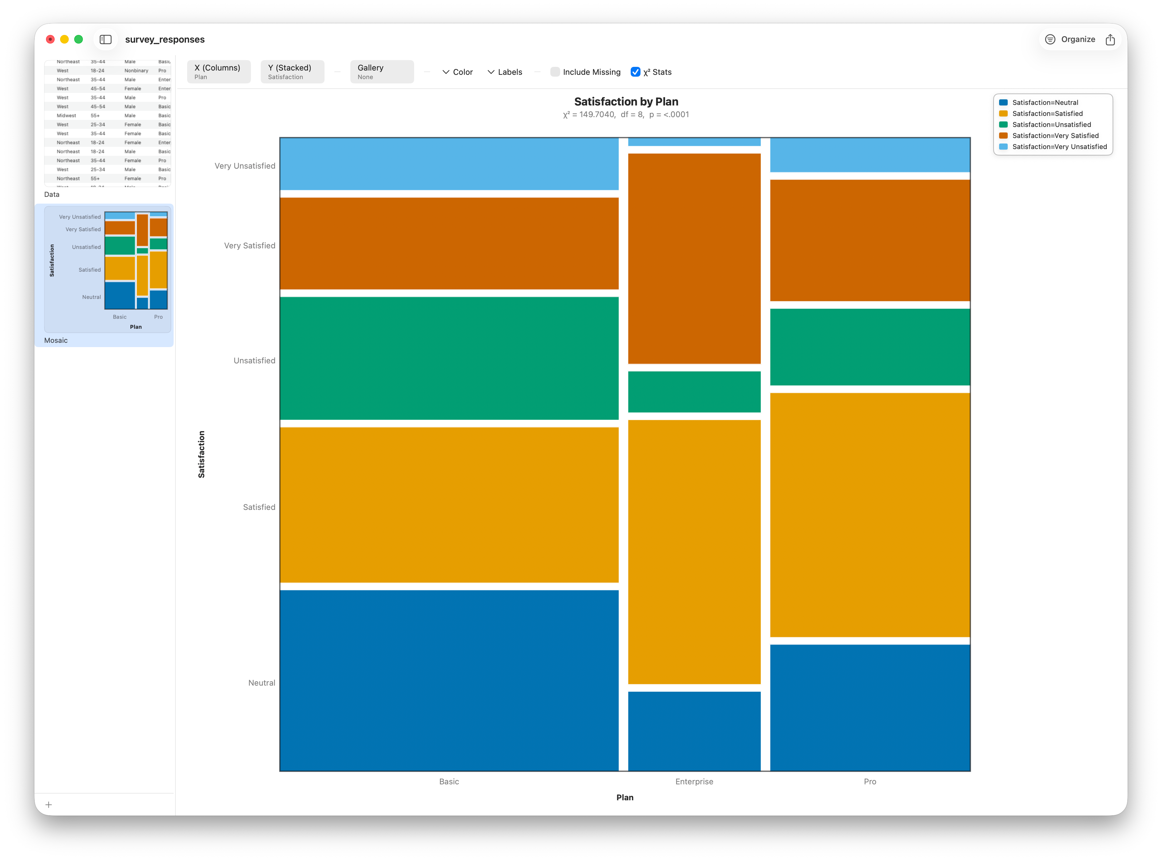
The trick is in how the tiles line up. First the plot splits the width by one variable, then it splits each of those columns by the second. If the two variables were independent — if satisfaction had nothing to do with which plan you're on — every column would split into the same satisfaction proportions, and the horizontal dividers would form clean, continuous lines across the whole chart. When those lines break and the tiles shift, you're literally looking at association.
Shading the surprises
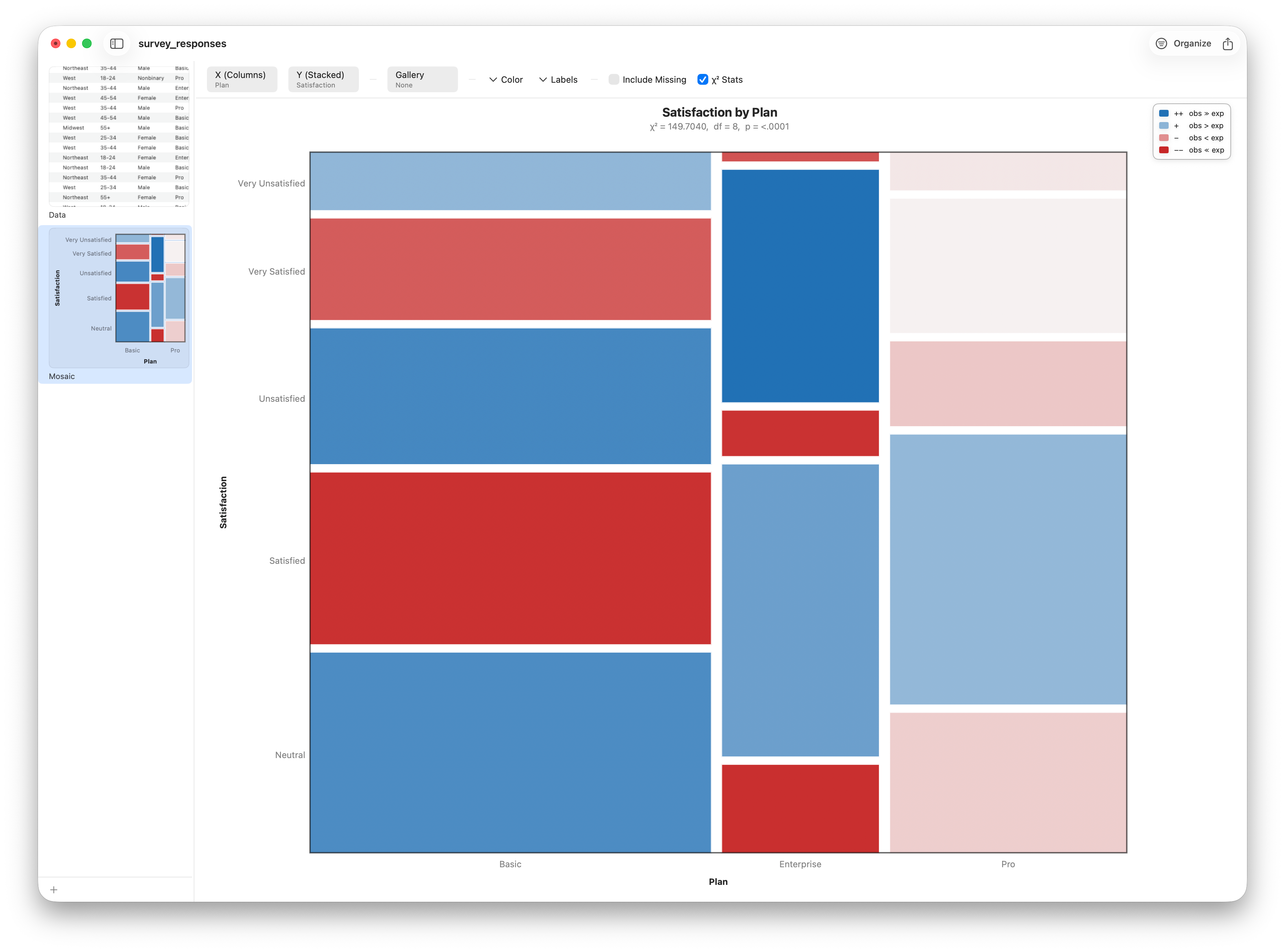
Stratum can take this one step further by shading each tile according to how far its count departs from what independence would predict. This shading is tied to the chi-square residuals: blue where a combination occurs more often than expected, red where it occurs less, with deeper color for bigger surprises. Suddenly the chart isn't just showing counts — it's highlighting exactly which plan–satisfaction pairings drive the relationship.
Follow along
- Datasets
- survey_responses.csv (pie, treemap, mosaic) · retail_sales.csv (bar + dot plot) · region_satisfaction.csv (dumbbell)
- You'll use
- A pie of
Plan, a treemap ofRegionnested byPlan, and a mosaic ofPlan×Satisfactionfrom the survey; a grouped/stacked bar and a dot plot of summedRevenuebyProductCategoryfrom retail; and a dumbbell ofSatisfaction_2024vsSatisfaction_2025byRegion - Up next
- Lesson 11 — Scatter, Trend, Bubble & Contour Charts
Categorical charts answer "how much," "how it's made up," and "how related." Next we cross into numbers-versus-numbers territory, where the scatter plot reigns — and where a single picture can reveal a relationship a whole table of counts never could.