 Stratum
Stratum at Scale: 5 Million Rows on Your Computer
Every lesson so far used datasets you could open in a spreadsheet. For the finale, let's break that ceiling: five million rows of IoT telemetry, opened, filtered, aggregated, and charted — all staying smooth on a laptop.
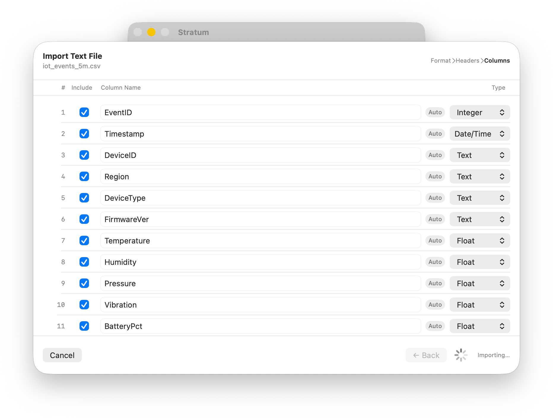
It's one thing to handle a few thousand rows; almost any tool can. The real test of a statistics app is whether it stays responsive when the data is genuinely big — when scrolling, filtering, and charting could each grind to a halt. To close the series we'll load iot_events_5m.csv, about five million rows of device readings, and put Stratum through the same moves you've learned, at a thousand times the scale. Large dataset statistics on your own computer, with no cloud and no notebook.
Why scale is the hard part
Most apps that choke on big data choke for one of two reasons: they try to draw everything at once, or they copy the whole dataset every time you do anything. Render five million table rows as five million views and you'll exhaust memory before the window even appears. Re-copy five million rows for every filter and each click costs seconds. Staying fast at scale is mostly about not doing those two things — and that's exactly what Stratum is built around.
A grid that only draws what you can see
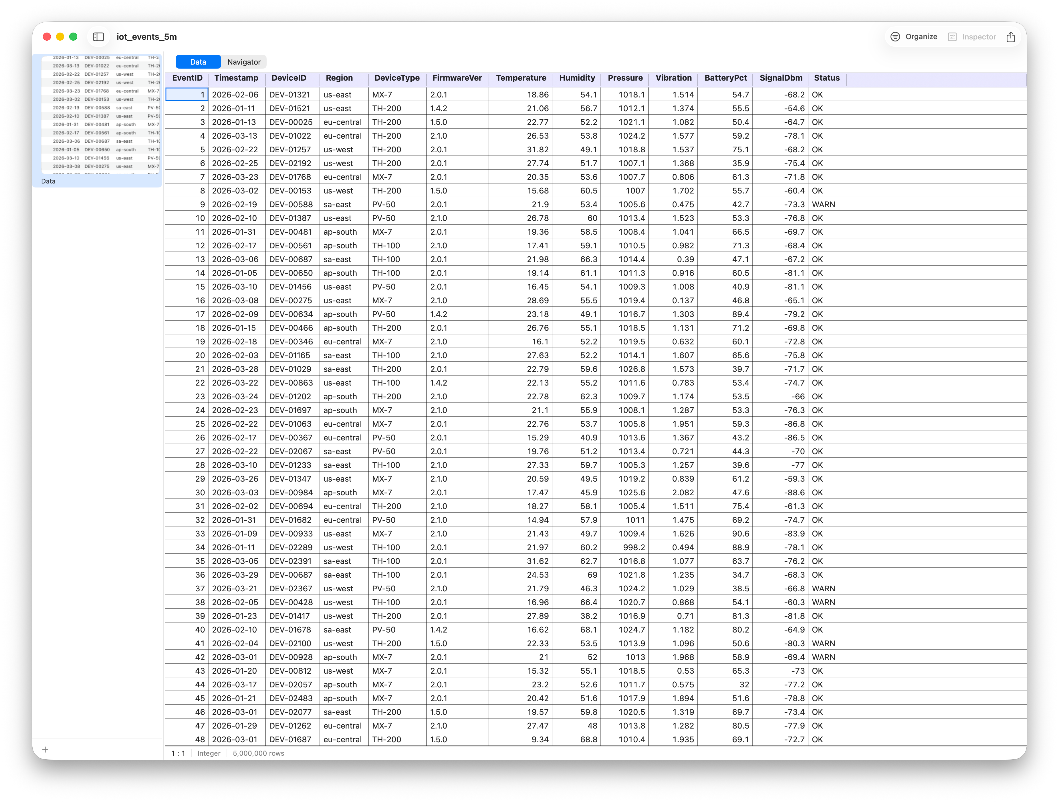
Stratum's data grid is a native table, and it's virtualized: it only ever builds the handful of rows actually visible in the window, recycling them as you scroll. Whether the dataset has five thousand rows or five million, the grid renders the same tiny number at any instant — so scrolling stays buttery no matter how far down you go.
Filtering without copying the data
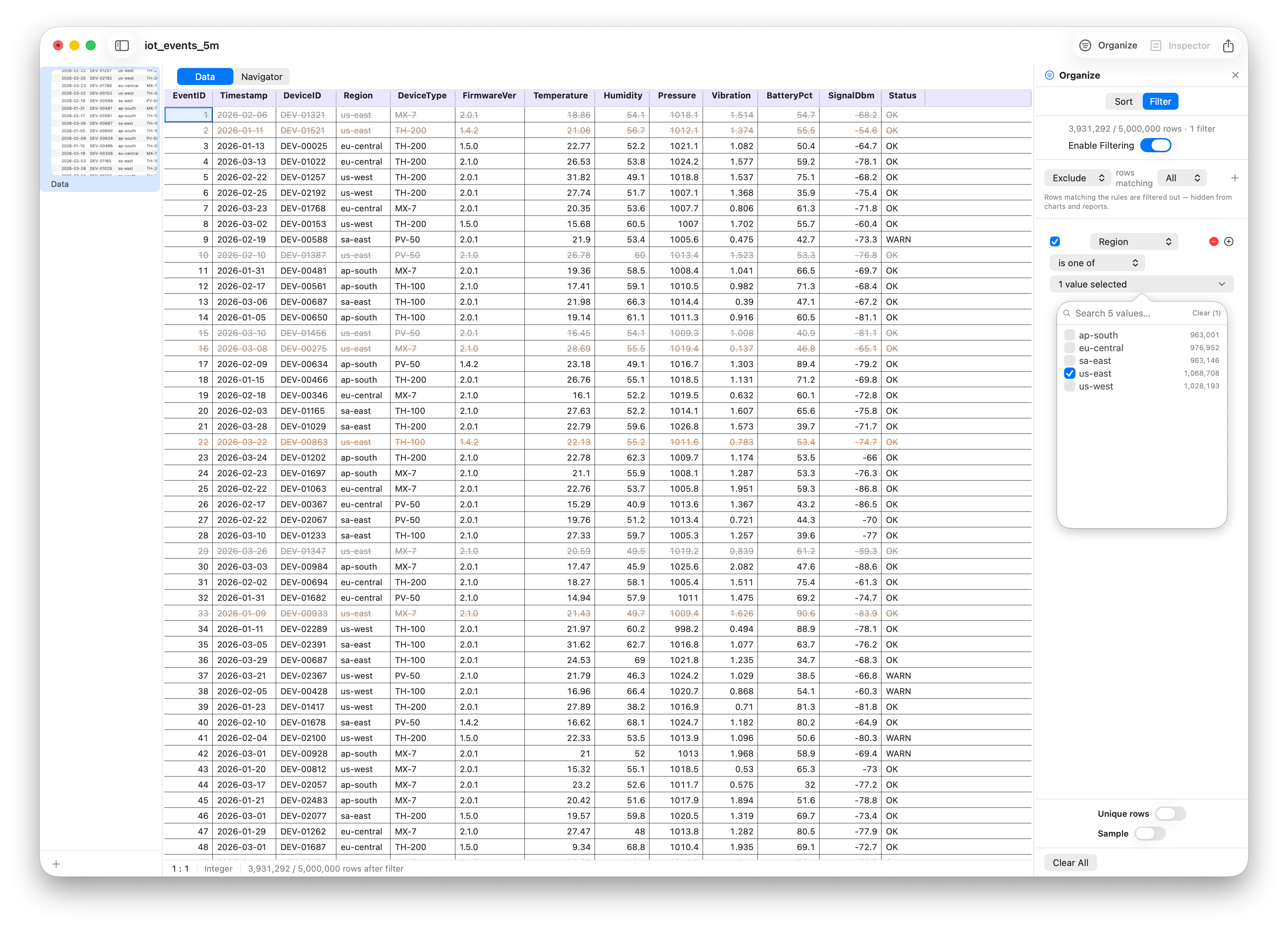
Filtering five million rows sounds expensive, but Stratum keeps it cheap by being lazy. Instead of building a brand-new filtered dataset, it computes a list of which row indices pass and works through that — the underlying columns are never duplicated. Add a condition on device region or status and the grid, every stat, and every chart update against the filtered view almost instantly.
Aggregation at scale
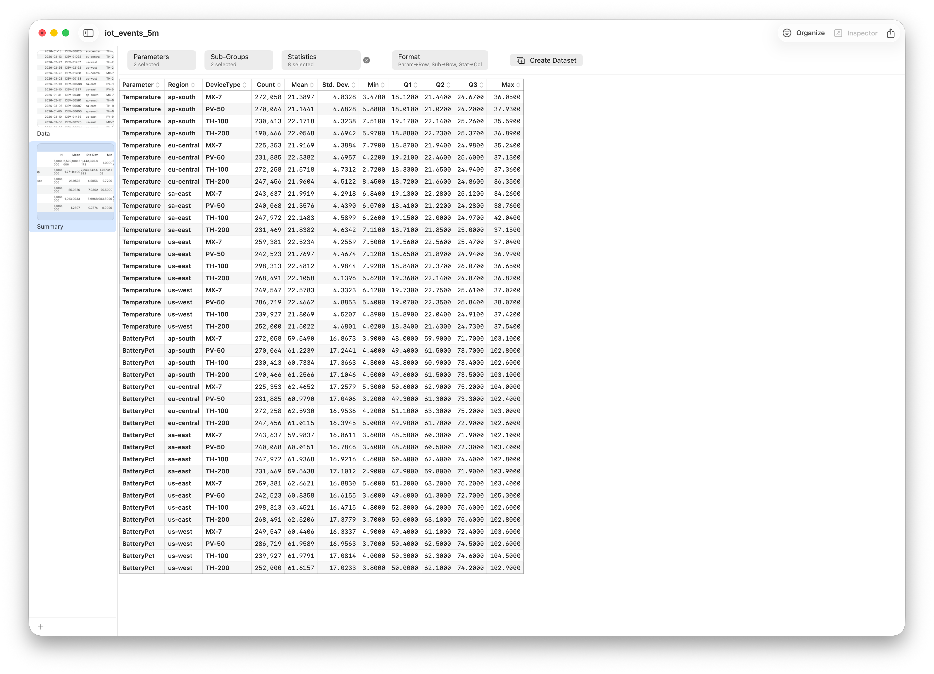
The same lazy approach powers group-by. Summarize average temperature and battery level by region and device type across all five million rows, and Stratum streams through the data once to build the summary rather than materializing intermediate copies. A question that would lock up a spreadsheet returns a tidy table in a heartbeat.
Charting millions of points
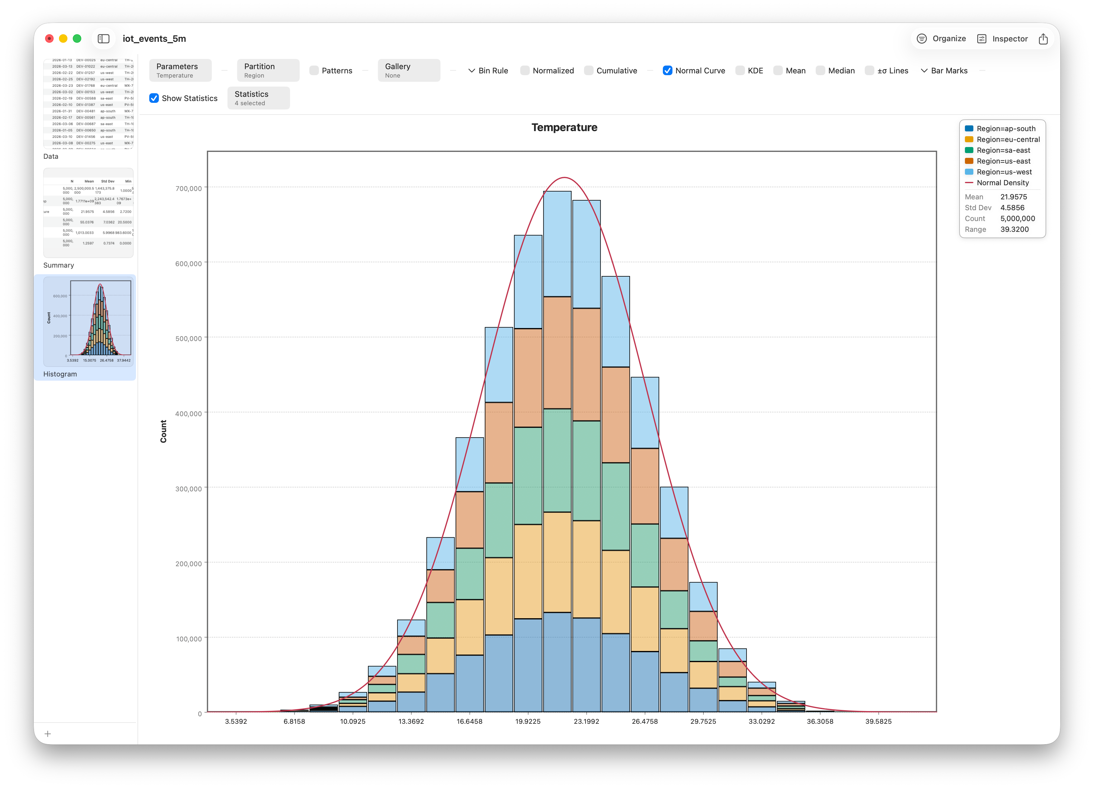
You can't honestly draw five million individual marks — and you don't need to. Stratum bins and samples behind the scenes so a histogram or trend line faithfully represents the whole dataset without plotting every single point. The picture you see reflects all five million readings; the rendering cost stays bounded.
Comfortable at any size — including the interface
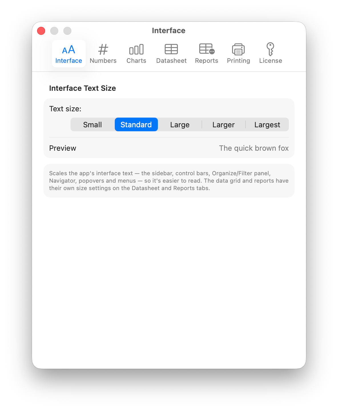
Scale isn't only about rows. Stratum's whole interface honors a text-size preference, so you can scale the chrome up for a big display or a long session without touching your data-grid or report fonts. It's a small thing that makes living in a large dataset all day far more comfortable.
The whole journey, in one app
And that brings the series full circle. Across twenty-five lessons you've taken data the whole distance: you imported it from CSV and Excel, wrangled it with formulas and reshaping, explored it with histograms, box plots, and scatterplots, tested it with t-tests, ANOVA, and correlation, modeled it with regression, decision trees, and ensembles — and now you've done it all at scale. Every step happened in one native, offline app, with the entire project — data, filters, charts, and analyses — saved together in a single .stratum file you own outright. No subscriptions, no uploads, no notebooks to babysit. Thanks for following along — now go open your own data.
Follow along
- Dataset
- iot_events_5m.csv — generate it with
gen_iot_5m.py(see the datasets README) - You'll use
- Import, the virtualized data grid, lazy filtering and group-by, charts on millions of points, and interface text scaling in Preferences
- That's a wrap
- You've finished the series — every lesson is on the blog index
That's the end of the tutorial series. From a first import to five million rows, it's all the same app, all on your own computer, all yours. Browse back through any lesson whenever you need a refresher.