 Stratum
How to Make a Scatter Plot on Mac & Windows
A scatter plot is how you see the relationship between two numbers — whether they move together, how tightly, and which points break the pattern. Here's how to make and read one on Mac & Windows.
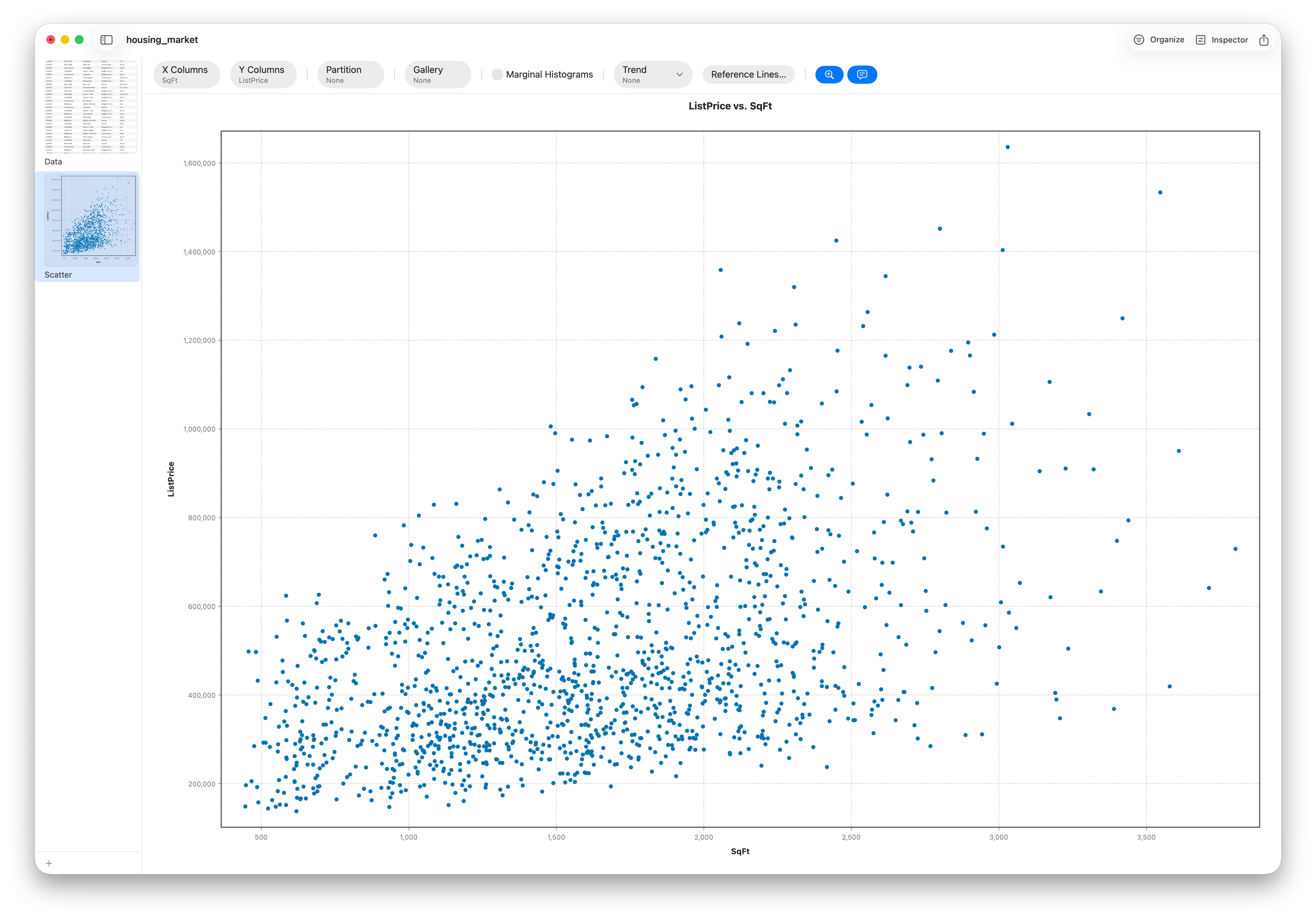
A scatter plot puts one numeric variable on the X axis and another on the Y, with a dot per observation. It's the first thing to reach for when you ask “do these two things move together?”
Make it
- Open your dataset and choose the Scatter chart.
- Pick the X and Y numeric variables.
- Optionally color the points by a category, or size them by a third variable (a bubble chart).
Add a line of best fit
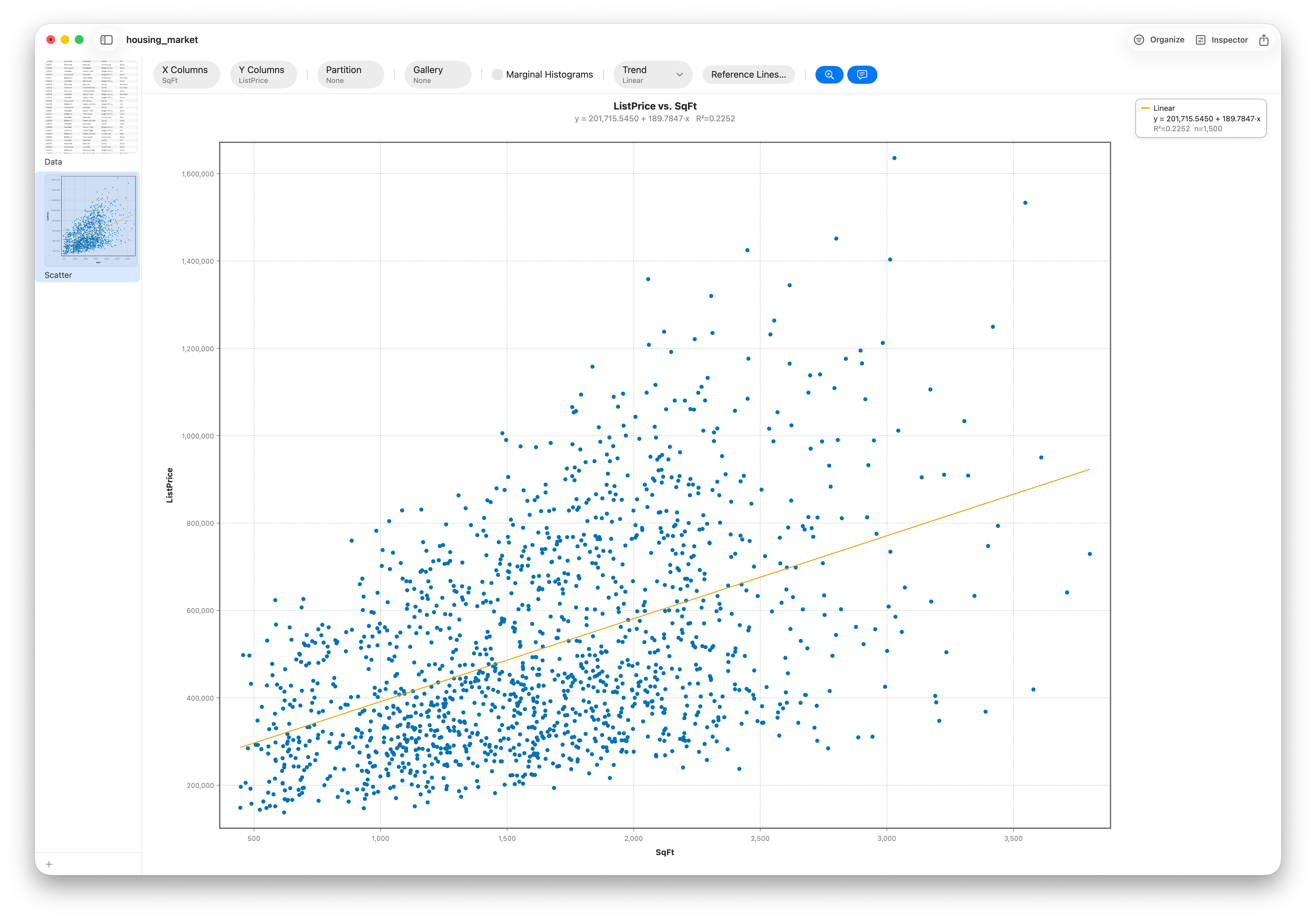
Turn on a trend line to summarize the relationship: a straight ordinary-least-squares fit for a linear trend, or a flexible LOESS curve when the pattern bends. The line makes the direction and strength obvious and is the top thing people add to a scatter plot.
Describe it: direction, form, strength, outliers
Four things describe any scatter plot:
- Direction — do the points rise (positive) or fall (negative) left to right?
- Form — is the pattern straight (linear) or curved?
- Strength — tight to the line, or a loose cloud?
- Outliers — points that break the pattern. Click one and Stratum reveals that row in the grid.
For the full walk-through, see Lesson 11.
Frequently asked questions
How do I add a line of best fit to a scatter plot?
Switch on the trend line. Choose an ordinary-least-squares line for a straight relationship, or a LOESS curve when the pattern bends. It summarizes the direction and strength at a glance.
What are the four things to describe a scatter plot?
Direction (positive or negative), form (linear or curved), strength (tight or loose), and outliers (points that break the pattern).
How can you tell if a scatter plot shows positive or negative correlation?
If the cloud of points rises from left to right, the correlation is positive; if it falls, it's negative; if there's no slope, there's little or no linear correlation.
Can a scatter plot be used for categorical data?
No — a scatter plot needs two numeric variables. For categories, use a bar chart, mosaic, or box plot by group instead.