 Stratum
Scatter Plots, Trend Lines, Bubble & Contour Charts: See Relationships
A histogram shows one variable. But the most interesting questions are about two — does price rise with size? The scatter plot is how you find out, and it's the single most important chart in all of data analysis. When the cloud gets crowded, the contour plot turns it into a map.
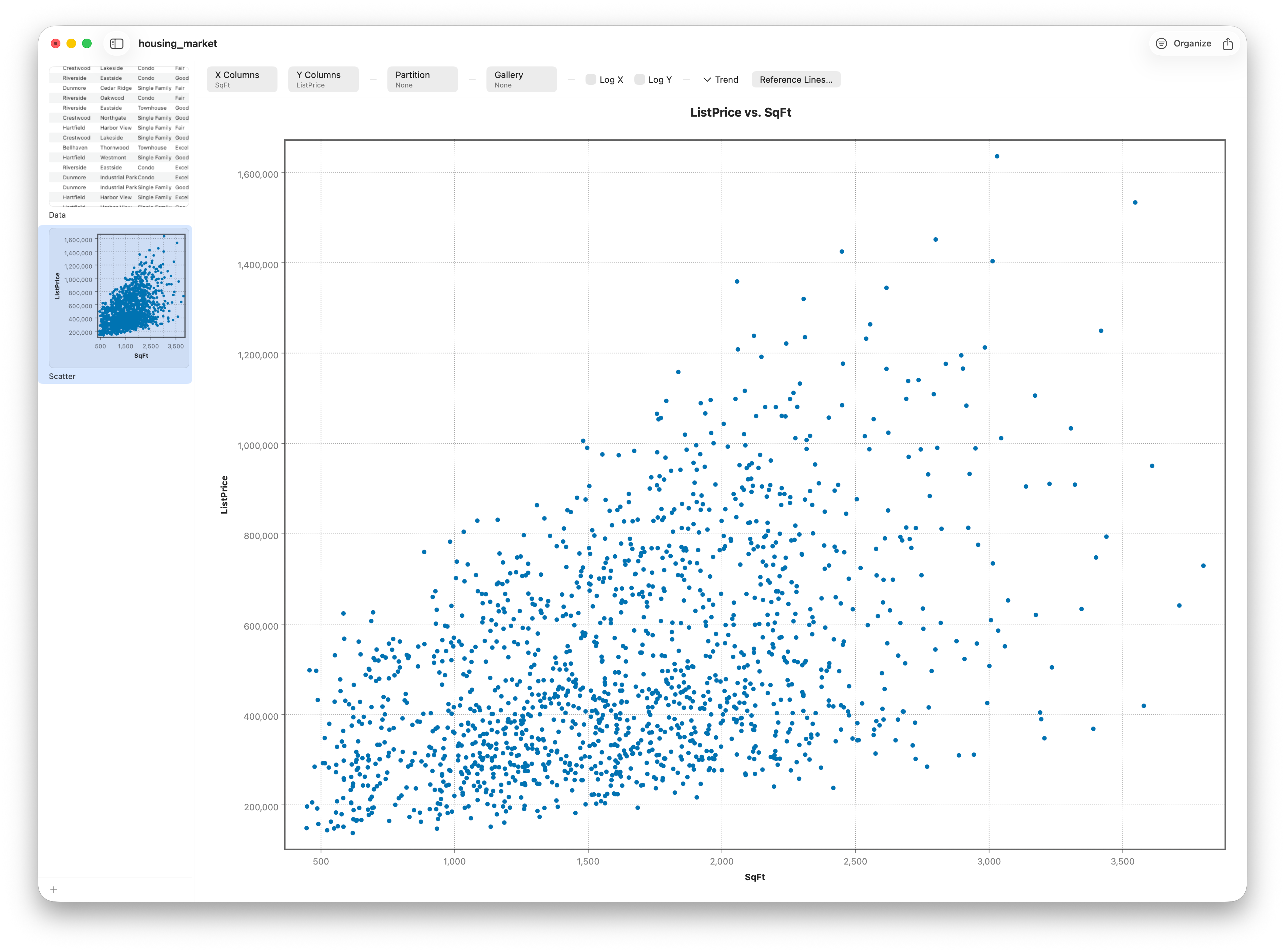
So far every chart we've drawn has examined one variable at a time. Real questions usually involve relationships: when this goes up, does that go up too? The scatter plot answers it directly. Give it an X column and a Y column — say square footage across and list price up — and it drops one point per row at that pair of coordinates. The cloud of points is the relationship.
Reading a scatter plot
You read three things from the cloud. First, direction: does it tilt up (positive), down (negative), or neither? Square footage and price tilt up — bigger homes cost more, no surprise. Second, form: is the trend a straight line, a curve, or no clear shape at all? Third, strength: do the points hug a tight band, or scatter loosely? A tight band means knowing x tells you a lot about y; a diffuse cloud means it barely helps. Here the points track only moderately — a loose upward band, not a tight one (correlation will put it near 0.48). That sense of "how tightly do they track" is exactly what correlation will measure in the next lesson.
Adding a trend line
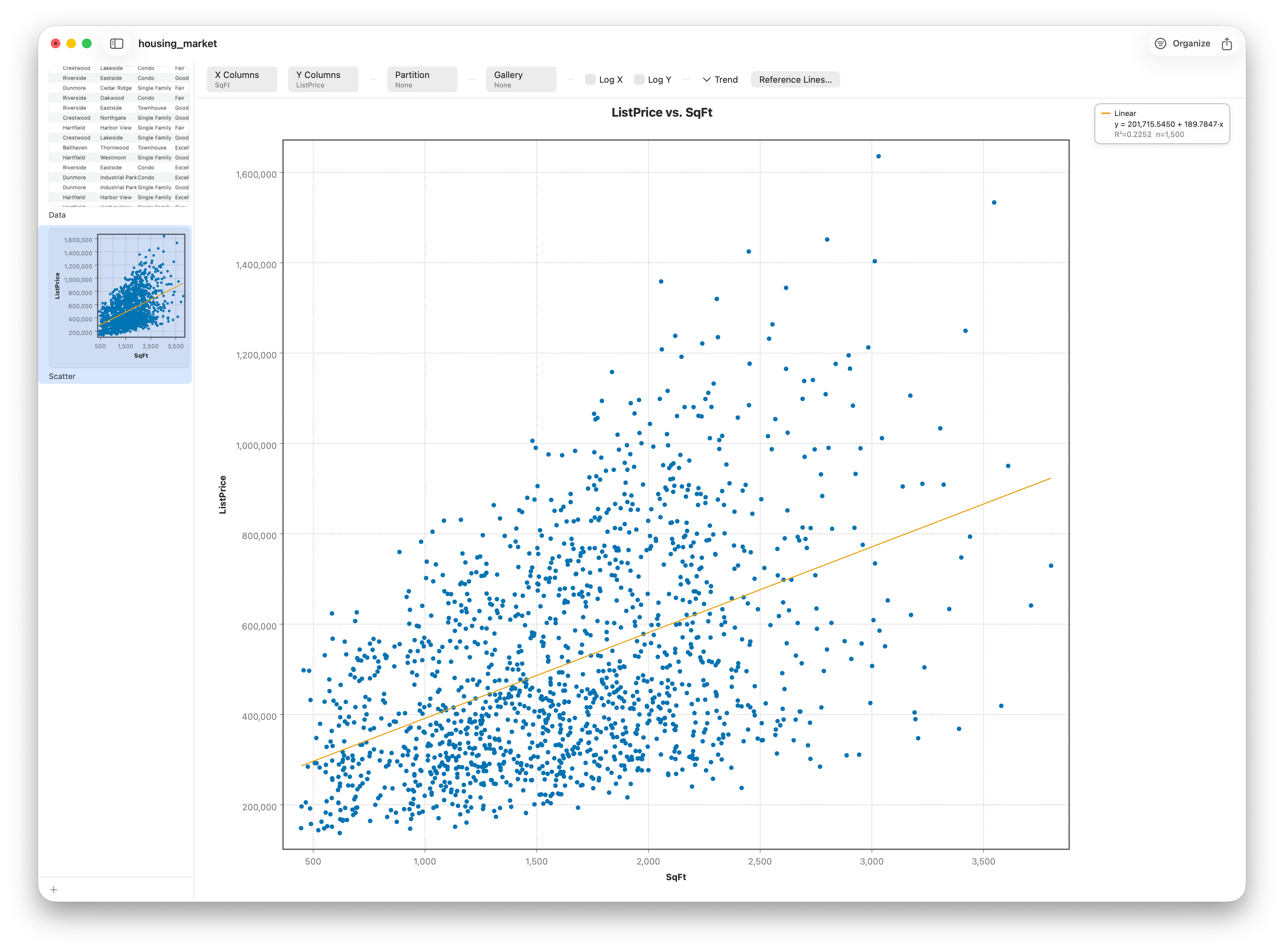
Your eye can see the drift, but a fitted line makes it precise. The classic choice is Trend ▸ Linear — an ordinary-least-squares fit — which lays down the single straight line that comes closest to all the points, minimizing the total squared vertical distance. It's the line you'd draw if you assumed the relationship were fundamentally straight.
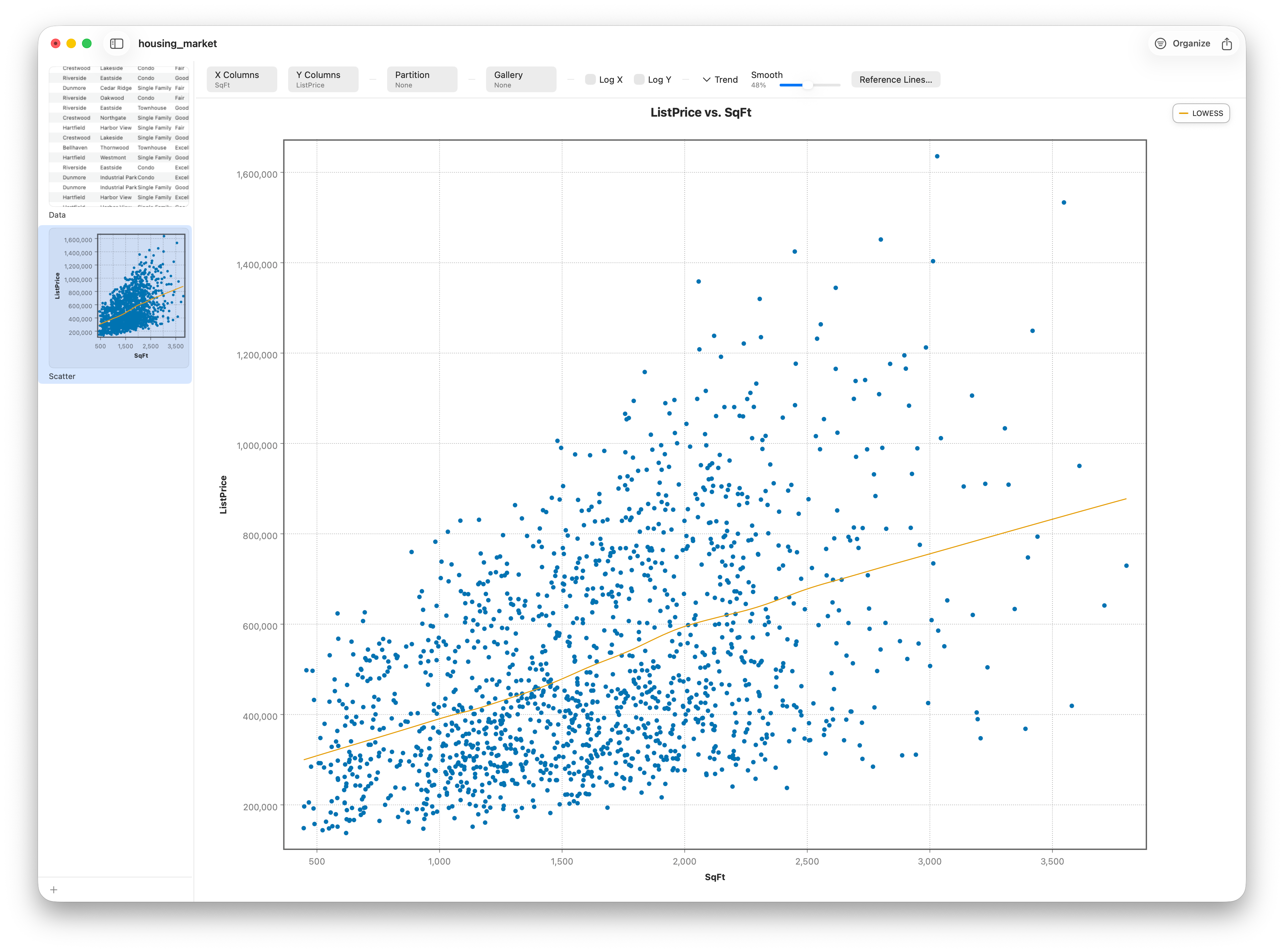
But relationships aren't always straight. Trend ▸ LOWESS takes a different approach: instead of forcing one global line, it fits many tiny local lines and stitches them into a smooth, flexible curve that follows whatever shape the data actually has — and the Smooth slider controls how flexible. Where the linear fit commits to a story in advance, LOWESS lets the data speak. Comparing the two is genuinely informative — if the LOWESS curve bends away from the straight line, your relationship has curvature the straight line is hiding.
A third dimension: color
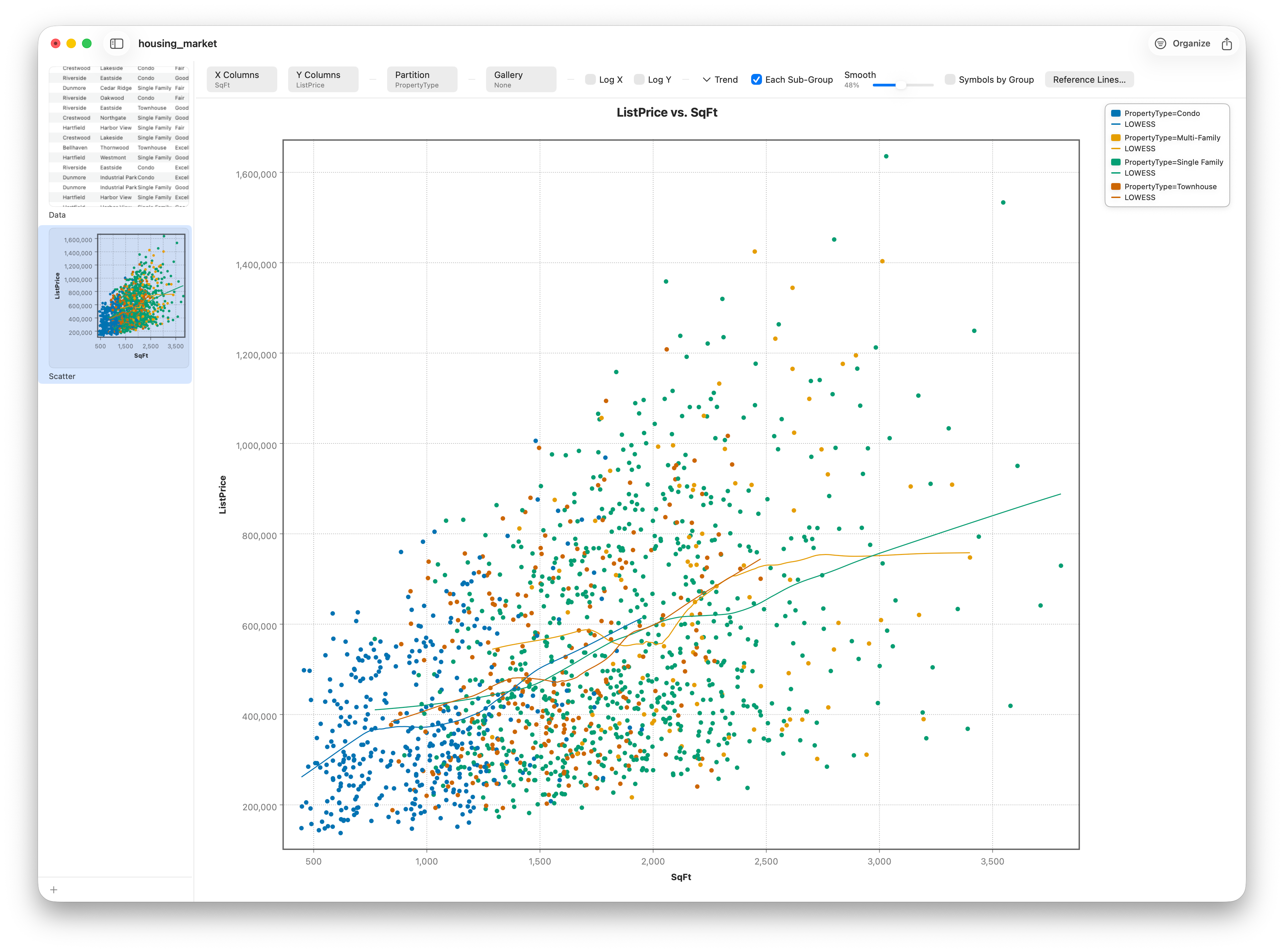
A flat scatter shows two variables, but you're rarely limited to two. Set Partition to a category — here PropertyType — and a third variable joins the picture, coloring the points by group. Now you can see whether condos, townhouses, and detached homes occupy different regions of the size-price plane. Turn on Each Sub-Group and Stratum fits a separate trend line per group, so you can compare how the relationship differs from one type to the next.
A fourth dimension: size
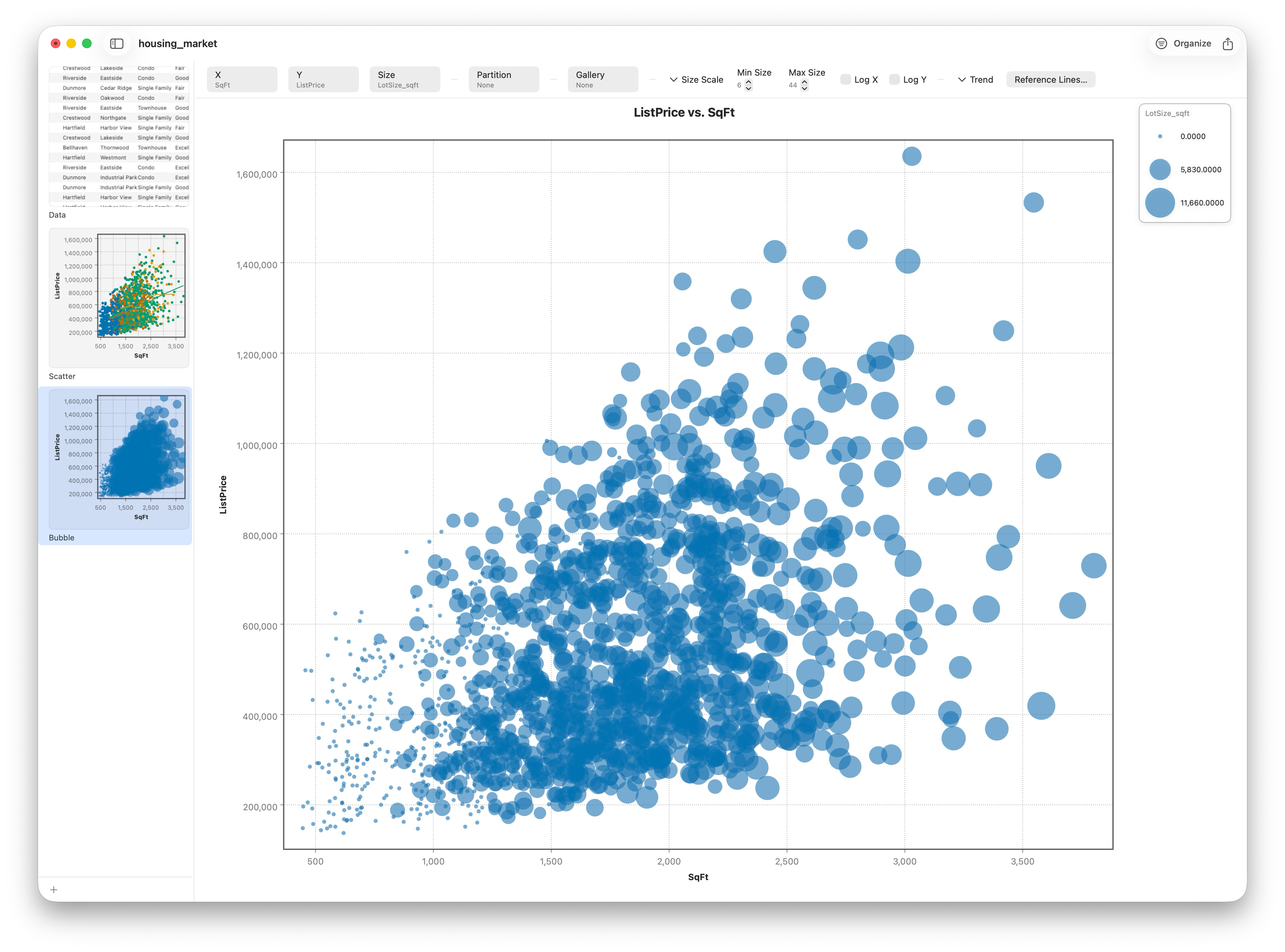
Push further and you can map a fourth variable onto the size of each point. That's a bubble chart. Scale the points by lot size and bigger lots literally become bigger bubbles, layering a fourth measurement onto the same plot without adding an axis.
When the cloud is crowded: the contour plot
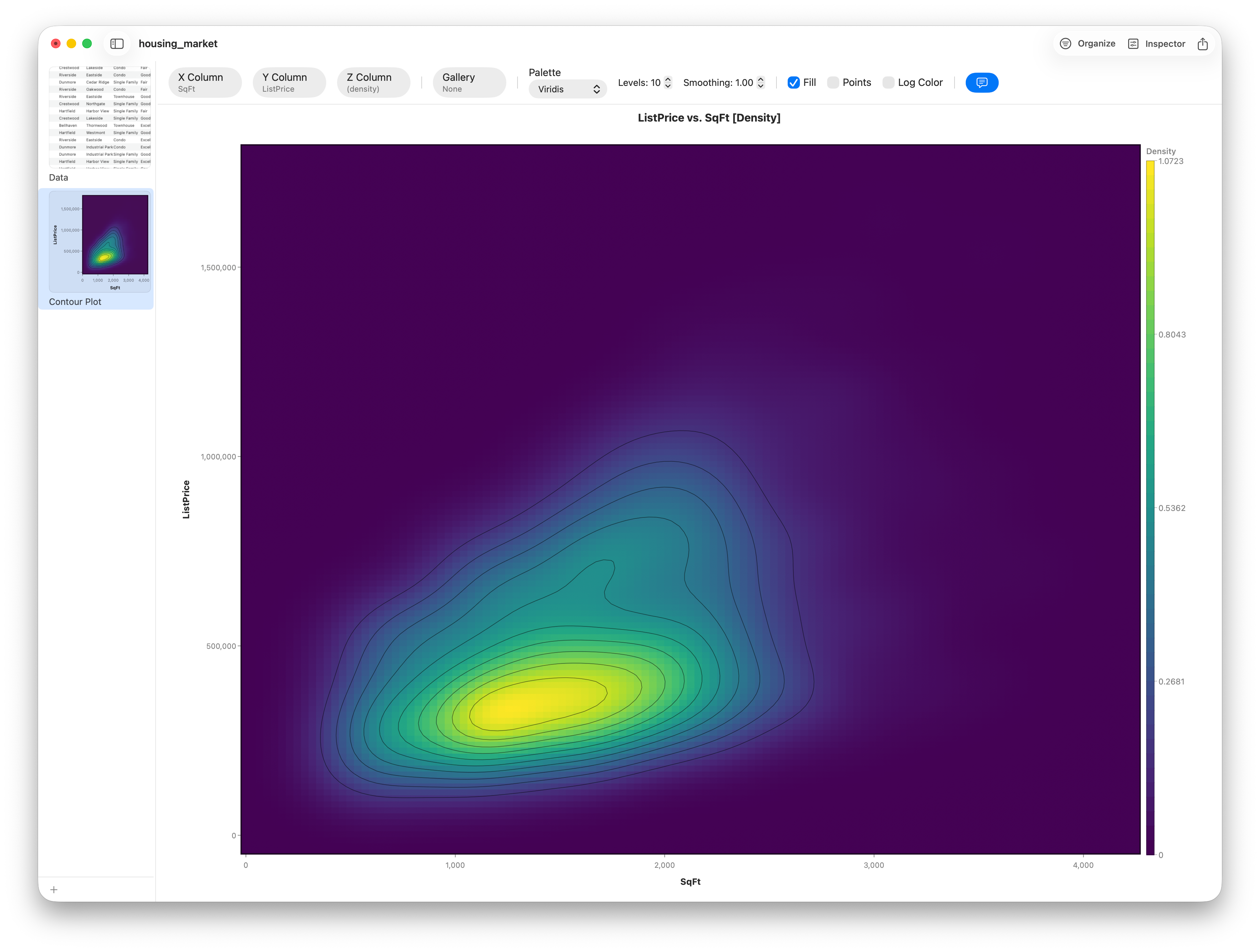
A scatter plot draws every point — which is its great strength until there are too many of them. Pile enough homes onto the size-price plane and the dots overprint into a solid smear; you can no longer tell where the crowd actually concentrates. The contour plot fixes that by trading individual points for density. It estimates how thickly points are packed across the plane and draws iso-density lines — exactly like the contour lines on a topographic map, where each ring joins ground of equal height. The rings bunch tightly around the peaks, where listings concentrate, and spread out where the data thins.
Open it from Charts ▸ Contour Plot and set X Column to SqFt and Y Column to ListPrice — the same two axes as the scatter. With no Z Column chosen, the plot maps the count of listings, so you're reading pure density: where is the typical home in this market? The Smoothing stepper controls how much the field is blurred (more smoothing, rounder hills), and Levels sets how many contour bands to draw.
Give it a Z Column and the contour stops counting points and starts mapping that third variable's average across the plane — set Z to PricePerSqFt and the map shades by price-per-square-foot, so you can see which size-and-price neighborhoods carry the premium. Toggle Fill for solid color bands or leave it off for clean lines, and flip on Points to overlay the raw scatter and confirm the field is tracking the data. This is the smooth, continuous twin of the heatmap's discrete bins — the same idea told with curves instead of tiles.
Follow along
- Dataset
- housing_market.csv
- You'll use
SqFtvsListPrice, Partition byPropertyType, size byLotSize_sqft, Trend ▸ Linear and LOWESS fits, plus a Contour Plot of the same two axes (density, then Z =PricePerSqFt)- Up next
- Lesson 12 — Correlation Analysis
A scatter plot lets you see how tightly two variables track; a contour plot lets you see where they crowd. The next lesson puts a number on the tracking — and then, instead of one pair at a time, measures every pairwise relationship in your data at once.