 Stratum
Q-Q Plots & Normality Tests: Is Your Data Normal?
Half the tests in statistics assume your data is roughly normal. The Q-Q plot turns that assumption into a picture you can check in seconds — and Stratum backs it up with formal normality tests so you don't have to rely on eyeballing alone.
You've probably noticed how often the normal distribution shows up. The t-test, ANOVA, and ordinary regression all lean on the assumption that your data — or your residuals — follow a bell curve, at least approximately. So before you trust any of those results, it pays to ask: is this distribution actually normal? The Q-Q plot is the single best tool for answering that question by eye.
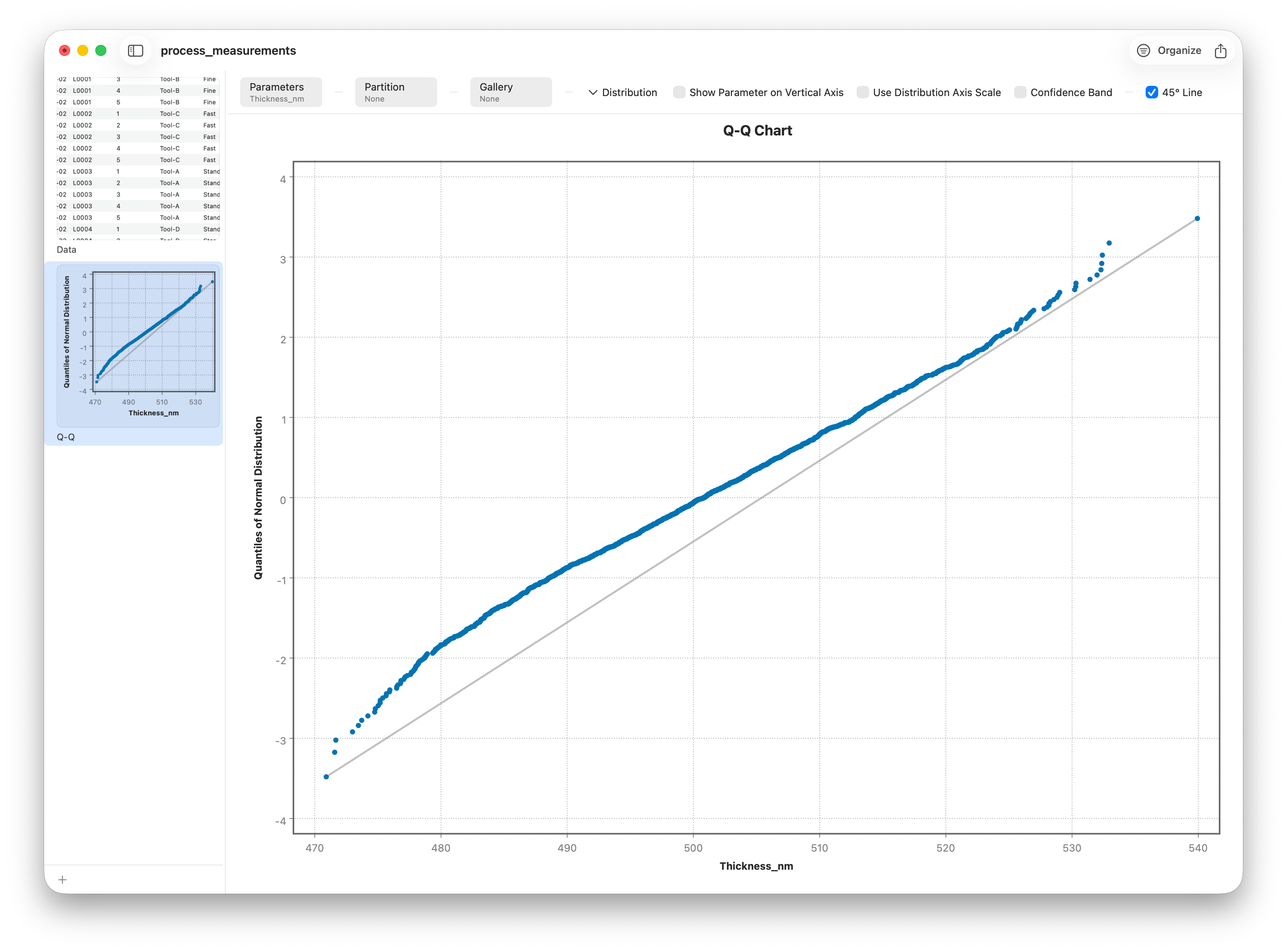
What a Q-Q plot compares
Q-Q stands for quantile-quantile. The plot sorts your data and asks, for each point: "if this data really were normal, where would this value land?" That predicted position is the theoretical quantile, and it goes on the horizontal axis. Your actual sorted value goes on the vertical axis. Plot all the pairs and one rule does all the work:
- If the points fall along a straight line, your data matches the reference distribution — it's normal.
- If they curve away from the line, they don't — and the way they curve tells you exactly how.
Stratum places the points using Filliben's plotting positions, a well-behaved choice for estimating where each ordered value "should" sit. The diagonal reference line is fitted to the data, so a perfect match is a perfectly straight diagonal.
Reading the departures
The beauty of a Q-Q plot is that non-normality has a signature. Swap to a skewed variable and the straight line bends into a recognizable shape.
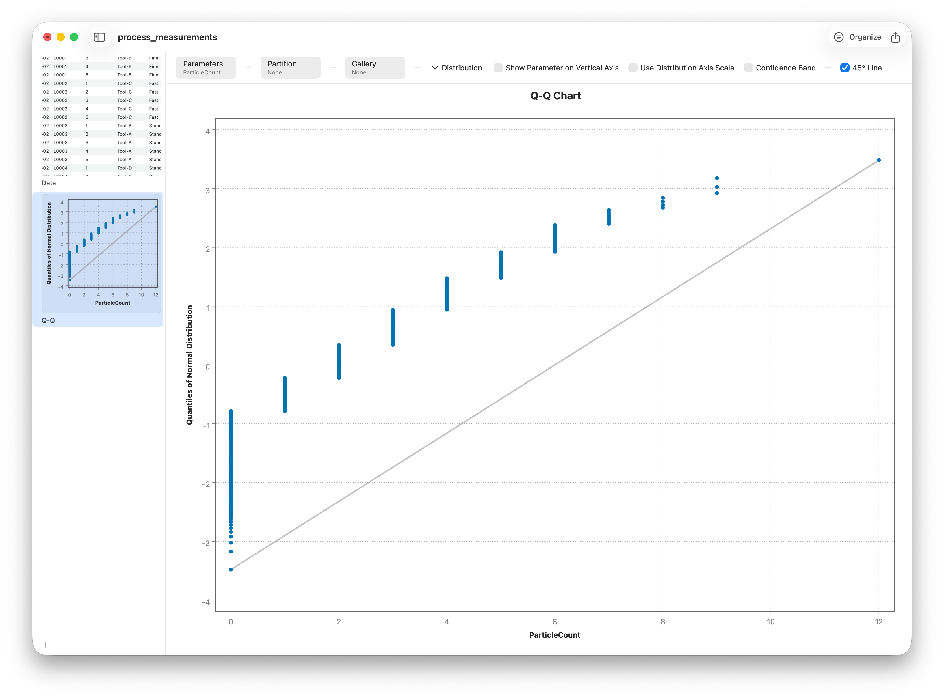
Learn these three signatures and you can diagnose almost any Q-Q plot:
- A curve (like a bend or arc) means skew — the data leans heavier on one side than a bell curve would.
- An S-shape means the tails are off: an S that steepens at both ends signals heavy tails (more extreme values than normal); the opposite signals light tails.
- Points stranded far above or below the line at the ends are outliers, the same ones a box plot would flag.
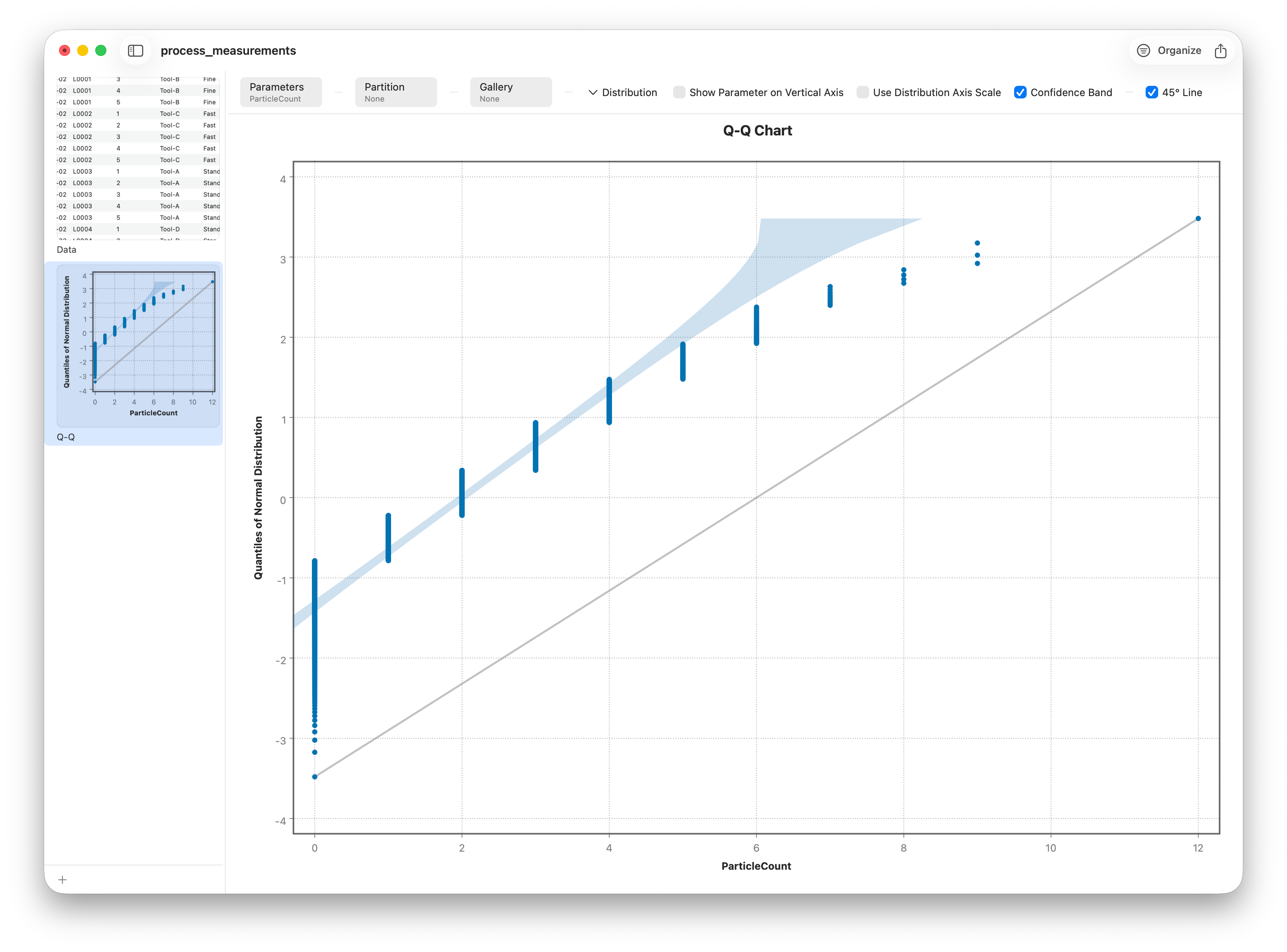
Is that wiggle real? Confidence bands
Real samples are never perfectly straight, even when they truly are normal — random variation guarantees some wobble. Turn on confidence bands and Stratum draws an envelope around the reference line showing how much deviation is expected by chance. Points inside the band are consistent with normality; points that stray outside it are the ones worth worrying about.
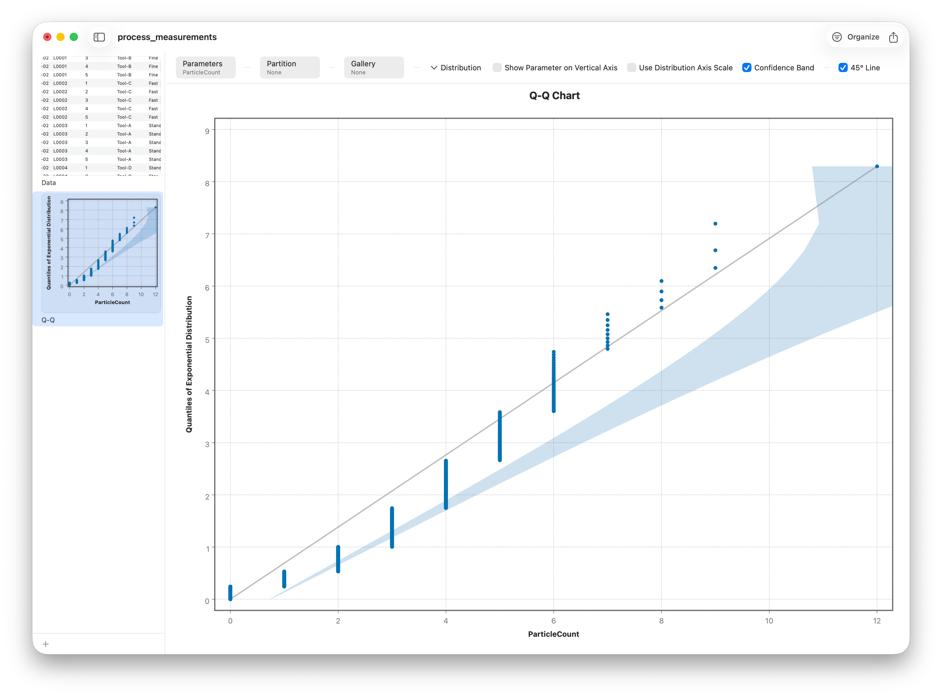
Not just normal
Q-Q plots aren't limited to the bell curve. If you suspect your data follows a different distribution, change the reference distribution and test that hypothesis instead. The same straight-line logic applies to whatever reference you pick — it's a general-purpose distribution-fit check, not a one-trick normality plot.
From picture to p-value: the normality tests
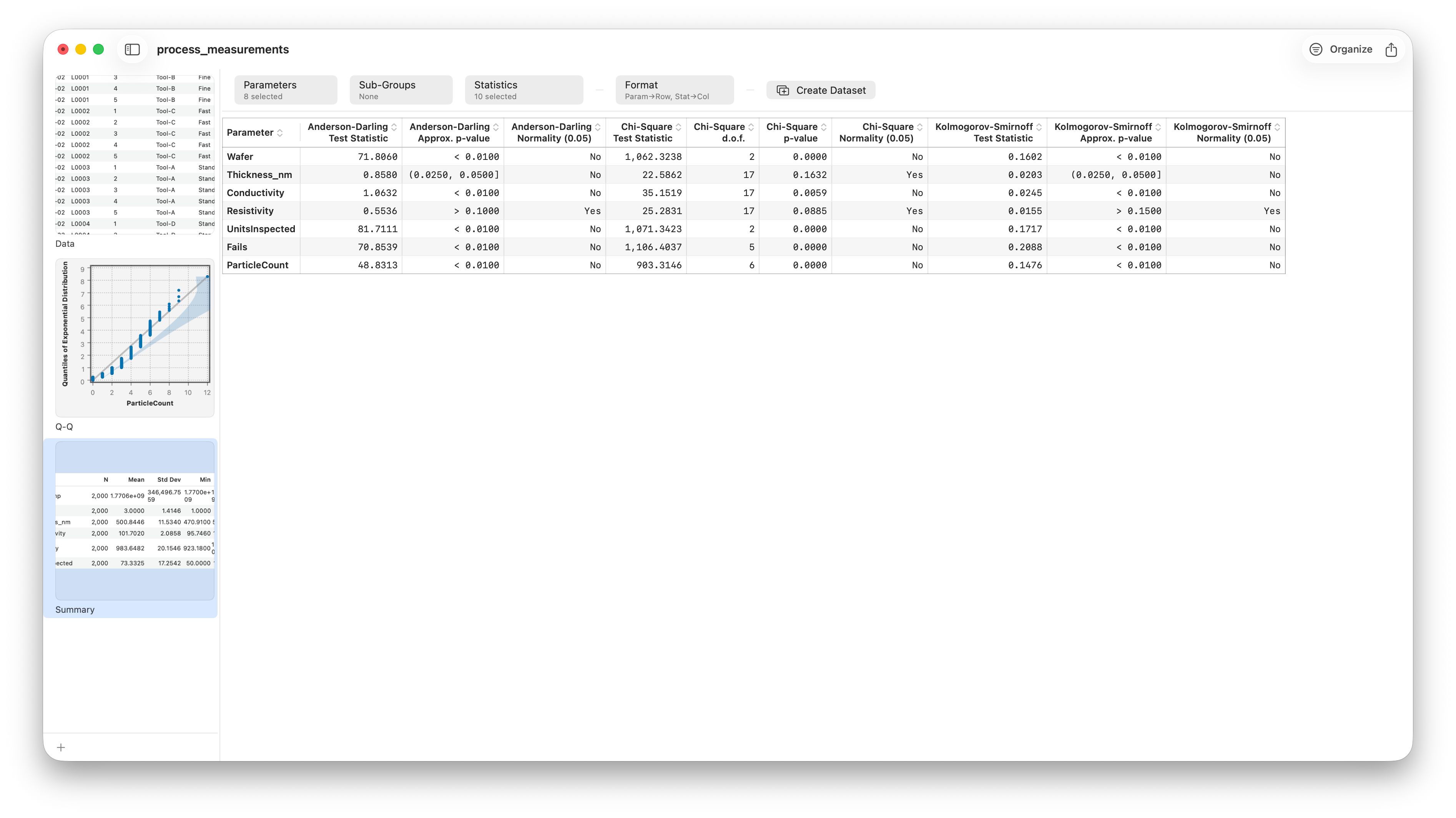
A Q-Q plot is persuasive, but sometimes you need a number to put in a report. The Summary report (Analyze ▸ Summary) runs three classic normality tests for each numeric column and reports each one's p-value:
- Anderson–Darling — the workhorse, and especially good at catching problems in the tails.
- Kolmogorov–Smirnov — based on the largest gap between your ECDF (Lesson 7) and the ideal normal curve.
- Chi-square — the classic goodness-of-fit test, comparing observed and expected bin counts.
What if it's not normal?
Failing a normality check isn't a dead end. You have good options: transform the variable (a log transform often straightens out right-skewed data like prices or particle counts), switch to a method that doesn't assume normality (the rank-based tests in Lesson 6's cousins), or lean on the fact that many tests are robust to mild non-normality once your sample is large. The Q-Q plot's job is to tell you which situation you're in — so you choose your next step deliberately rather than by accident.
Follow along
- Dataset
- process_measurements.csv
- You'll use
- The Q-Q plot on thickness (near-normal), then particle count for a right-skewed contrast; confidence bands, the reference-distribution picker, and the built-in normality tests
- Up next
- Lesson 9 — Dot/Strip & Pareto
We've now covered the charts that judge a distribution's shape and fit. Next we turn to two charts for a different job entirely: showing every single data point when samples are small, and ranking causes so you can act on the few that matter most.