 Stratum
Dot Plots, Strip Plots & Pareto Charts: Find the Vital Few
Summaries are powerful, but they can lie by omission. When a sample is small, the most honest chart shows every single point — and when you need to prioritize, the Pareto chart tells you which few causes to fix first.
The box and violin plots from Lesson 6 summarize a group into a shape. That's exactly what you want with hundreds of points per group — but with only a couple dozen observations, a summary can hide more than it reveals. When samples are small, the most honest move is to plot every observation and let the reader see the raw evidence. That's what strip plots and dot plots do.
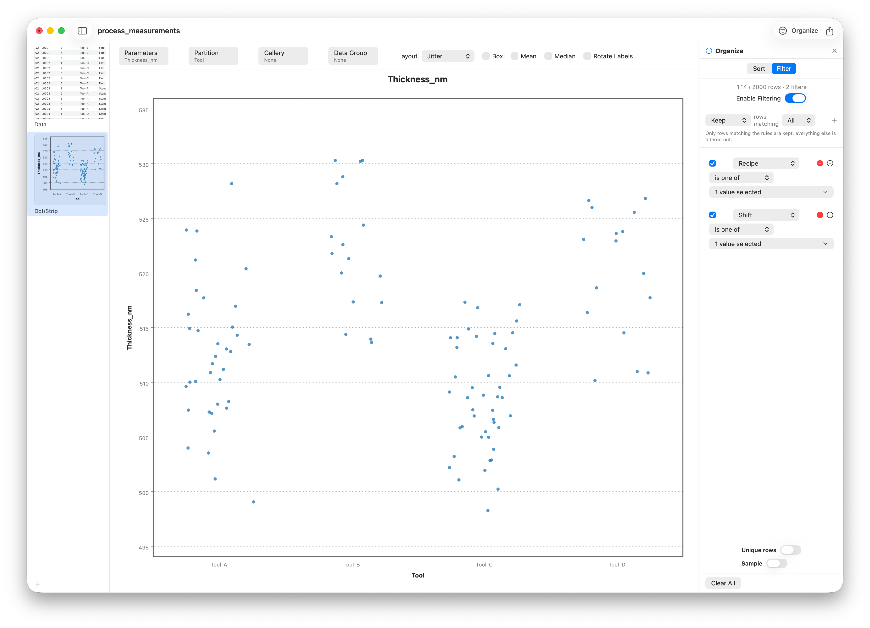
Our process dataset has 2,000 rows, so to create that small-sample situation we zoom in: filter to a single recipe on a single shift, which leaves only a couple dozen wafers per tool — few enough that a box plot would oversimplify.
Show every point
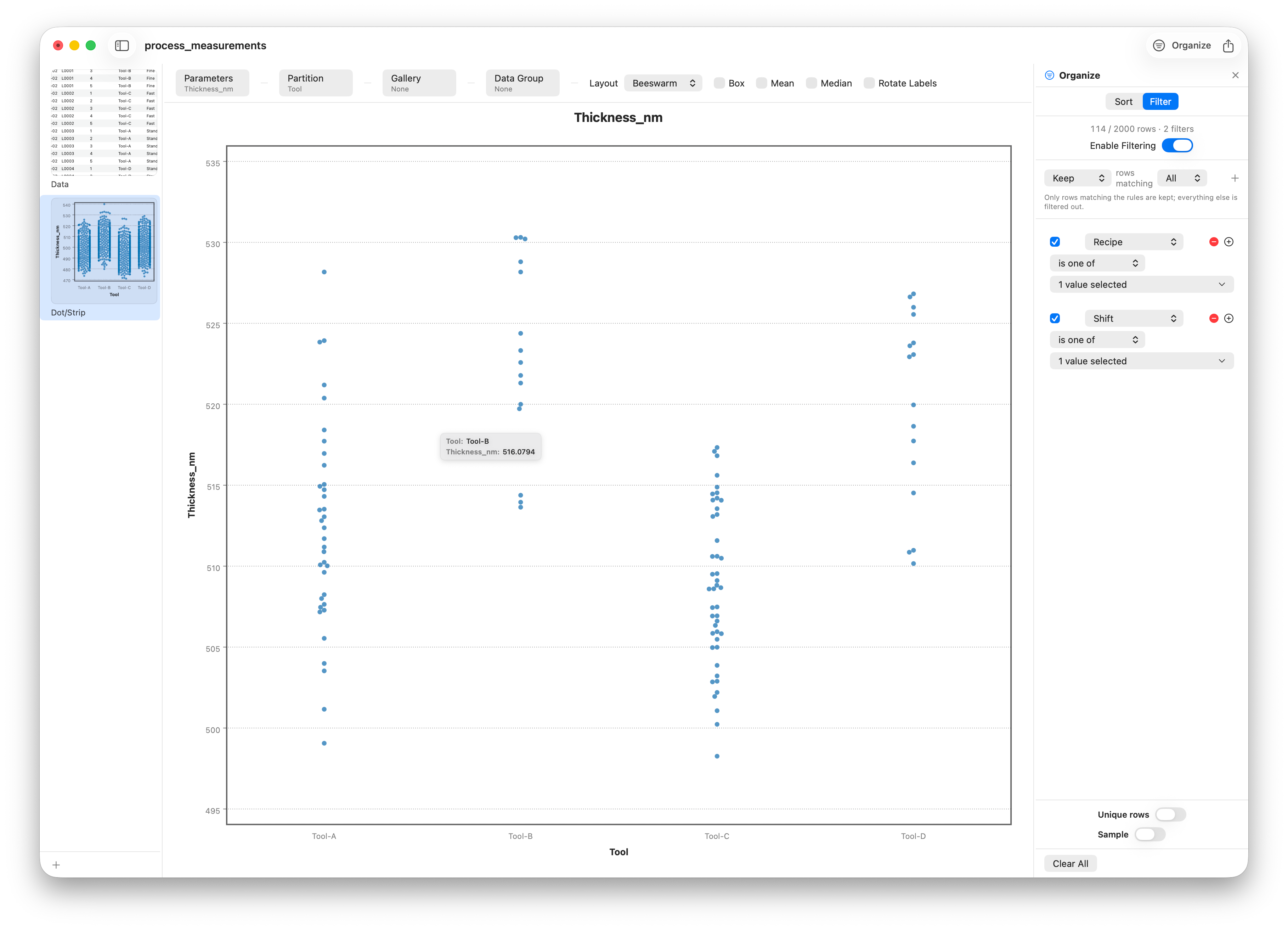
A strip plot places one mark per observation along an axis, grouped by category. Nothing is averaged, binned, or smoothed — you see the actual data, gaps and clusters and lone points included. The catch is overplotting: when several values are identical or very close, their marks land on top of each other and you lose the count. There are two clean fixes:
- Jitter nudges each point a small random amount sideways so overlapping marks fan out and become countable.
- Beeswarm packing is more elegant — it slides points aside just enough to avoid overlap, so the width of each pile is the local density. The result reads almost like a violin built from real dots.
The Pareto chart: rank the causes
Dot and strip plots are about seeing every value. The Pareto chart is about a different job: deciding what to fix first. It rests on the Pareto principle — the 80/20 rule — the common observation that a large share of effects comes from a small share of causes. Even when the split isn't a clean 80/20, ranking the causes tells you where to start. To find which tool to fix first here, we filter the data to the defects — the reworked and scrapped wafers — and let Stratum count them by tool.
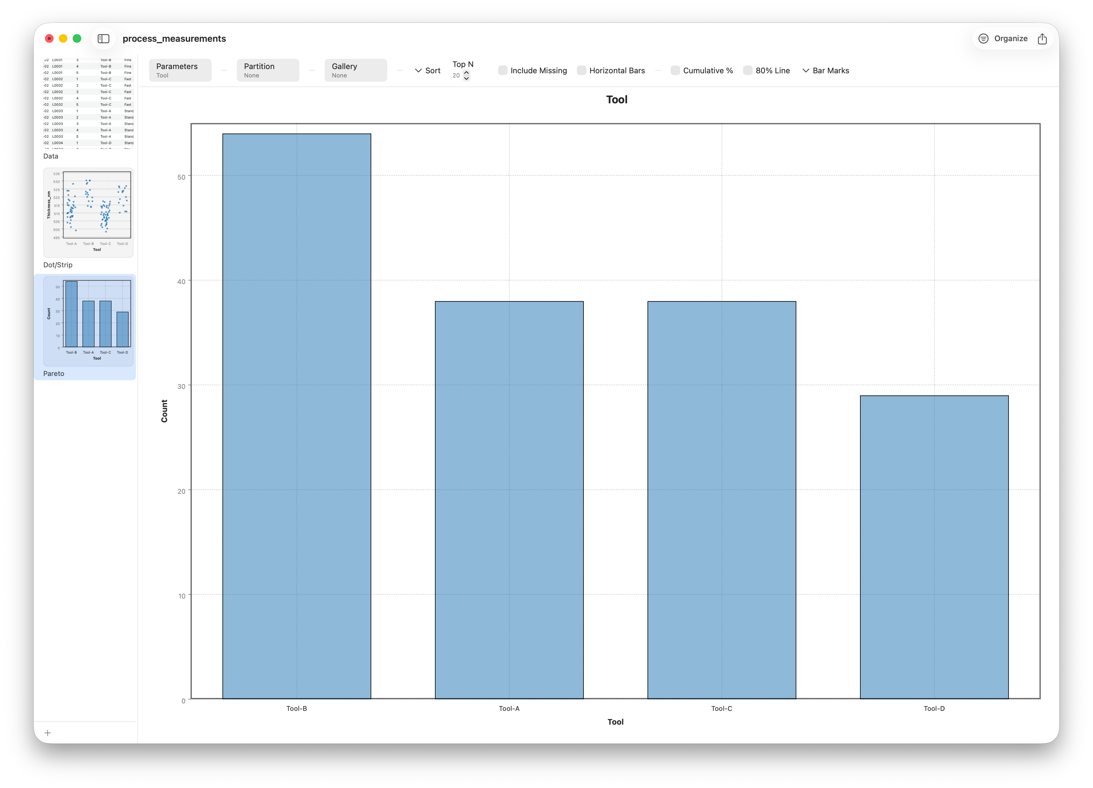
A Pareto chart is two charts in one. The bars are a frequency count of each category — here, defective wafers per tool — but with a twist: they're sorted from tallest to shortest, so the biggest contributor sits on the left. That sorting alone makes the chart useful; your eye goes straight to the leading cause.
The 80% line
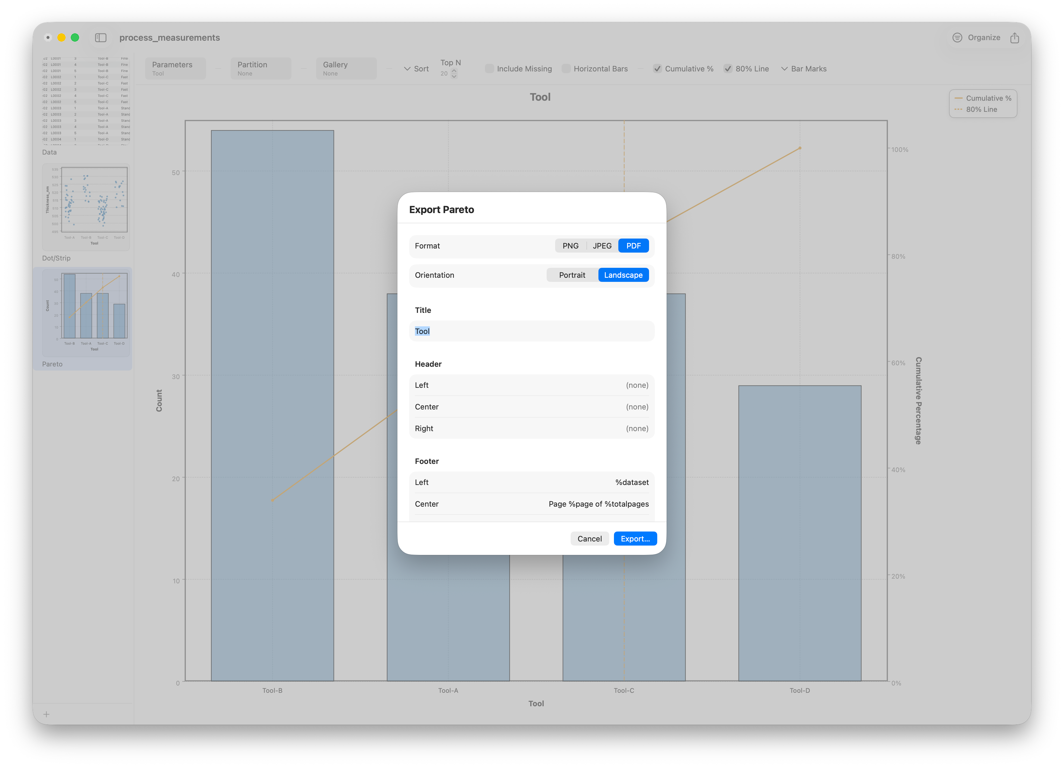
The second layer is what makes a Pareto chart a decision tool. A cumulative percentage line climbs across the bars, showing the running total: the first bar's share, then the first two combined, and so on up to 100%. Stratum draws a reference line at 80%, and where the cumulative curve crosses it marks the boundary of the vital few — the handful of categories on the left that, fixed, would resolve the bulk of the problem.
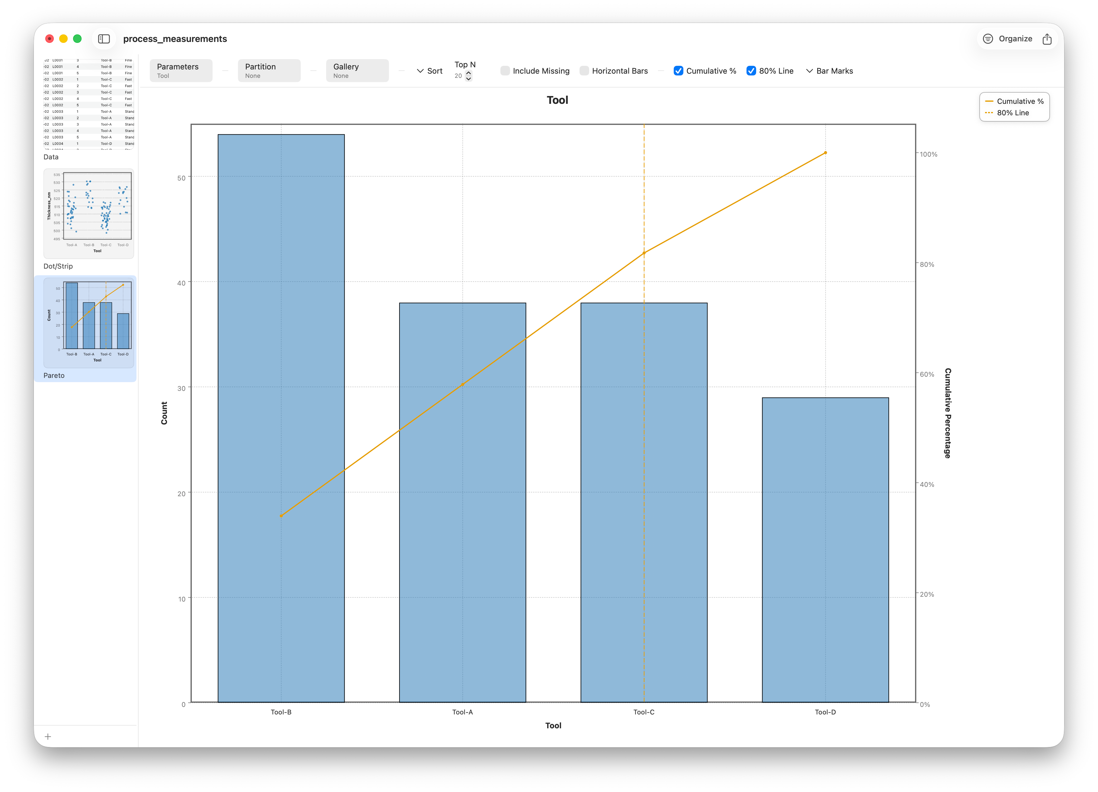
This is how the Pareto chart pays for itself. Instead of spreading effort evenly, you read off the leading causes and start there — here, the worst tool alone accounts for about a third of the defects, and the two worst for nearly 60%. It turns a flat to-do list into a ranked plan of attack. When one category truly dominates, the cumulative line shoots up fast and the "vital few" is obvious; when causes are more even, as here, the ranking still tells you the order to tackle them.
Ready to share
Like every chart in Stratum, a finished Pareto or dot plot exports to PNG, JPEG, or vector PDF — ready to drop into a quality review or a status deck.
Follow along
- Dataset
- process_measurements.csv
- You'll use
- A strip/beeswarm plot of thickness by tool on a small slice (filter to one recipe + shift), then — filtering to the defects (Rework/Scrap) — a Pareto chart of defects ranked by tool, with the cumulative line and 80% threshold, plus export
- Up next
- Lesson 10 — Pie, Bar & Mosaic
We've now seen charts for distributions, for individual points, and for ranking causes. Next we move to categorical data proper — counts and proportions — with pie charts, bar charts, and the mosaic plot that reveals how two categories relate.