 Stratum
Correlation Analysis: Pearson, Spearman & Significance
The scatter plot let you see how tightly two variables track. Correlation turns that impression into a single number — and a correlation matrix gives you every pairwise number in your dataset at once.
In the last lesson you learned to read the strength of a relationship by eye. A correlation coefficient makes that judgment exact. It's a single number, written r, that always lands between −1 and +1. The sign tells you the direction — positive means they rise together, negative means one falls as the other rises — and the magnitude tells you the strength. An r near ±1 means the points fall almost perfectly on a line; an r near 0 means there's essentially no linear relationship at all.
A whole matrix at once
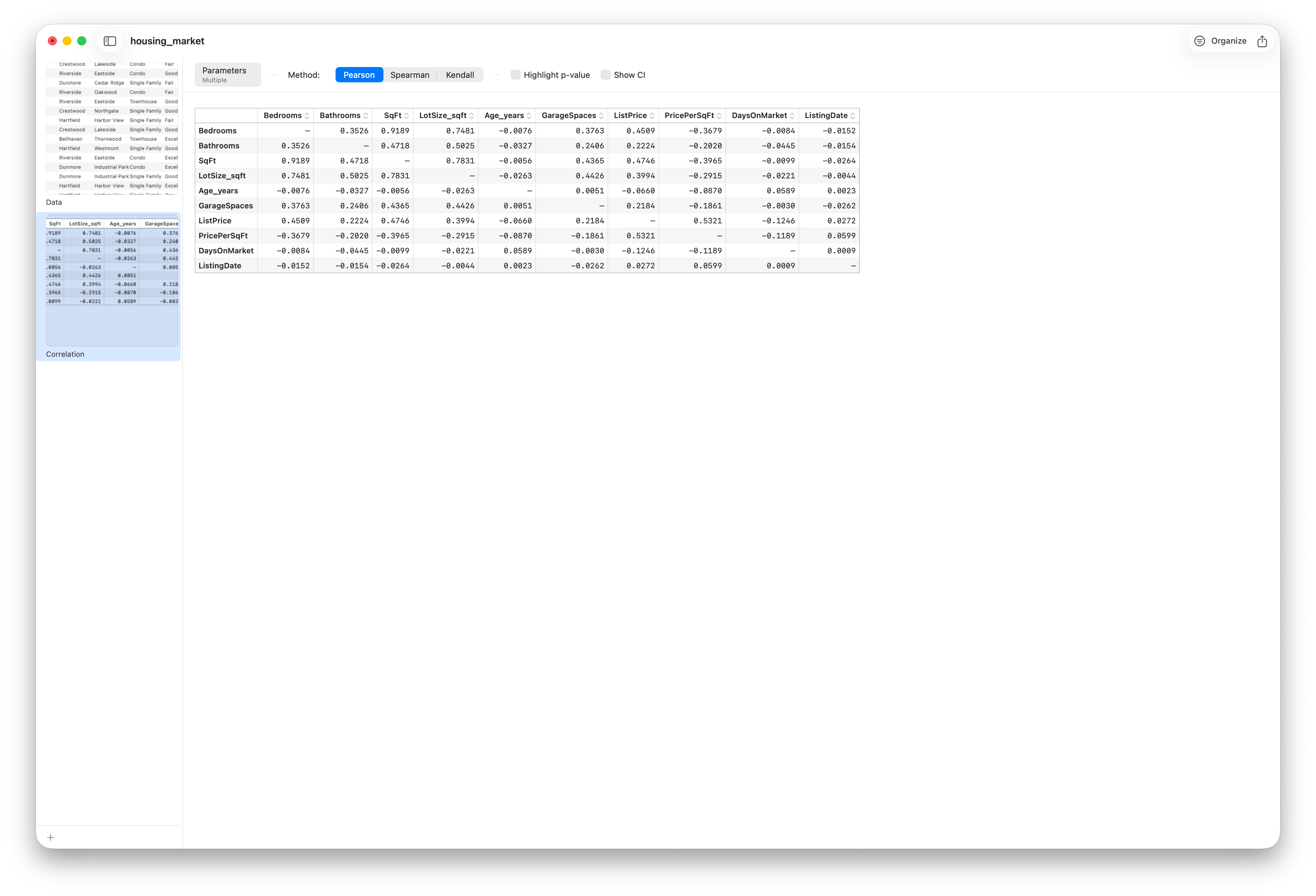
The real efficiency comes from doing this for every pair of numeric columns simultaneously. Stratum's Correlation analysis produces a correlation matrix: a grid where every row and column is a variable, and each cell holds the r between that pair. The diagonal is always 1 — every variable correlates perfectly with itself — and the matrix is symmetric, so you really only need to read one triangle.
Pearson, Spearman & Kendall
The Method picker chooses the coefficient. The default is Pearson's, which measures linear association — it's at its best when the relationship is a straight line. But a relationship can be strong and not straight, and Pearson will understate it. Spearman's coefficient fixes this by working on the ranks of the values rather than the values themselves. That makes it measure any monotonic relationship — one that consistently moves the same direction even if it bends — and, as a bonus, it's far more resistant to outliers, since a single extreme value can only ever be the highest or lowest rank. The picker also offers Kendall's tau, another rank-based measure that's especially robust in small samples.
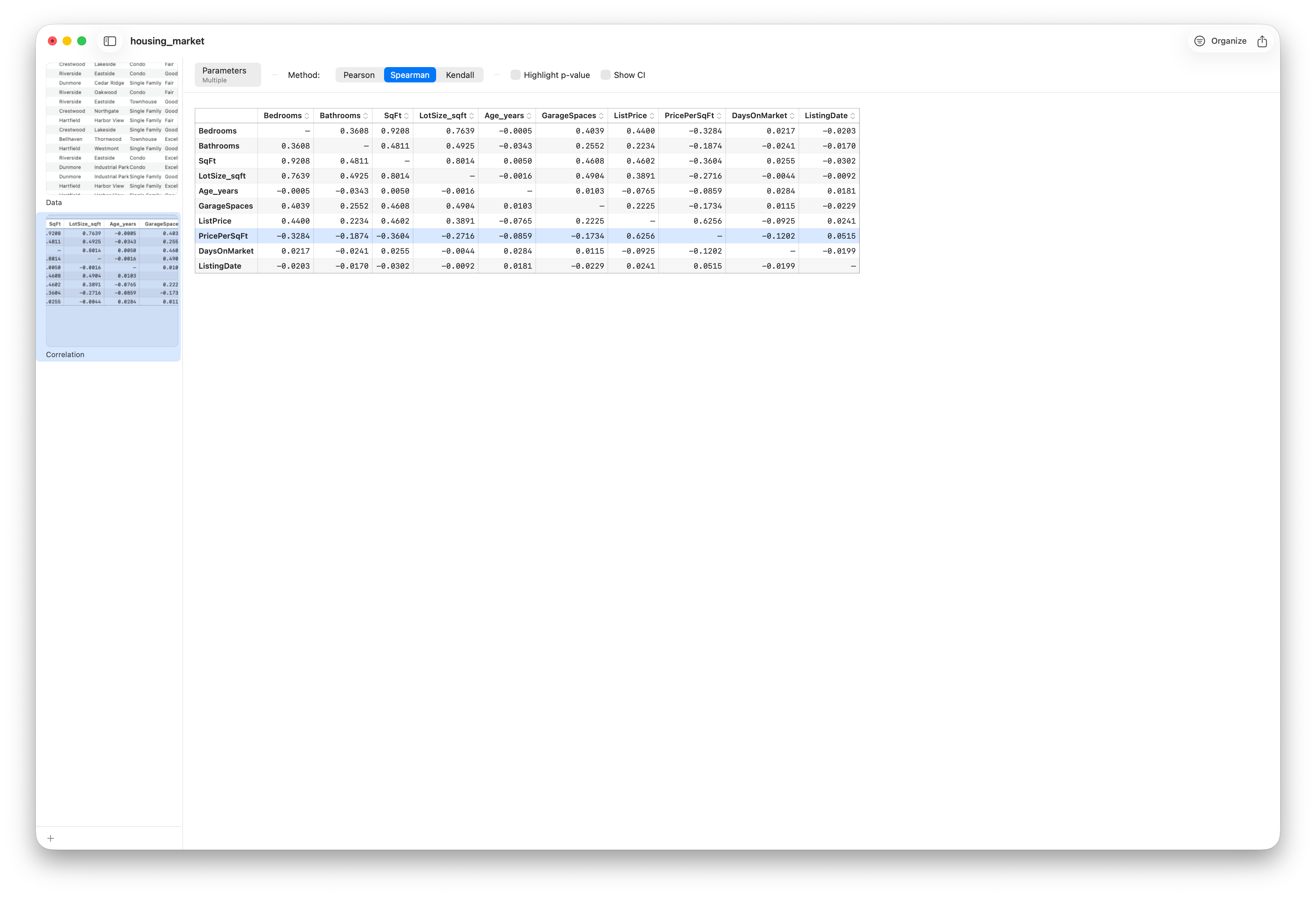
A practical habit: if two methods disagree sharply for a pair, that's a signal. It usually means either curvature or an outlier is at work, and it's your cue to go back to the scatter plot and look.
Is it real? p-values and confidence intervals
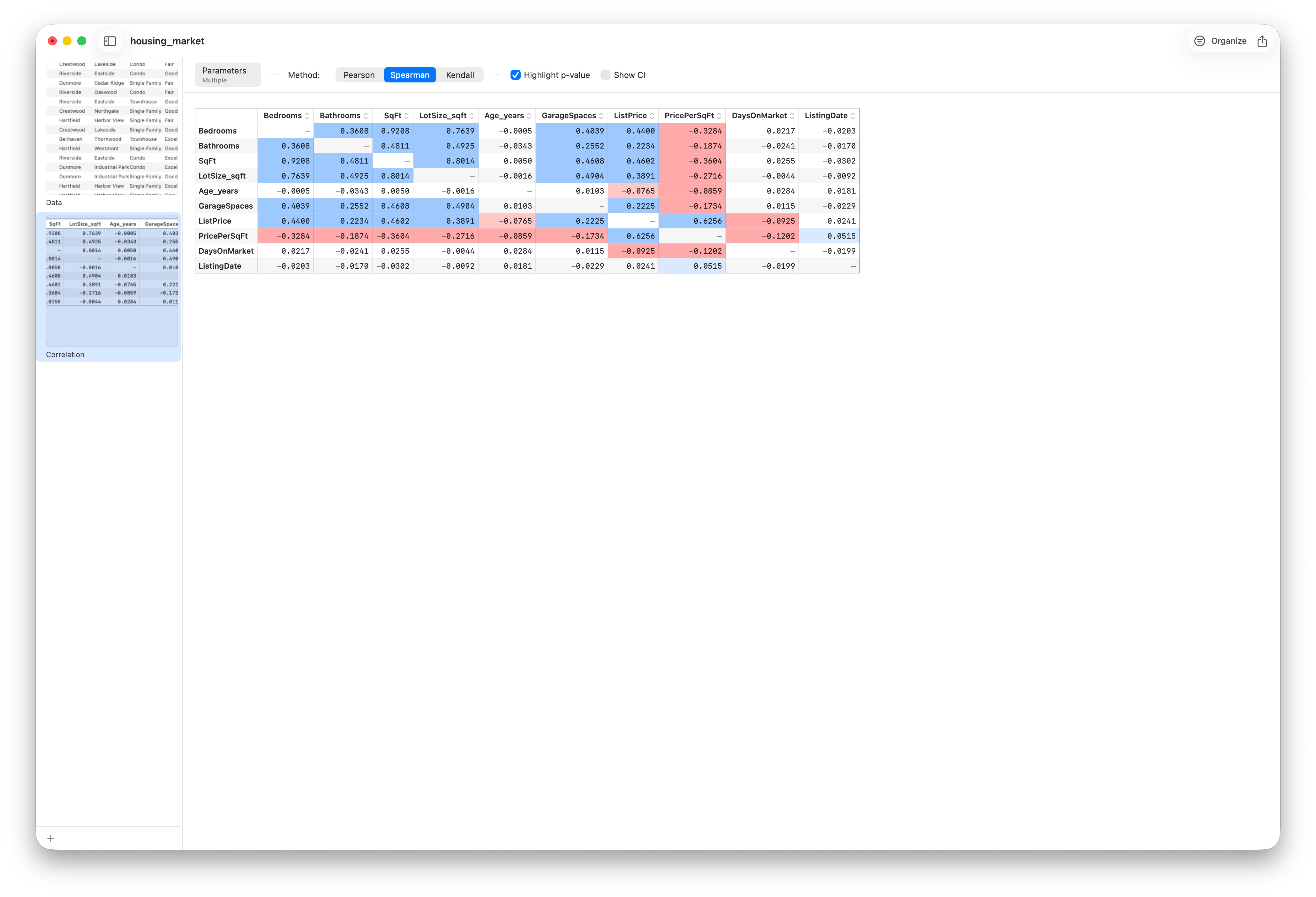
An observed correlation could be a genuine pattern, or it could be noise that happened to line up in this particular sample. The p-value addresses that: it estimates how likely you'd see a correlation this strong if the true relationship were actually zero. A small p-value (conventionally below 0.05) says the correlation is unlikely to be a fluke. By default the matrix is a plain grid of numbers; turn on Highlight p-value and Stratum colors only the statistically significant cells — blue for positive, red for negative, deeper for a smaller p — leaving non-significant cells and the diagonal blank, so the relationships worth trusting stand out at a glance.
A word on missing data — and on causation
Real datasets have gaps. Stratum handles each pair on its own — every correlation is computed from the rows where both of its two variables are present (the matrix footer labels this "listwise"). That keeps as much data as possible for each cell, though it does mean different cells can rest on slightly different row counts.
And the warning that can never be repeated too often: correlation is not causation. A strong r tells you two variables move together. It says nothing about whether one causes the other, whether the arrow runs the other way, or whether some third variable drives them both. Correlation is where investigation starts, not where it ends.
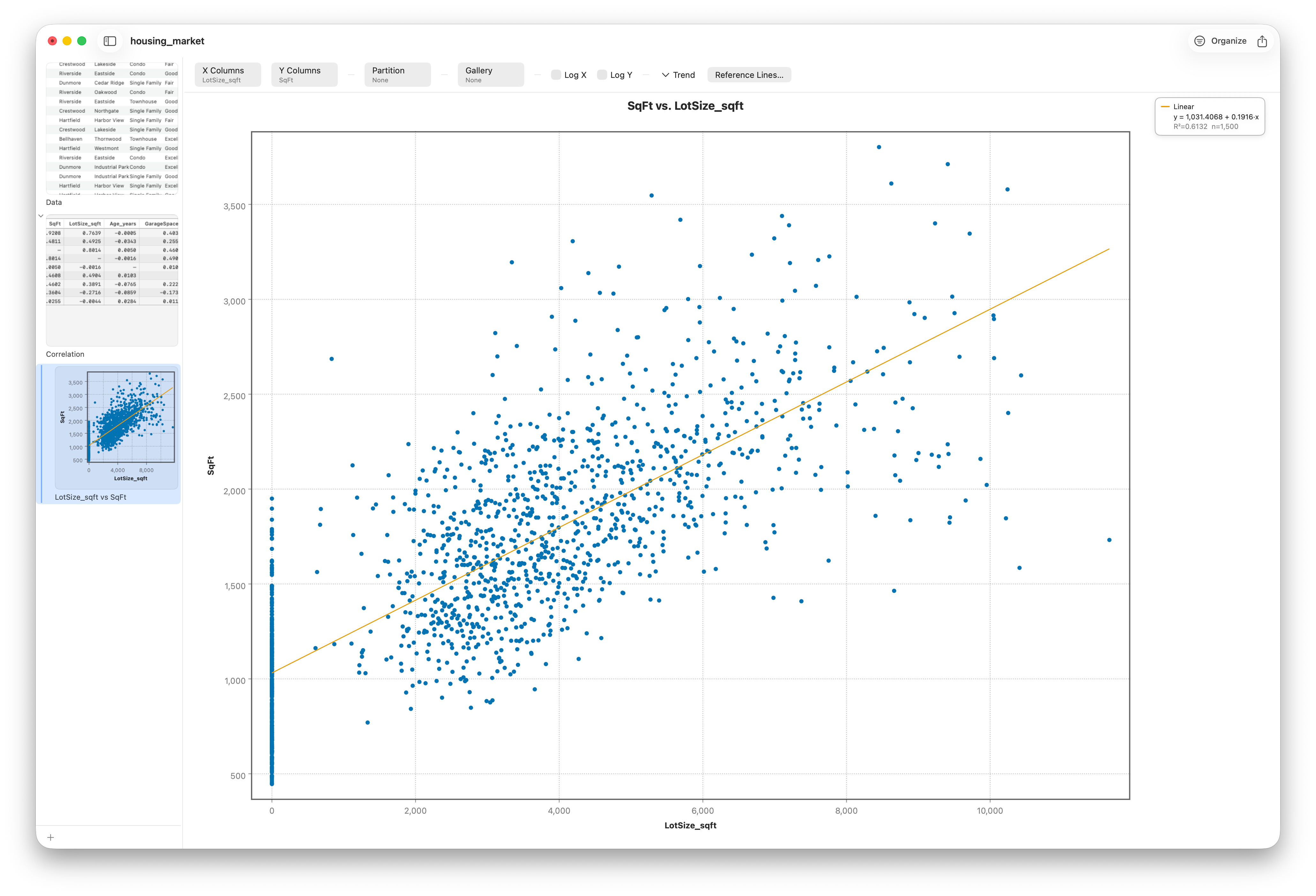
The fastest way to act on the matrix is to drill in. With at least two columns selected in Parameters, right-click a strong cell and choose Drill Down to Scatter; Stratum opens the underlying scatter plot, so you can confirm with your own eyes that the number reflects a real, sensible pattern.
Follow along
- Dataset
- housing_market.csv
- You'll use
- The numeric columns —
SqFt,ListPrice,PricePerSqFt,Age_years,DaysOnMarket,LotSize_sqft,Bedrooms,Bathrooms— in a Pearson/Spearman matrix with significance highlighting - Up next
- Lesson 13 — The Summary Report
You've now measured relationships across the whole dataset. Next we step back to a single variable at a time and master the report that summarizes it completely — mean, spread, shape, and all.