 Stratum
The Summary Report: Master Descriptive Statistics
Charts show you shape; the Summary report puts numbers on it. In one table you get the mean, median, spread, and shape of every numeric column — the descriptive statistics that underpin everything else you'll do.
Every analysis eventually needs the basics in writing: how big is this variable on average, how much does it vary, what does its distribution look like? Stratum's Summary report answers all of that for every numeric column at once, in a single sortable, exportable table. Learning to read it fluently is learning the vocabulary of descriptive statistics.
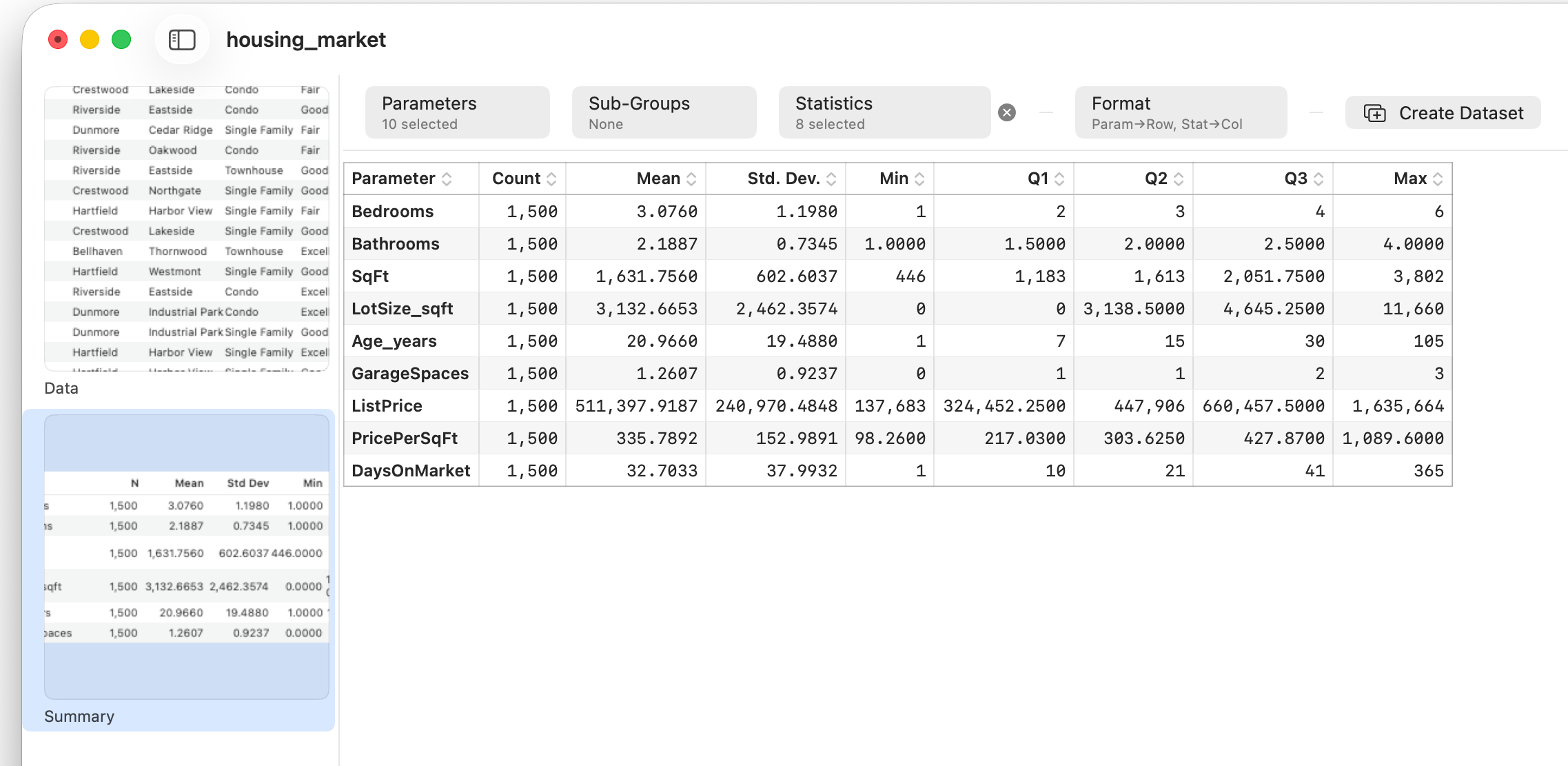
Where is the center?
The report's first job is to tell you the typical value, and it offers more than one answer. The mean is the familiar arithmetic average — add everything up, divide by the count. The median is the middle value when the data is sorted. The difference between them is diagnostic: for a symmetric distribution they nearly coincide, but for a skewed one they pull apart, with the mean dragged toward the long tail. That's why, for something like house prices, the median is often the more honest "typical" figure — it isn't yanked upward by a handful of mansions. The mode, the most frequent value, rounds out the trio and matters most for discrete or categorical-like data.
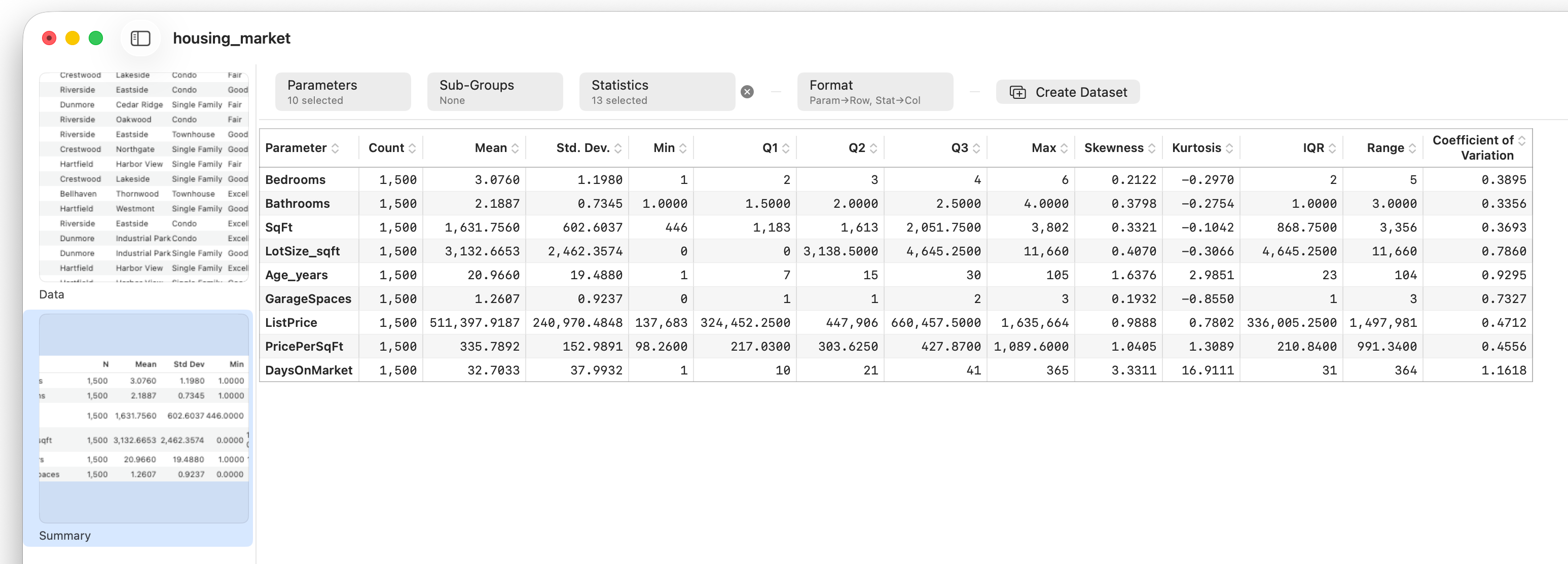
How spread out is it?
Center alone is half the story. Two variables can share a mean and behave completely differently if one is tightly clustered and the other wildly dispersed. The report quantifies spread several ways. The standard deviation (the Std. Dev. column) is the standard measure of typical distance from the mean. The range (max minus min) is simple but fragile — one outlier sets it. The interquartile range, the span of the middle 50% between the first and third quartiles, is the robust alternative that ignores the extremes.
One more spread statistic earns special mention. The coefficient of variation expresses the standard deviation as a percentage of the mean, which makes it unit-free. That's what lets you compare variability across things measured on totally different scales — is price more variable than days-on-market? — a comparison the raw standard deviation can't make.
What shape is it?
Beyond center and spread, two numbers describe the distribution's shape, putting figures on what you'd otherwise eyeball from a histogram. Skewness measures asymmetry: positive means a tail stretching right, negative a tail to the left, zero a symmetric distribution. Kurtosis measures tailedness — how much of the action lives in the extremes versus the middle. High kurtosis means heavy tails and more frequent extreme values than a normal distribution would produce.
Breaking it out by group
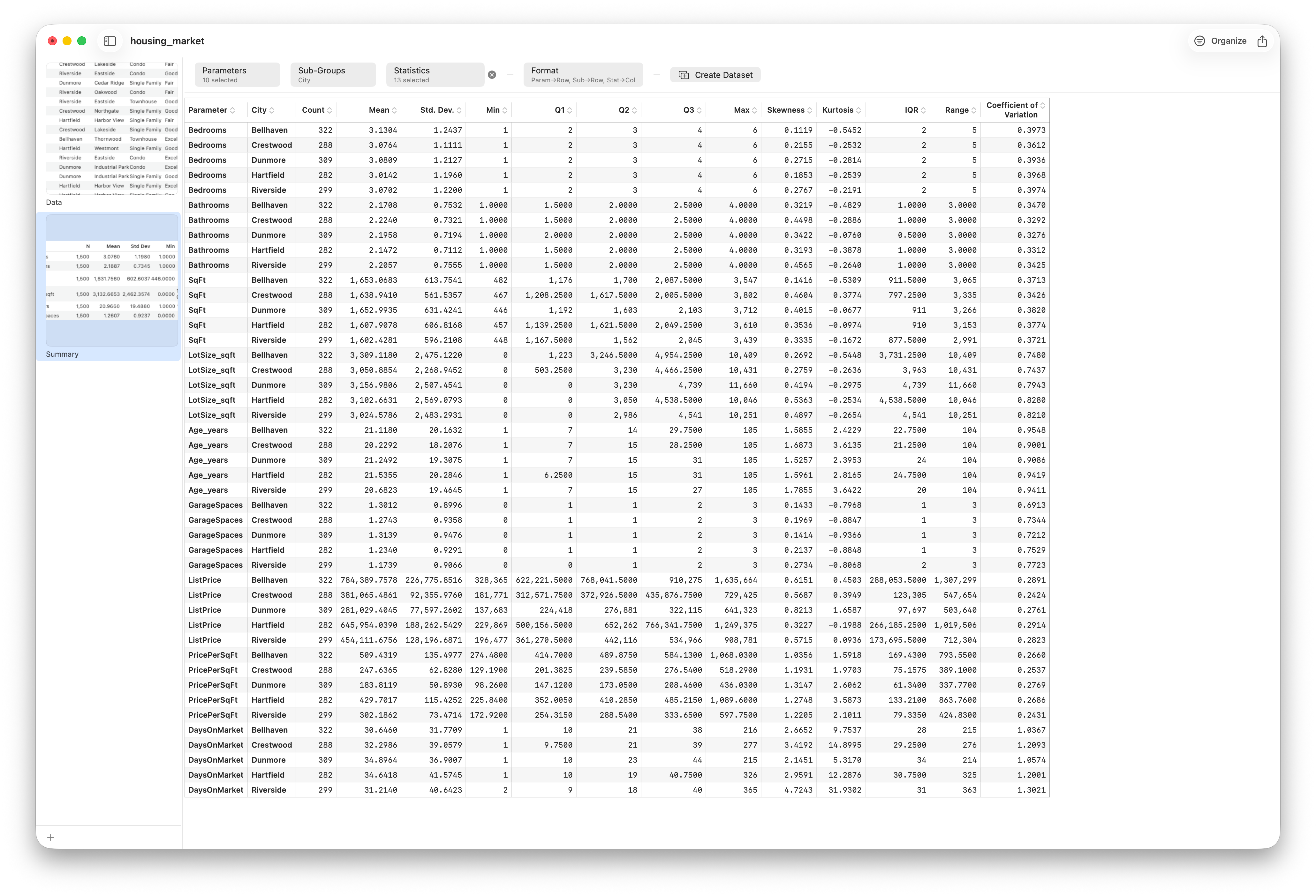
A single summary is useful; a summary per group is often the actual answer you need. Set a column in Sub-Groups and Stratum repeats the whole report within each category, so you can compare the center, spread, and shape of, say, price across cities or property types side by side. This is frequently the fastest route from "what does my data look like?" to "how do these groups differ?"
Take it with you
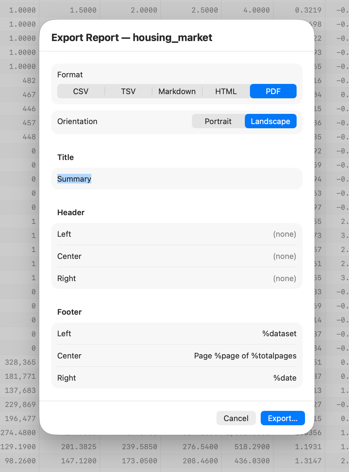
The Summary report flows through the same export pipeline as every other report in Stratum, so once it says what you need, you can send it anywhere. Export to CSV or TSV for a spreadsheet, Markdown or HTML to drop into documentation, or PDF for a polished, print-ready table.
Follow along
- Dataset
- housing_market.csv
- You'll use
- The Summary report over all numeric columns, the Statistics picker to add Skewness/Kurtosis/IQR/Range/CV, a Sub-Groups column to break it out, and the export menu
- Up next
- Lesson 14 — Two-Sample Comparison
You can now describe any single variable completely. The natural next question is comparison: are two groups really different, or could the gap be chance? That's where formal testing begins — starting with the two-sample comparison.