 Stratum
Trend, Time-Series & Slopegraphs: Smoothing, Seasonality & Change
Some data isn't a static pile of values — it unfolds in time. Sales, temperatures, defect counts: each carries an order that ordinary summaries throw away. Time-series analysis puts that order back at the center and asks where the data is heading — and when you want to compare where many categories started and finished, the slopegraph makes the change the story.
Up to now we've treated rows as interchangeable — shuffle them and the histogram, the regression, the correlation all come out the same. But a column of monthly revenue is not interchangeable. December follows November for a reason, and last year's pattern echoes into this one. The moment a date column enters the picture, you've got a time series: values indexed by time, where the sequence itself is data. This lesson is your introduction to time series analysis in Stratum.
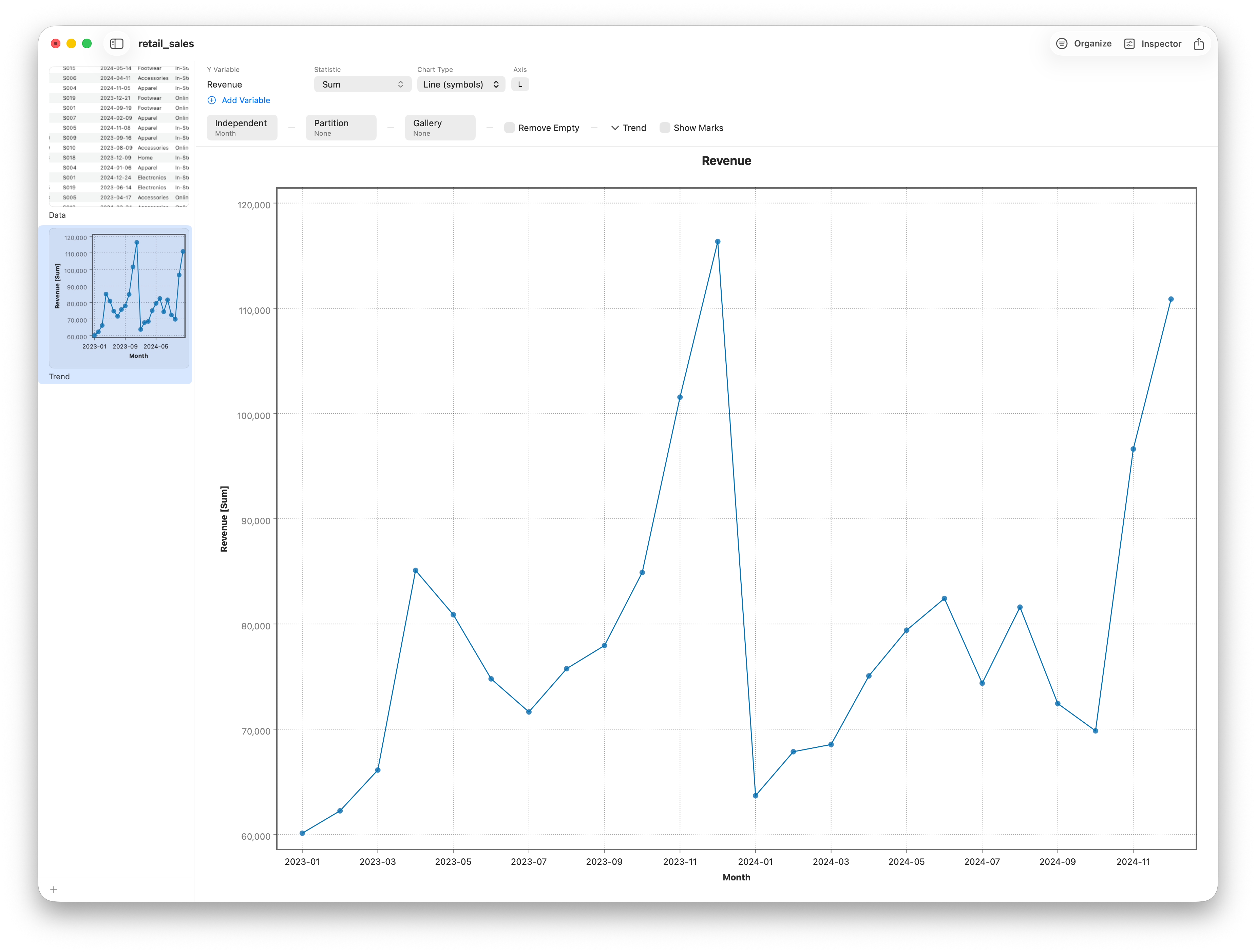
We'll work with retail orders. Individual orders are too jagged to learn from, so the first move is to roll them up to one number per month. Stratum doesn't bucket by month automatically — the Trend chart groups per unique value of whatever you give it, and a raw Date column groups per day. So we first add a month column: a formula (or recode) column derived from Date. Then open Charts ▸ Trend, set the Independent picker to that month column, Y to Revenue, and the Statistic to Sum. That gives one clean number per period, which is the series we'll plot and smooth.
The three things every time series contains
Stare at almost any real series and you'll find it's a blend of three ingredients:
- Trend — the slow, long-run direction. Is revenue drifting up over the two years, or flat?
- Seasonality — a pattern that repeats on a fixed calendar cycle, like the reliable holiday lift every December.
- Noise — the irregular, one-off wobble that's left after trend and season are accounted for.
Learning to see these three separately is the whole game. A spike isn't a crisis if it's the seasonal peak you get every year; a gentle climb isn't luck if it's a genuine trend.
Smoothing with a moving average
The raw line jumps around enough that the trend is hard to trace by eye. The natural tool for a time series is a moving average. From Stratum's Trend menu choose Moving Average and set the Window to 12. Each plotted point becomes the average of its twelve-month neighborhood, so a whole year of seasonal ups and downs cancels out and only the underlying direction is left.
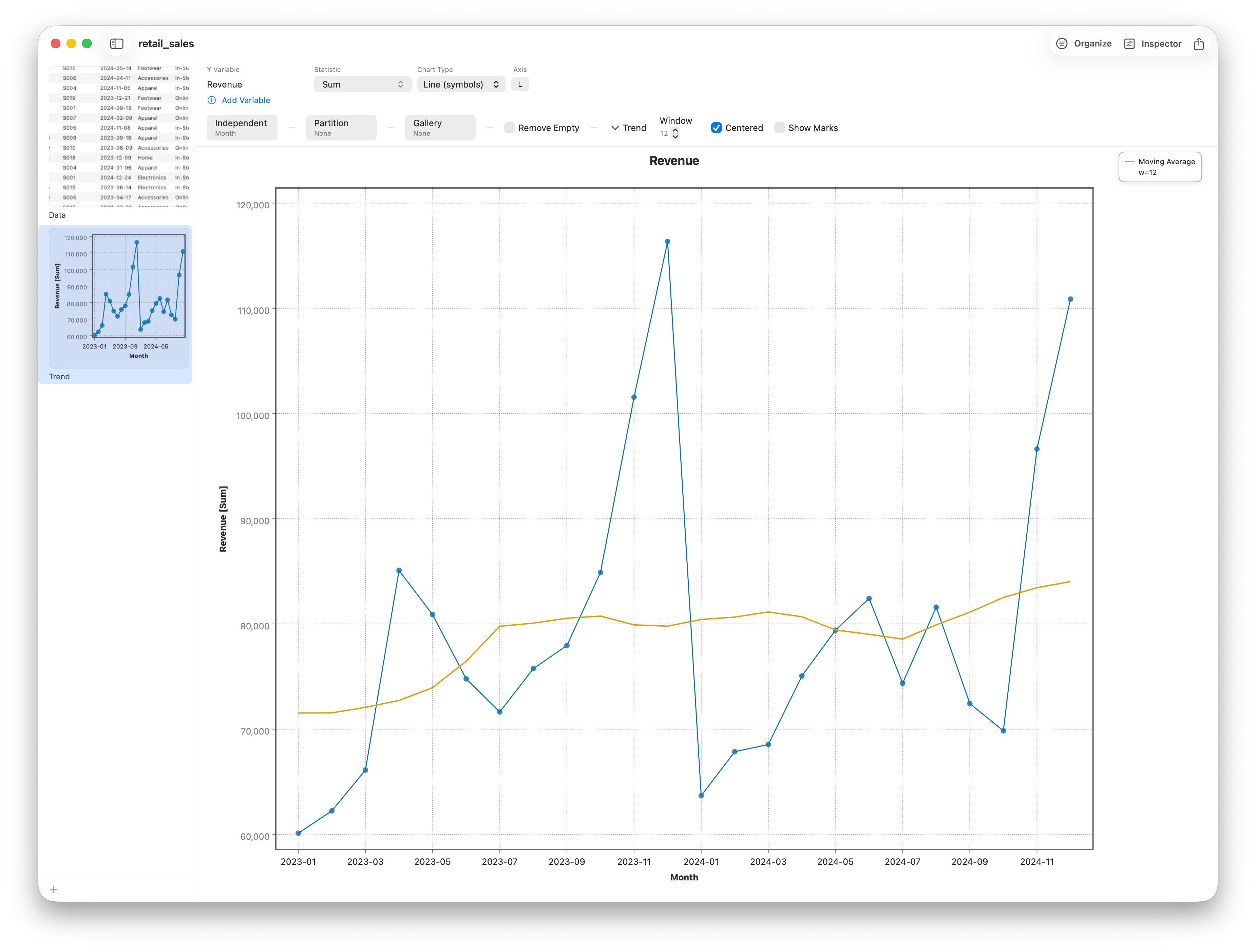
Two controls shape it. The Window is the trade-off knob: a short window stays responsive but keeps jitter; a long one is smoother but lags genuine turning points — for monthly data with an annual cycle, a 12-month window is the natural choice because it averages exactly one full season. The Centered toggle decides alignment: centered keeps the smooth curve sitting over the data, while turning it off gives a trailing average that looks only backward — the way a running figure updates as each month closes. And if you'd rather fit a flexible curve than a fixed window, LOWESS is in the same menu as an alternative.
Reading trend and season off the curve
You don't need a separate decomposition view to put the three ingredients to work. With the smoothed curve laid over the raw points, the trend is the curve itself, the seasonality is the regular gap between the raw points and the curve — the same months pulling above or below it year after year — and the noise is the small, irregular scatter that's left.
Ranking change between two periods: the slopegraph
A trend line follows one series through time. But a different question comes up constantly: my categories all changed from last year to this year — who rose, who fell, and did the ranking shuffle? The chart built for that is the slopegraph. It puts two (or a few) time points on the horizontal axis, plots each category's value at each point, and connects them with a straight line. A line sloping up means growth, down means decline, and when two lines cross, two categories swapped rank — the single most eye-catching event a slopegraph can show.
Our monthly view smoothed everything into one line; here we want one line per product category, from 2023 to 2024. First derive a year label: a formula column Year = text(year(Date)) — wrapping year() in text() makes it a category, so it can serve as a stage rather than a number to average. Then open Charts ▸ Slopegraph, set Data to Long, and fill in Entity = ProductCategory, Stage = Year, Value = Revenue, with Statistic = Sum. Each category becomes a line from its 2023 total to its 2024 total on one shared axis.
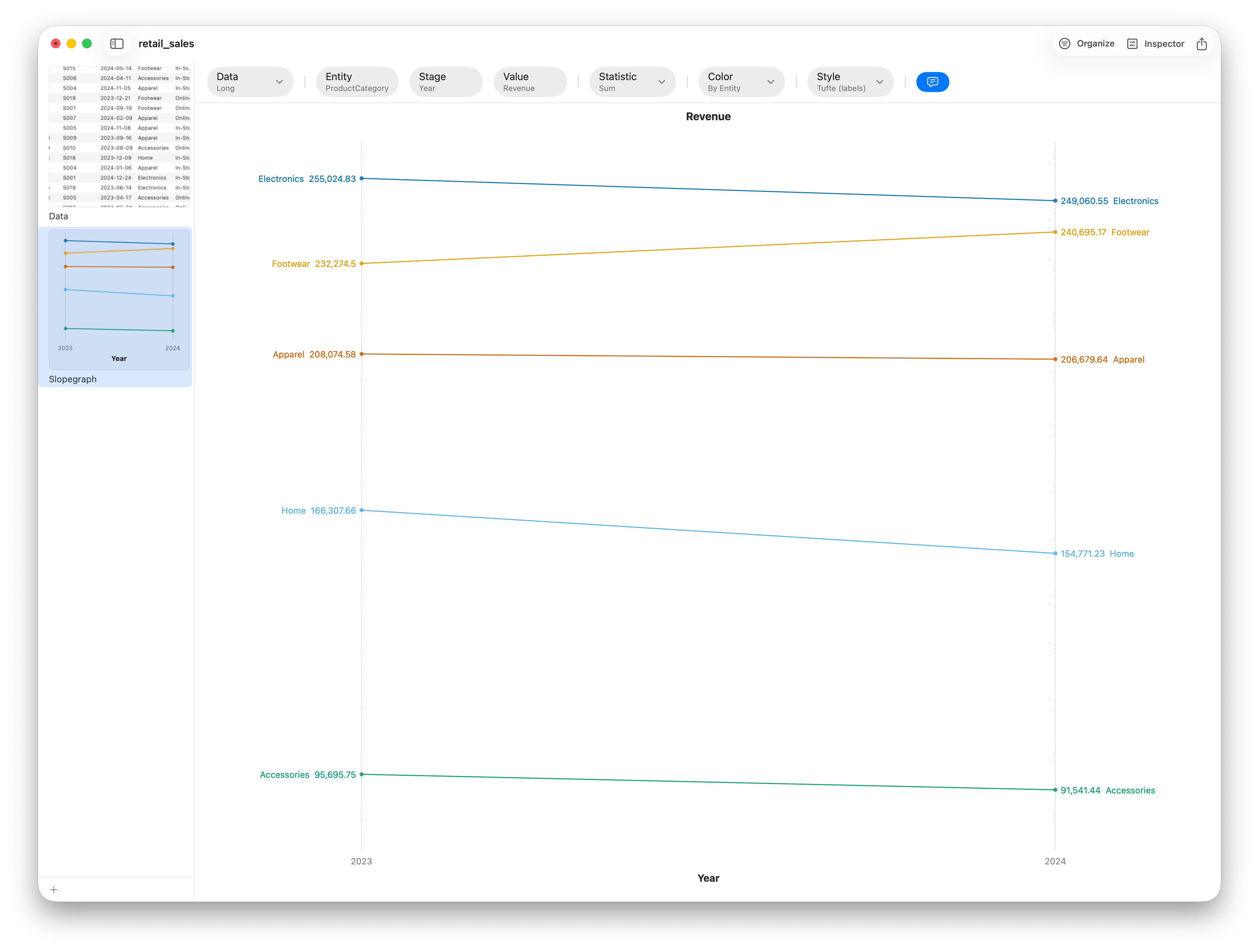
Two controls set the tone. Color by Direction paints risers and fallers in different hues so the winners and losers separate instantly; color by Entity instead if you want to track specific categories. Style switches between the spare Tufte look — no y-axis, the category names and values sitting right in the gutters as the scale — and a Standard look with a conventional axis and a legend. The slopegraph isn't limited to two stages, either: give it three or four ordered periods and it becomes a compact multi-period trajectory, one line per entity.
Follow along
- Dataset
- retail_sales.csv
- You'll use
- A month column derived from Date, the Trend chart (Independent / Statistic = Sum), a moving-average smoother (Window = 12, Centered), and a slopegraph (Long form: Entity = ProductCategory, Stage =
Year = text(year(Date)), Value = Revenue) - Up next
- Lesson 19 — Control Charts I: Shewhart SPC
Trend analysis tells you where a process is going, and a slopegraph tells you how its parts shifted between periods. The next question is whether a process is stable — staying within its natural variation, or drifting out of control. That's the job of the control chart, and it's where we head next.