 Stratum
Control Charts I: I-MR and X-bar (Shewhart SPC)
Every process varies. The question that matters is whether it varies the way it always has — or whether something just changed. The control chart is the tool that answers it, and it's the heart of statistical process control.
A trend chart tells you where a process is heading. A control chart asks a sharper question: is the process stable? Are the ups and downs you're seeing just the normal breathing of the system, or did something genuinely shift? Walter Shewhart's insight, nearly a century ago, was that you can answer this with a chart and three lines — and that insight became the foundation of statistical process control, or SPC.
Common cause vs special cause
The whole framework rests on splitting variation into two kinds. Common-cause variation is the inherent, ever-present jitter of a stable process — countless tiny influences that you can't and shouldn't chase one by one. Special-cause variation is different in kind: a worn tool, a bad batch of material, a miscalibrated sensor. It's a signal, not noise, and it's worth investigating.
A control chart is a machine for telling these two apart. It plots your measurements in time order against a center line (the process average) and a pair of control limits set three standard deviations above and below it. As long as points fall inside the limits and scatter randomly, the process is "in control" — only common cause is at work. A point outside the limits is a flag.
I-MR: charting individual measurements
When measurements come one at a time — a single thickness reading per wafer, say — you reach for the I-MR chart, under Charts ▸ Control Charts ▸ I-MR Chart. It's a pair. The Individuals (I) chart plots each value against the center line and limits. The Moving Range (MR) chart below it plots the absolute difference between consecutive points, which is how the chart estimates the process spread when there are no subgroups to pool. Pick the column to monitor with the Measurement picker; we'll chart conductivity, which is recorded once per reading.
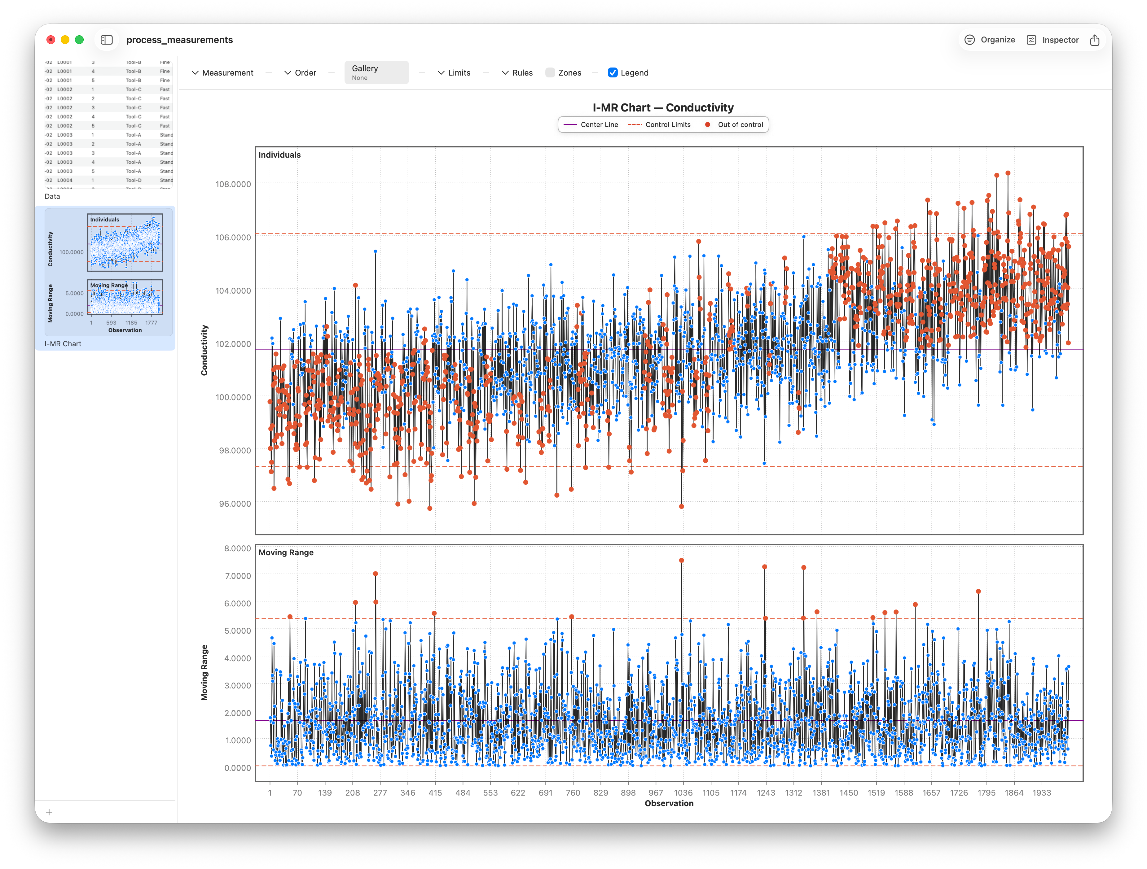
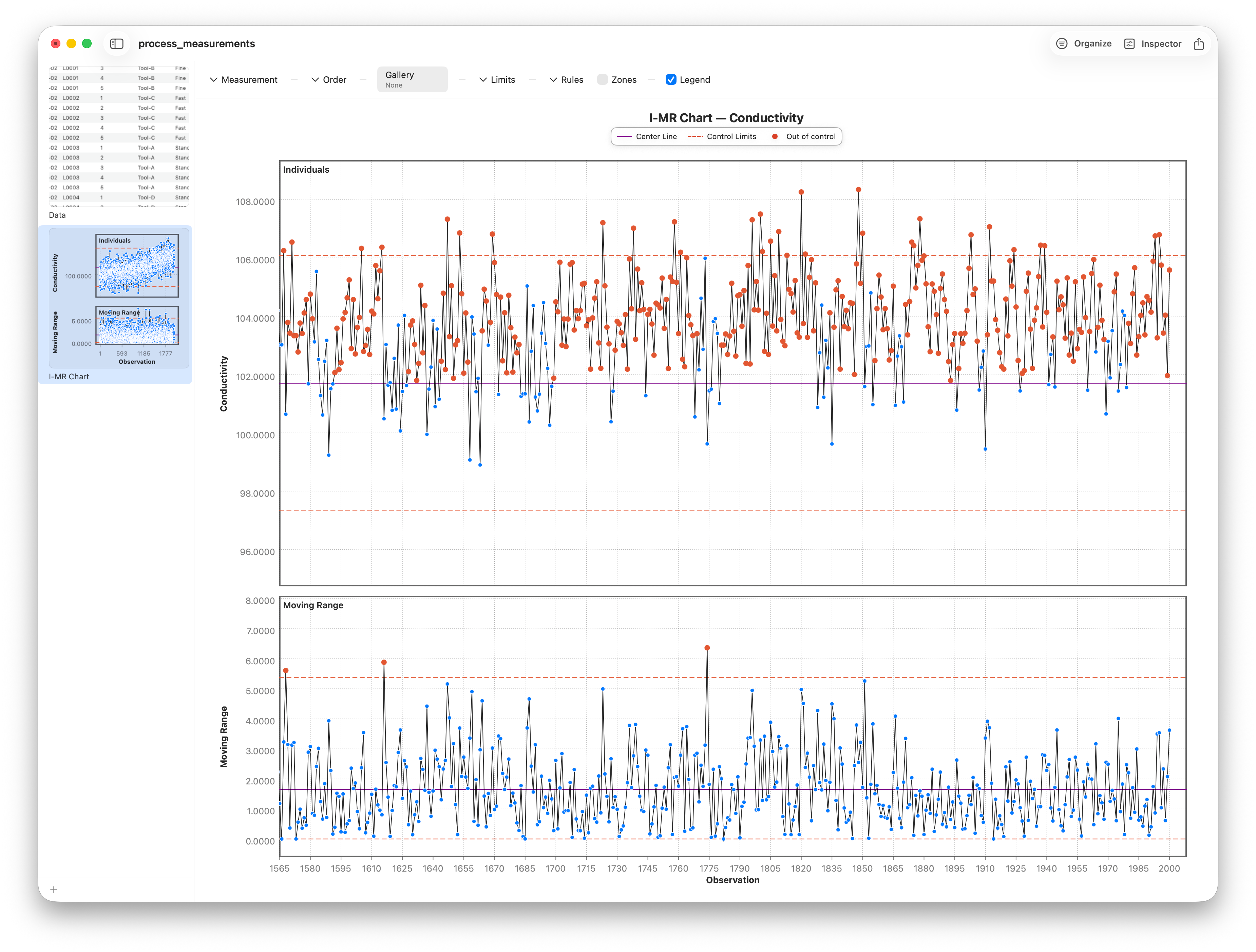
Read the individuals panel like a heartbeat. A stable process hugs the center line with random scatter inside the limits. When conductivity starts creeping upward and a point pierces the upper limit, Stratum recolors it — the out-of-control signal is impossible to miss.
X-bar: charting subgroups
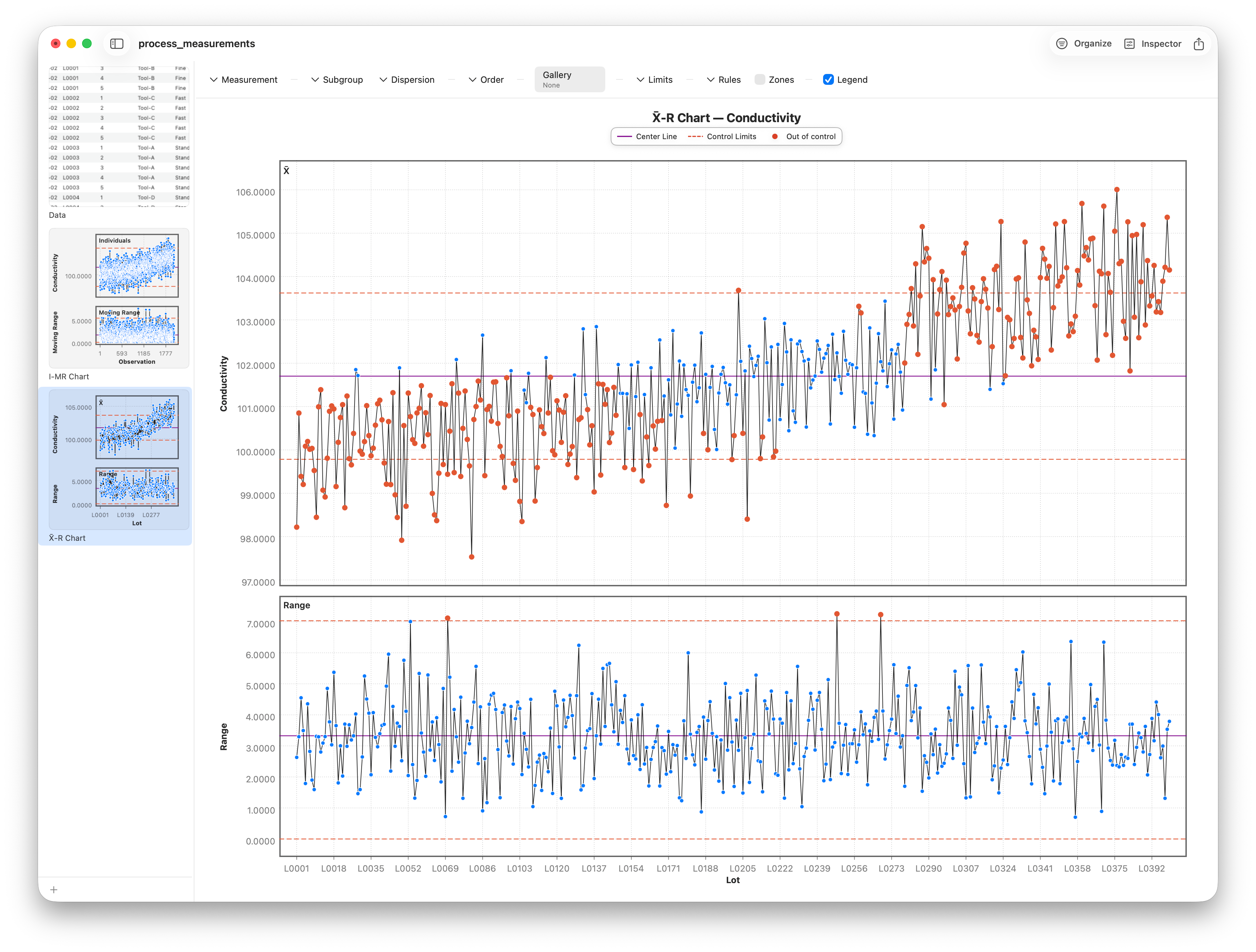
Often measurements arrive in natural batches. Here, each lot holds several wafers — a subgroup. Subgrouping is powerful: instead of plotting raw readings, you plot the average of each subgroup on the X-bar chart, under Charts ▸ Control Charts ▸ X-bar Chart. Set the subgroup to Lot and Stratum forms one mean per lot. (When you don't have a grouping column, a Subgroup Size stepper appears instead, slicing the readings into fixed-size groups — but with Lot in hand we let the data define the subgroups.) Averages are tighter and more normal than individuals, so the chart is more sensitive to a real shift in the process mean.
But the mean is only half the story. You also need to watch the spread within each subgroup, so the X-bar chart always stacks a companion panel beneath the means. How that spread is estimated is set by the Dispersion picker — Auto, Range (R), or StdDev (S). With small subgroups the R option tracks the range — the simple high-minus-low within each lot.
For larger subgroups the range wastes information — it only uses two points. The S option uses the full standard deviation of each subgroup instead, a more efficient measure of spread. Leave Dispersion on Auto and Stratum picks R or S for you based on subgroup size; set it explicitly to force one or the other.
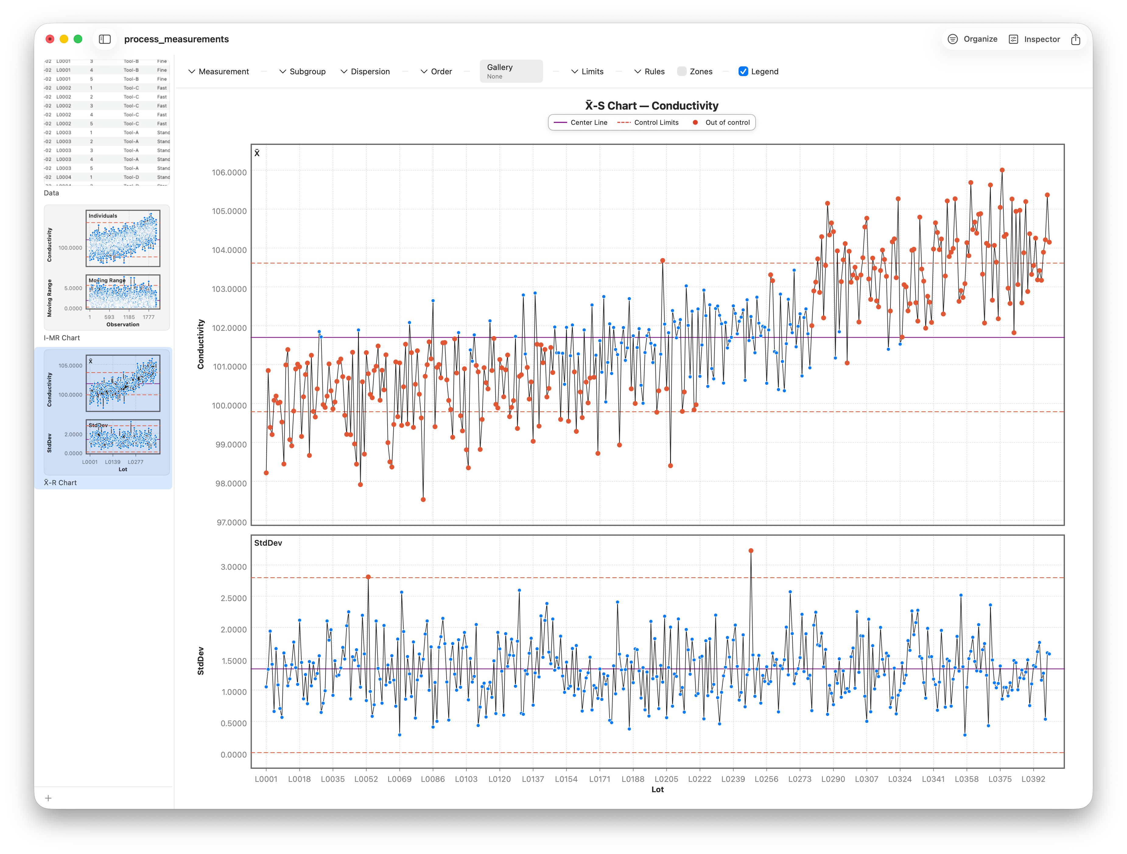
Always read the spread chart first. If the within-subgroup variation isn't stable, the limits on the means are built on sand and can't be trusted. Spread in control, then means in control — that's the order.
Follow along
- Dataset
- process_measurements.csv
- You'll use
- I-MR on Conductivity (Measurement picker), and the X-bar chart using Lot as the subgroup, with the Dispersion picker set to Auto / Range (R) / StdDev (S)
- Up next
- Lesson 20 — Control Charts II: Attribute charts & Nelson rules
I-MR and X-bar cover measured, continuous data. But plenty of quality data is counted, not measured — how many units failed, how many particles landed. Those need a different family of control charts, and that's where we go next.