 Stratum
Control Charts II: p, np, c, u Charts & Nelson Rules
Not everything you monitor is measured on a scale. Sometimes you're counting: how many units failed, how many particles landed. Counted data needs its own family of control charts — and a richer set of rules for reading them.
The Shewhart charts in the last lesson all assumed variable data — a continuous measurement like thickness or conductivity. But a huge amount of quality data is attribute data: counts and pass/fail outcomes. Did the unit pass inspection? How many defects on this board? You can't average a yes/no, so these counts get their own control charts, built on different probability models. This lesson covers the four classic attribute charts and, just as important, the rules that read patterns inside the limits.
Counting failures: the P chart
When each item is either good or bad, the natural statistic is the fraction failing in each sample. The P chart, under Charts ▸ Control Charts ▸ P Chart, plots that proportion. Its limits come from the binomial distribution — the math of independent yes/no trials — so the chart automatically knows how much a fraction should wobble for a given sample size. Set Value (the defectives) to Fails and Sample Size to UnitsInspected to chart the failures out of units inspected.
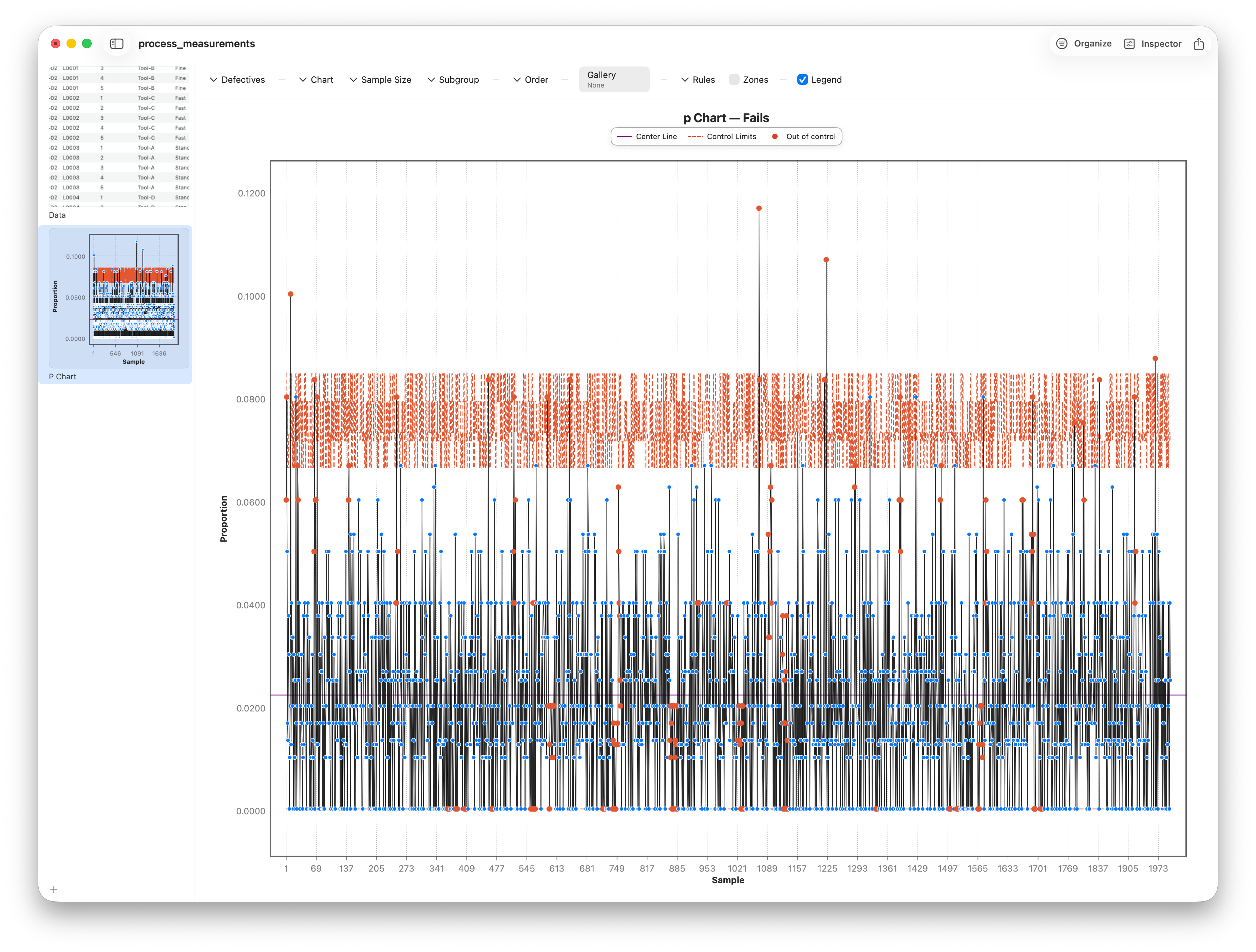
If every sample has the same size, the np variant is the simpler cousin: it plots the raw count of failures rather than the fraction. It lives inside the P Chart — flip the Chart picker from p (proportion) to np (count). Same information, different units on the axis. Reach for np when your sample size is constant and you'd rather read whole counts.
When sample size varies, limits stair-step
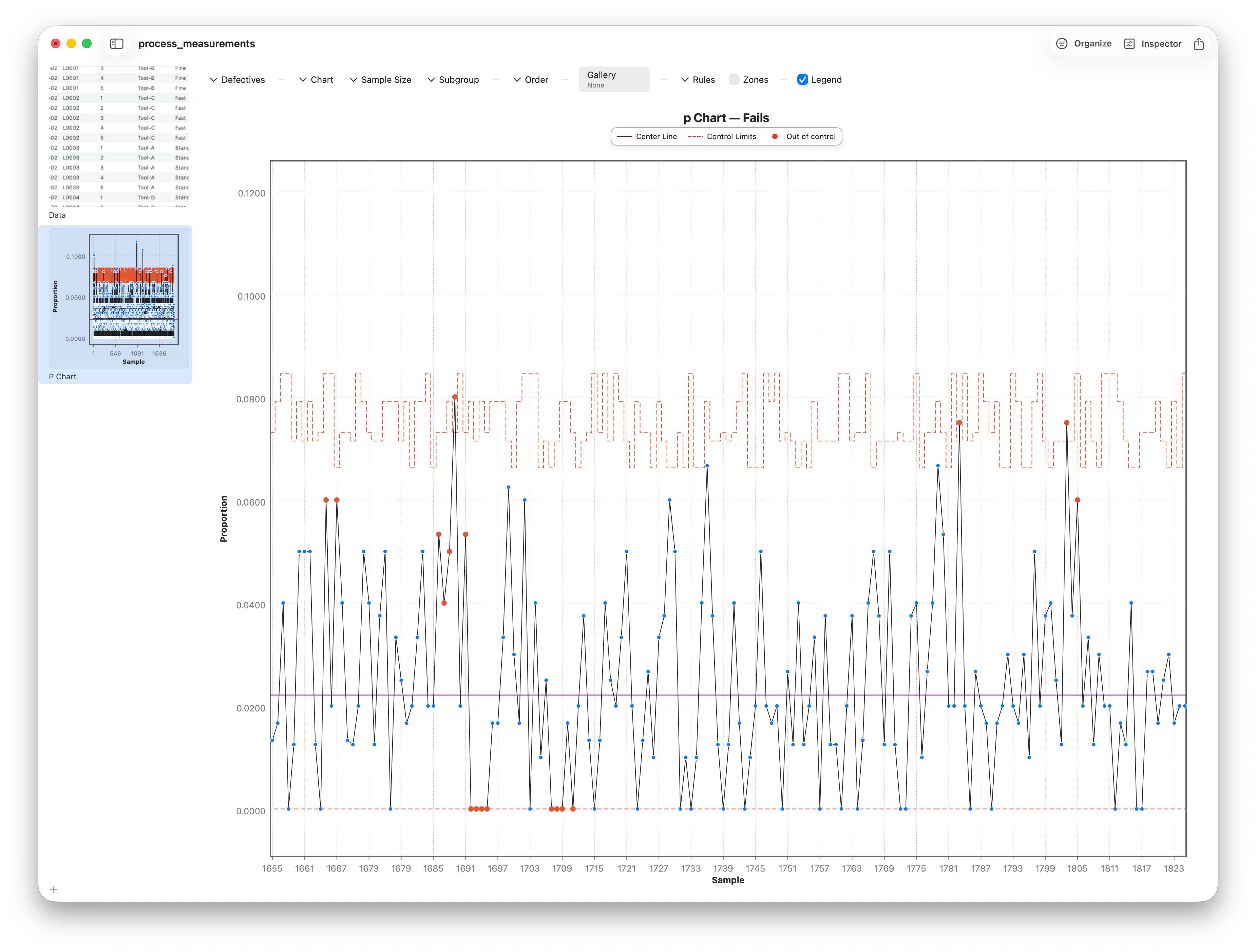
Real inspection batches are rarely the same size. Here's the elegant part: because the binomial spread depends on sample size, a larger sample gives tighter limits and a smaller one gives wider limits. Stratum computes the limits per point, so when the sample size changes, the control limits visibly stair-step in and out along the chart.
Counting events: the C chart (and u)
Failures-out-of-a-sample is one kind of count, but some things you just tally as events: particles on a wafer, scratches on a panel, flaws per length of cable. These follow the Poisson distribution rather than the binomial, and they get the C chart, under Charts ▸ Control Charts ▸ C Chart.
The c variant plots the raw count of events per unit, assuming each unit is the same size. Set the count to ParticleCount — a textbook Poisson tally.
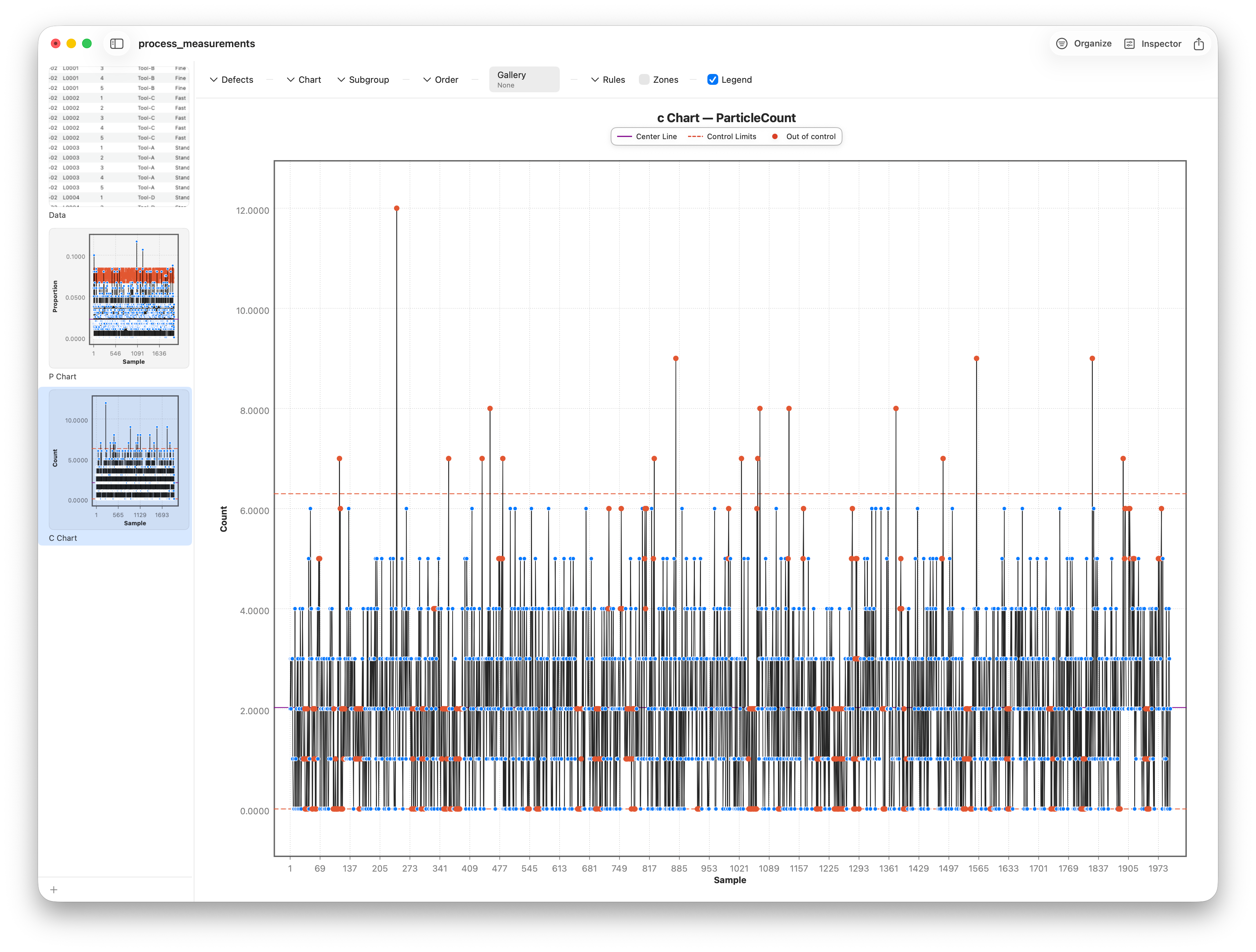
The C Chart's Chart picker also offers a u variant — the C chart's flexible sibling. It plots the rate of events per unit when the inspected area or count varies from sample to sample, with limits that stair-step just like the p chart's. The u variant needs a Units column giving each sample's inspected size, though, and this dataset doesn't have one — so for the worked example we stay on c.
Beyond a single point: the Nelson rules
A point outside the limits is the obvious alarm — but it's not the only kind of signal. A process can stay inside the limits and still misbehave: nine points in a row on one side of the center line, a steady upward run, a hugging-the-center pattern that's suspiciously calm. These non-random patterns are evidence of a special cause even without a single out-of-limit point.
The Nelson rules are eight standard tests for exactly these patterns — runs, trends, zone violations, and oscillations. Stratum lets you toggle each rule on or off and flags the points that trip it, so you can dial in how sensitive you want the chart to be.
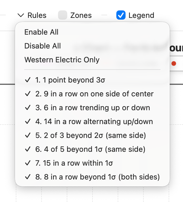
Turn on more rules and you catch subtler shifts sooner, at the cost of more false alarms; turn on fewer and you stay quiet until something is unmistakable. There's no universally right setting — it's a sensitivity dial you tune to the cost of a miss versus the cost of a false alarm in your process.
Follow along
- Dataset
- process_measurements.csv
- You'll use
- the P Chart (p / np) with Value = Fails and Sample Size = UnitsInspected, the C Chart (c) on ParticleCount, and the eight Nelson-rule toggles
- Up next
- Lesson 21 — Control Charts III: CUSUM & EWMA
The charts so far are quick to flag a big jump but slow to notice a small, sustained drift. The final control-chart lesson introduces two designs built for exactly that — the cumulative sum and the exponentially weighted moving average.