 Stratum
Control Charts III: CUSUM & EWMA for Small Shifts
A Shewhart chart is great at catching a sudden jump. But a slow, small drift — the kind that creeps in over weeks — can hide in plain sight for ages. Two specialized charts are built to catch exactly that.
The control charts so far judge each point on its own: is this value beyond the limits? That makes them quick to flag a big, sudden jump, but oddly blind to a small, sustained shift. If a process drifts up by less than a standard deviation, each individual point still looks plausible, and the chart can stay silent for dozens of samples. When the cost of a slow drift is high — a process slowly walking off target — you want a chart with memory. Both charts in this lesson have it.
The cumulative sum chart
The first design is the cumulative sum chart, usually called CUSUM, under Charts ▸ Control Charts ▸ CUSUM Chart. Instead of plotting each value, it plots a running total of how far each point sits from the target. When the process is on target, the deviations are random — some positive, some negative — and they cancel out, so the cumulative sum hovers near zero. But the moment the process drifts even slightly, the deviations stop canceling: they all lean the same way, and the running total starts to climb in a clear, persistent slope.
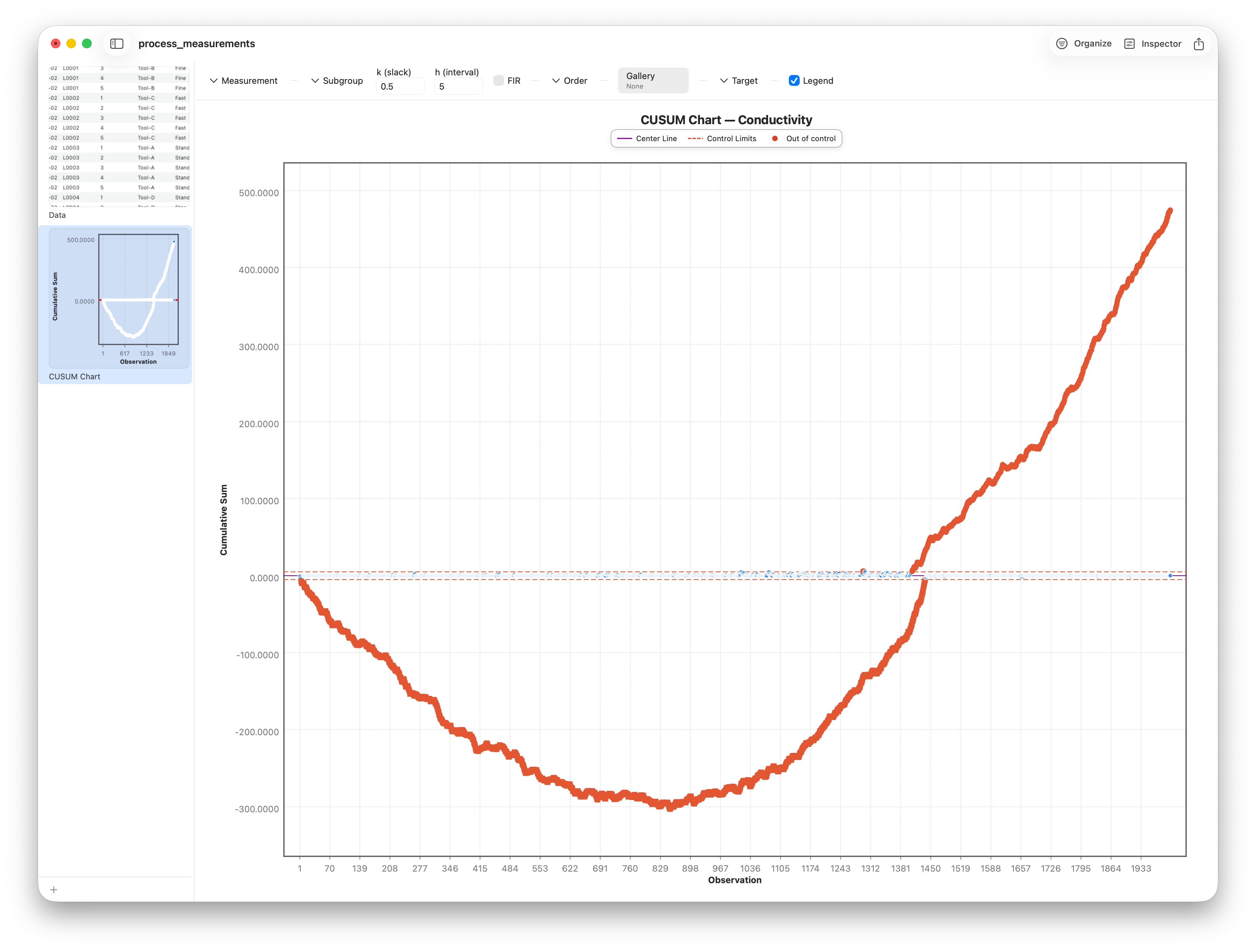
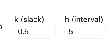
That accumulation is what makes a small shift visible early. A drift too gentle to push any single point past a Shewhart limit shows up as an unmistakable trend in the cumulative sum. Stratum uses the tabular two-sided CUSUM: two running sums set by a k (slack) field — how big a drift to ignore as noise — and it signals when either sum crosses the h (interval) decision boundary, the CUSUM equivalent of a control limit.
The EWMA chart
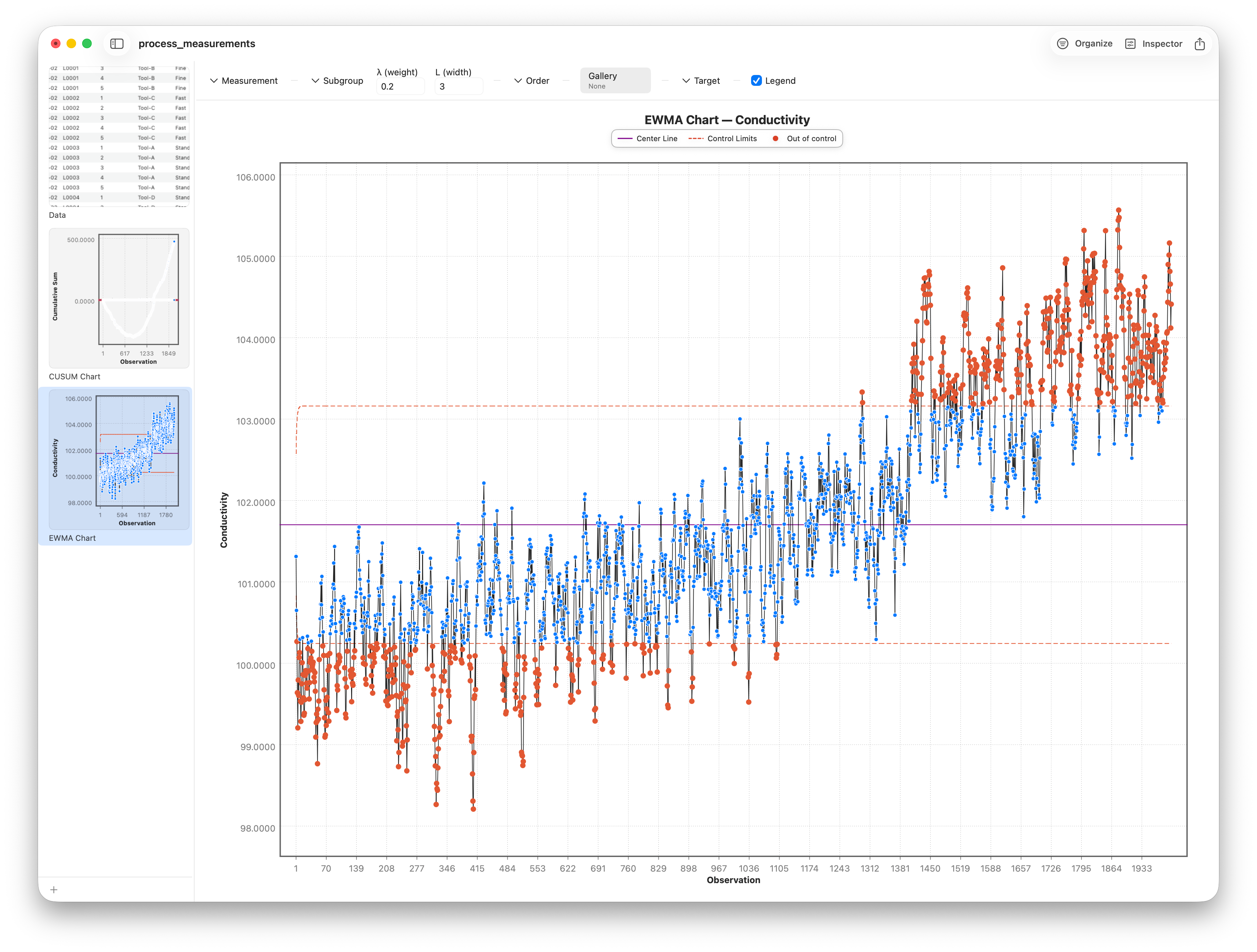
The second design is the EWMA chart — the exponentially weighted moving average — under Charts ▸ Control Charts ▸ EWMA Chart. It plots a special moving average where the newest point counts the most and older points fade in influence, geometrically, the further back they are. The result is a smooth line that carries memory of the recent past, so a sustained shift drags it steadily across the control limit rather than waiting for one dramatic point.
Where the cumulative sum keeps a hard running total, the EWMA keeps a soft, fading one — every new reading nudges the line a little, and the influence of any single point decays smoothly into the past. That makes the EWMA forgiving of one-off blips while still being quick to register a genuine, persistent change in level. It's often the easiest of the memory charts to read, because it stays on the same scale as your original measurement.
Tuning sensitivity with lambda
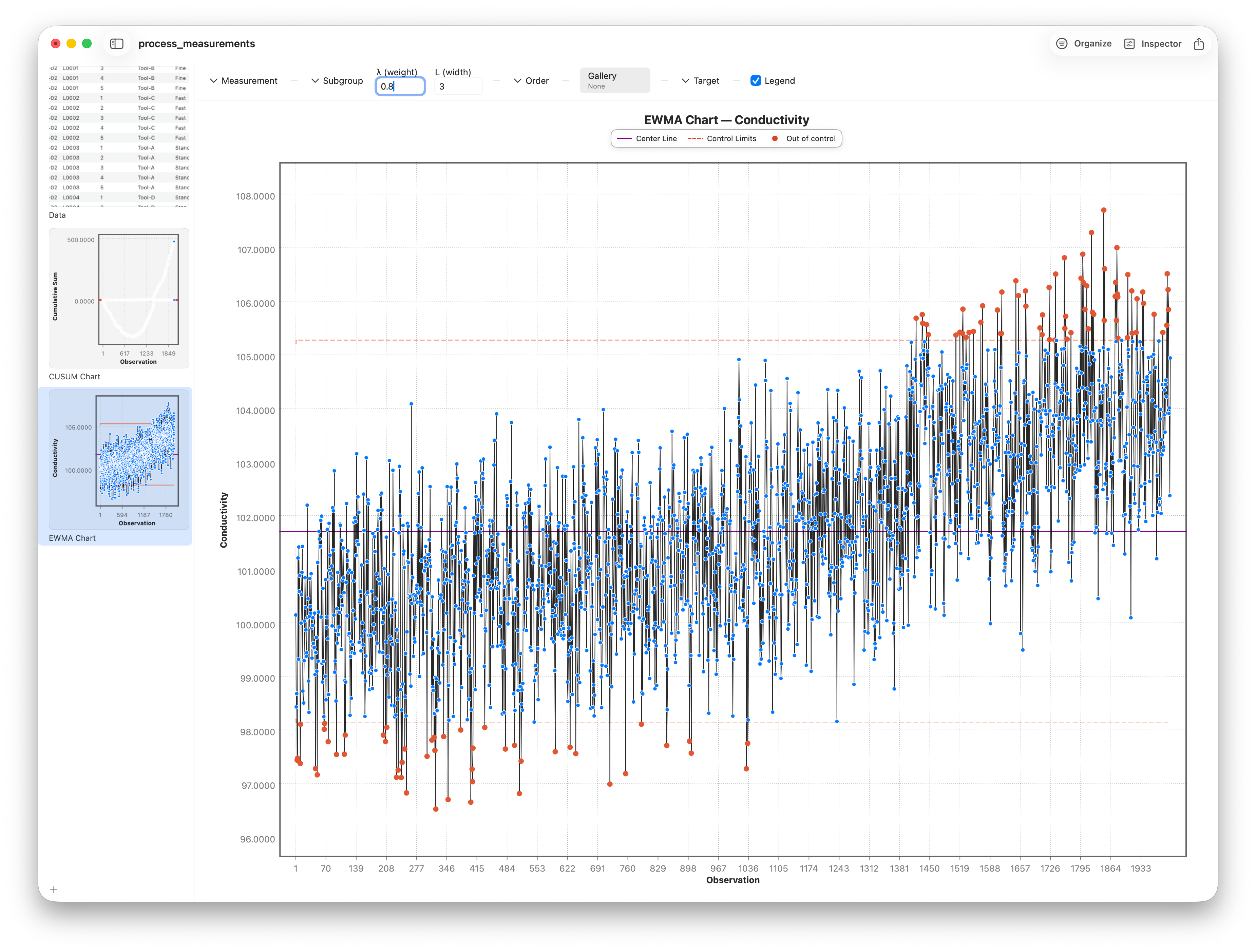
The EWMA's behavior is governed by one smoothing parameter, lambda, between zero and one, entered in the λ (weight) field (it defaults to 0.2). It sets how fast old data fades. A small lambda gives the chart a long memory — it leans heavily on history, smooths aggressively, and is exquisitely sensitive to small, slow shifts. A large lambda forgets quickly and behaves more like an ordinary individuals chart, reacting to recent points. Type a smaller or larger lambda and watch the line tighten or loosen. A companion L (width) field sets how many sigma out the control limits sit.
One more refinement, back on the CUSUM chart: the FIR (fast-initial-response, or head-start) toggle. It seeds the cumulative sums with a non-zero starting value so that if the process is already off target when monitoring begins, the chart signals quickly instead of taking many samples to build up. It's a small touch that pays off when you switch a chart on mid-process. The EWMA gets the same fast-startup behavior automatically — its control limits start tight and widen over the first several samples, so an early shift trips the chart without waiting for the average to warm up.
Follow along
- Dataset
- process_measurements.csv
- You'll use
- The CUSUM chart on Conductivity (with its slow drift) and its k/h/FIR controls, the EWMA chart, and the λ (weight) and L (width) fields
- Up next
- Lesson 22 — PCA & Clustering
That completes the control-chart family — from the workhorse Shewhart charts to the memory-based designs for subtle drift. Next we leave process monitoring behind and turn to finding structure in many variables at once, with principal components and clustering.