 Stratum
How to Make a Box Plot on Mac & Windows (Box and Whisker in Stratum)
A box plot is the fastest way to compare groups and spot outliers at a glance. Here's how to make one on Mac or Windows in well under a minute — and how to get more out of it once you have.
You have a numeric measurement and a category that splits it into groups — house prices by neighborhood, test scores by class, cycle time by machine — and you want to see how the groups stack up. A box-and-whisker plot is built for exactly that: it shows the center, the spread, and the outliers of each group, side by side, in one compact picture. On Mac or Windows, Stratum makes one without a single line of code.
Step 1 — get your data in
Drag a CSV or Excel file onto the Stratum window, or open it from the File menu. Stratum auto-detects the delimiter, reads the header row, and infers which columns are numeric and which are categorical — so a column like ListPrice is ready to summarize and Neighborhood is ready to group by. There's nothing to configure for a tidy file.
Step 2 — make the box plot
- Choose the Box-Whisker chart from the Charts menu.
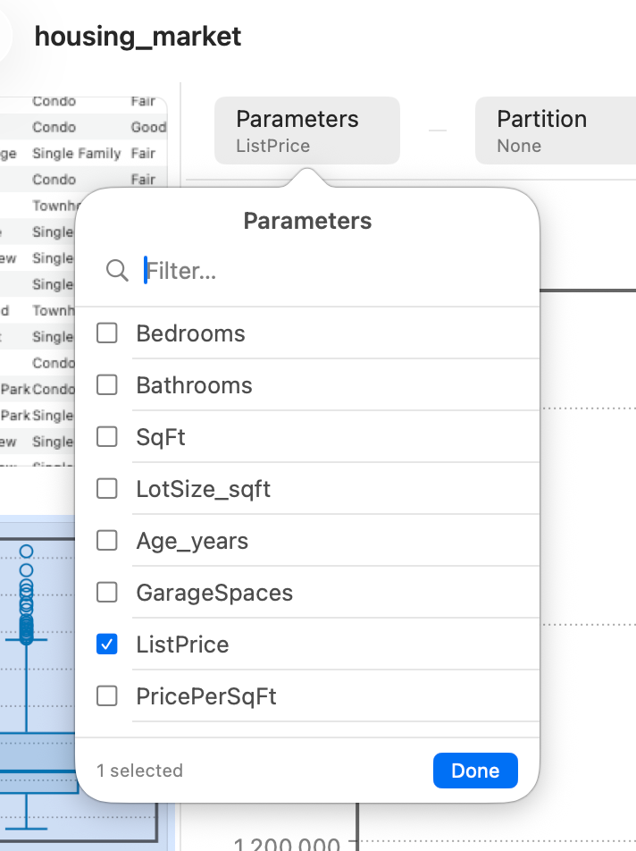
- Pick the numeric variable to summarize (the measurement).
- Pick a grouping variable to split it by (the category).
- Read the result — one box per group, all drawn to the same scale.
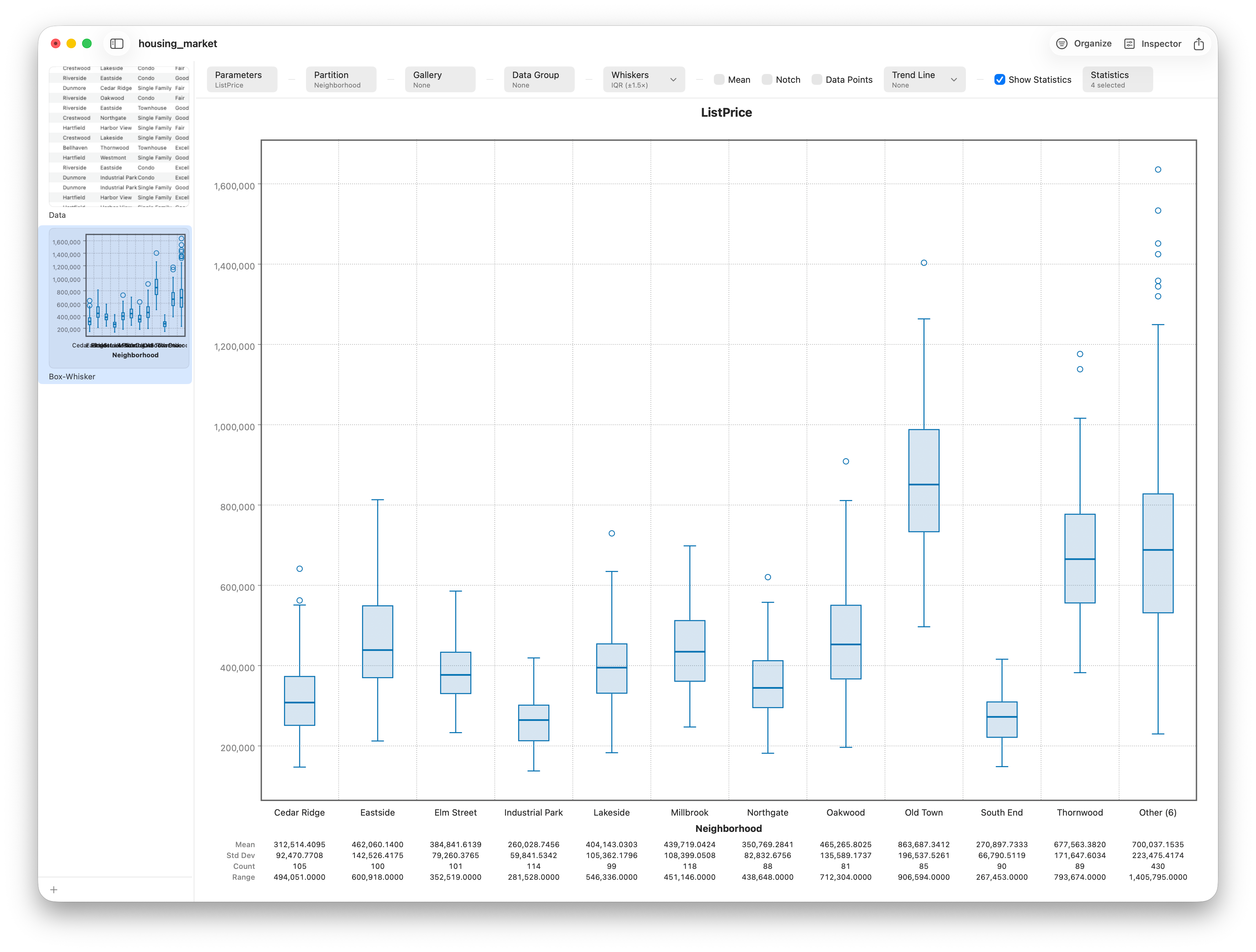
That's the whole job. If you skip the grouping variable, you get a single box for the variable as a whole; add the group and Stratum facets it into one box per category automatically.
Step 3 — read what each box shows
Every box is the five-number summary of its group:
- The line inside the box is the median (the 50th percentile).
- The box spans the interquartile range — from Q1 (25th percentile) to Q3 (75th), i.e. the middle 50% of the data.
- The whiskers reach to the most extreme points still within 1.5× the IQR of the box.
- Anything past the whiskers is drawn as an individual outlier mark.
Reading a group comparison then comes down to three glances: a higher box sits higher (larger values), a taller box is a more variable group, and a median pushed toward one end signals skew. If you want the precise meaning of every line, see Box Plots Explained.
Get more out of it
A few options turn a basic box plot into something report-ready:
- Notched boxes. Turn on notches to show an approximate 95% confidence interval around each median. When two groups' notches don't overlap, that's informal evidence their medians differ.
- See the full shape. A box plot summarizes; it can hide a distribution that's split into two clumps. When shape matters, switch to the separate Violin chart, which draws a smoothed density for each group alongside the quartiles.
- Group order. Groups are laid out alphabetically by their label. (If you need a particular order, name or recode the categories so the labels sort the way you want.)
Step 4 — export it
When the chart says what you need, export it as a PNG or PDF for a report, paper, or slide — one click, publication-ready, with no watermark. Because Stratum's grid and charts are native and virtualized, the same box plot works whether you have a few hundred rows or a few million.
That's box plots in Stratum, start to finish. For the deeper walk-through — notched CIs, density-by-group, jittered points, and styling — see Lesson 6 of the Stratum tutorial.
Frequently asked questions
Does Excel make box plots?
Excel on Mac or Windows can produce a basic box & whisker chart, but it's fiddly to configure and limited to a single layout. A dedicated stats app draws one from a numeric column plus a grouping column in two clicks, flags outliers as clickable points, and exports cleanly. See Stratum vs Excel.
What counts as an outlier on a box plot?
By the standard convention, any point more than 1.5×IQR beyond Q1 or Q3 (the box edges) is drawn as an outlier. It flags a value worth a look — not necessarily an error.
Box plot or violin plot — which should I use?
Use a box plot to compare summaries (median, spread, outliers) cleanly across many groups. Use a violin plot when the shape of each distribution matters, since a box can hide a bimodal group.
Where is the mean on a box plot?
It usually isn't shown. The line inside the box is the median, not the mean — the two only match for symmetric data, and the gap between them is itself a clue about skew. If you need the mean, read it from a summary report or add it as a separate marker.
Can I make a box plot from a five-number summary?
Stratum builds the box plot straight from your raw data and computes the quartiles for you. If all you have is a five-number summary (min, Q1, median, Q3, max), you'd plot it by hand or with a calculator, since there are no underlying rows to draw from.