 Stratum
Box Plots Explained: How to Read Quartiles, IQR and Outliers
A box plot packs five numbers and the outliers of a distribution into one small picture. Once you know what each part means, you can read a whole group comparison in a single glance.
The box plot — or box-and-whisker plot — is one of the most information-dense charts in statistics. John Tukey designed it to summarize a distribution with a handful of robust numbers: values that a few extreme observations can't throw off. Once you can read one, you can compare a dozen groups at a glance. Here's every part, in plain language — then a worked reading and the mistakes to avoid.
The five-number summary
A box plot draws five numbers:
- Minimum and maximum (within range) — the ends of the whiskers.
- Q1 (25th percentile) and Q3 (75th percentile) — the bottom and top of the box.
- Median (50th percentile) — the line inside the box.
Together these split the data into four quarters, each holding about 25% of the observations. That's the whole idea: instead of plotting hundreds of points, you plot the four boundaries between the quarters.
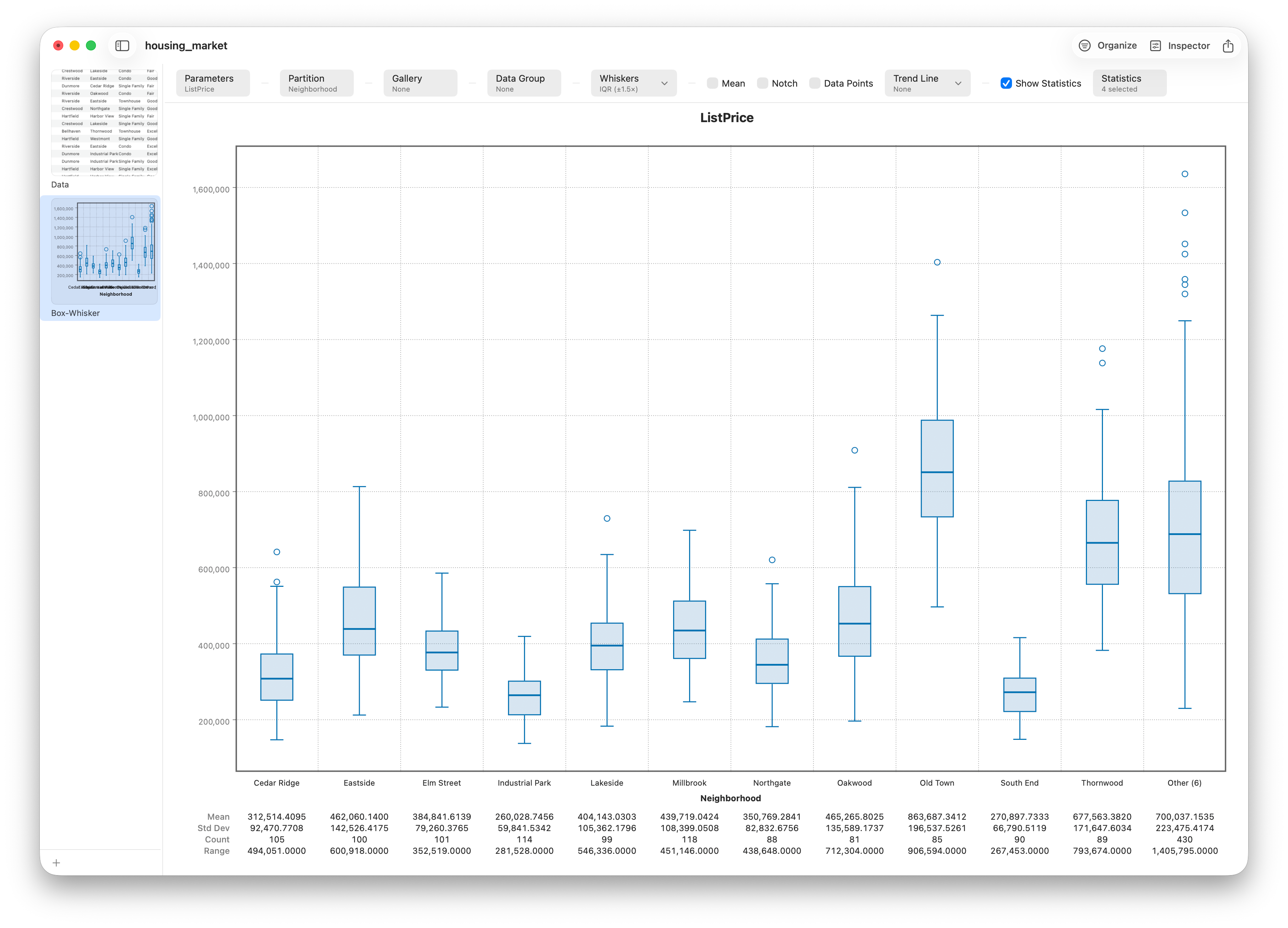
The box is the middle 50%
The box spans the interquartile range (IQR = Q3 − Q1) — the middle half of the data. The IQR is a resistant measure of spread: unlike the standard deviation, a single huge value barely moves it. A tall box means a spread-out group; a short box means a tight one. The median line's position inside the box is your first read on symmetry — centered means roughly symmetric, shoved to one side means skew.
The whiskers and the 1.5×IQR rule
The whiskers extend from the box to the furthest points that are still within 1.5 × IQR of it. Any observation beyond that distance is drawn as its own point and treated as a potential outlier. This 1.5×IQR cutoff is a convention, not a law of nature — an "outlier" by this rule is simply a value far enough from the bulk to deserve a second look. It might be a data-entry error, or the single most interesting case in your dataset. The whiskers themselves stop at real data points, so they're rarely the same length on both sides.
A worked reading
Picture house prices for one neighborhood. The median line sits at $420,000; the box runs from $360,000 (Q1) to $510,000 (Q3), so the IQR is $150,000 — half the homes fall in that band. The lower whisker reaches down to $290,000; the upper whisker stops at $720,000, and three points sit above it, out to $1.2M. What do you conclude? The typical home is ~$420k, the middle half spans a fairly wide $150k, and a few luxury listings stretch the top end. Because the median sits low in the box and the high outliers are far away, this neighborhood is right-skewed — exactly what you'd expect from a market with a handful of premium homes.
Want to see it on your own numbers? Paste a column into our free box plot maker and the box, whiskers, and outliers are drawn for you.
Why compare with box plots
Box plots shine when you line several up side by side. Three differences read instantly:
- Level — how high each median sits.
- Spread — how tall each box is.
- Skew — where the median sits within each box.
That makes them the workhorse chart for "do these groups differ, and how?" — the same question a one-way ANOVA answers formally. Read the box plot first; it tells you what to expect before you run the test.
Common misreadings to avoid
- Box height is spread, not count. A tall box doesn't mean "more data" — every box holds the same middle 50% regardless of sample size. Box plots hide how many observations each group has.
- An "outlier" isn't automatically an error. The 1.5×IQR rule just flags distance; investigate before deleting.
- Whisker length isn't the full range unless there are no outliers. When points sit beyond the whiskers, the true min/max are those outliers, not the whisker tips.
The one blind spot
A box plot only knows quartiles, so it cannot show multimodality: a group with two separate clusters looks identical to one with a single hump, as long as the quartiles match. When you suspect more than one peak, overlay the points or switch to a violin or density plot, which draw the full shape.
That's how to read one — now make one from your own data, or work through the full box & violin lesson.
Frequently asked questions
What does the line inside the box mean?
It's the median — the middle value, with half the data below it and half above. It's not the mean; the gap between the two is itself a clue about skew.
What is the IQR on a box plot?
The interquartile range is Q3 − Q1 — the height of the box, covering the middle 50% of the data. It's a measure of spread that resists outliers.
Why are some points drawn outside the whiskers?
Those are outliers: observations more than 1.5×IQR beyond the box. The whiskers stop at the last point inside that fence, and anything past it is marked individually.
Can a box plot show how many data points there are?
No — that's its main limitation. Every box shows the same middle 50% regardless of sample size, and two groups with very different counts can look identical. Add jittered points or a violin if count and shape matter.
Box plot, histogram, or violin — when do I use each?
Box plot to compare many groups' summaries side by side; histogram to see one variable's detailed shape; violin when you need shape and a group comparison (it shows bimodality a box plot hides).
Why is a box plot better than a bar chart?
A bar chart shows one number per group (usually a mean or total); a box plot shows the whole distribution — center, spread, skew, and outliers. To compare how groups vary, not just their average, the box plot carries far more information in the same space.
Where are box plots used in real life?
Anywhere groups get compared: house prices by neighborhood, test scores by class, salaries by role, response times by server, lab measurements by batch. They're a staple in quality control, science, finance, and quick exploratory looks at how a measurement differs across categories.