 Stratum
How to Make a Histogram on Mac & Windows
A histogram is the quickest way to see the shape of a single variable — where the values pile up, how spread out they are, and whether they're skewed. Here's how to make one on Mac & Windows.
A histogram (sometimes called a frequency distribution) buckets a numeric variable into ranges and draws a bar for how many values fall in each. It answers the first question you should ask of any measurement: what shape is it?
Make it in three clicks
- Drag your CSV or Excel file onto Stratum.
- Choose the Histogram chart and pick a numeric column.
- Read the bars — tall where values cluster, short in the tails.
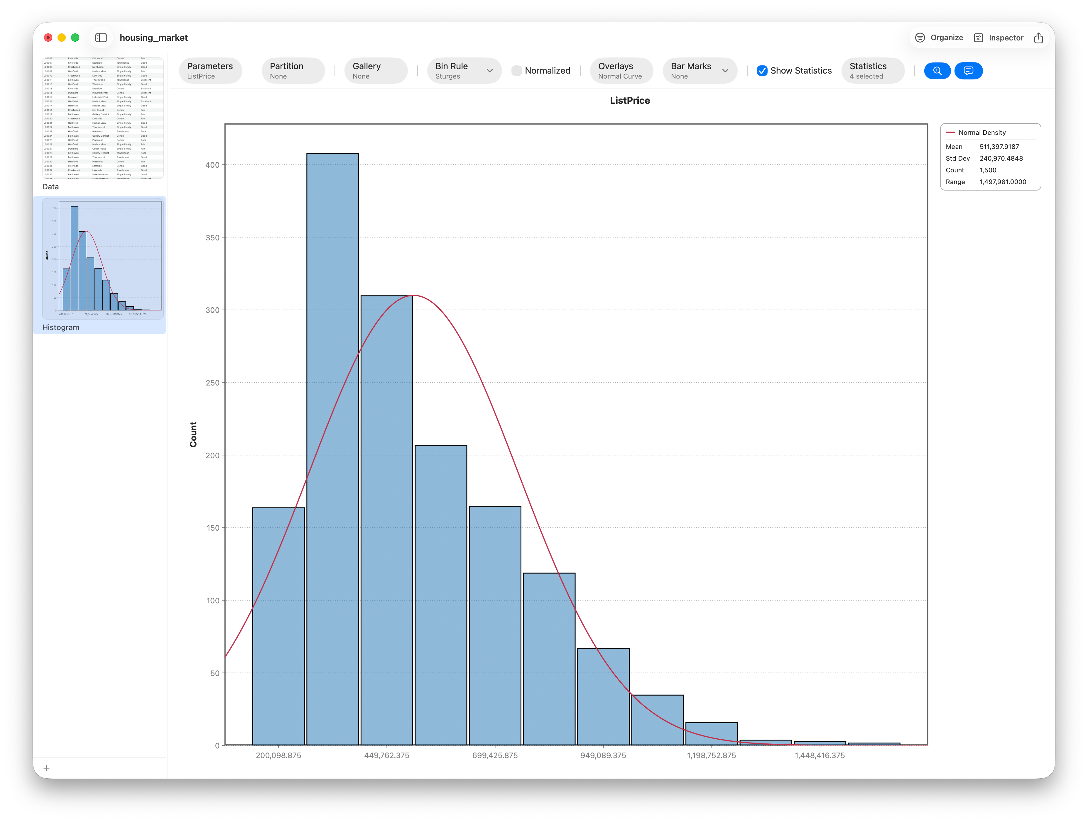
Choosing the bins
Bin width is the one real decision. Too few bins hides detail; too many turns the shape into noise. Stratum picks a sensible default and lets you switch between standard rules (Sturges, Freedman–Diaconis) or set the count yourself. When in doubt, try a couple and keep the one whose shape is stable.
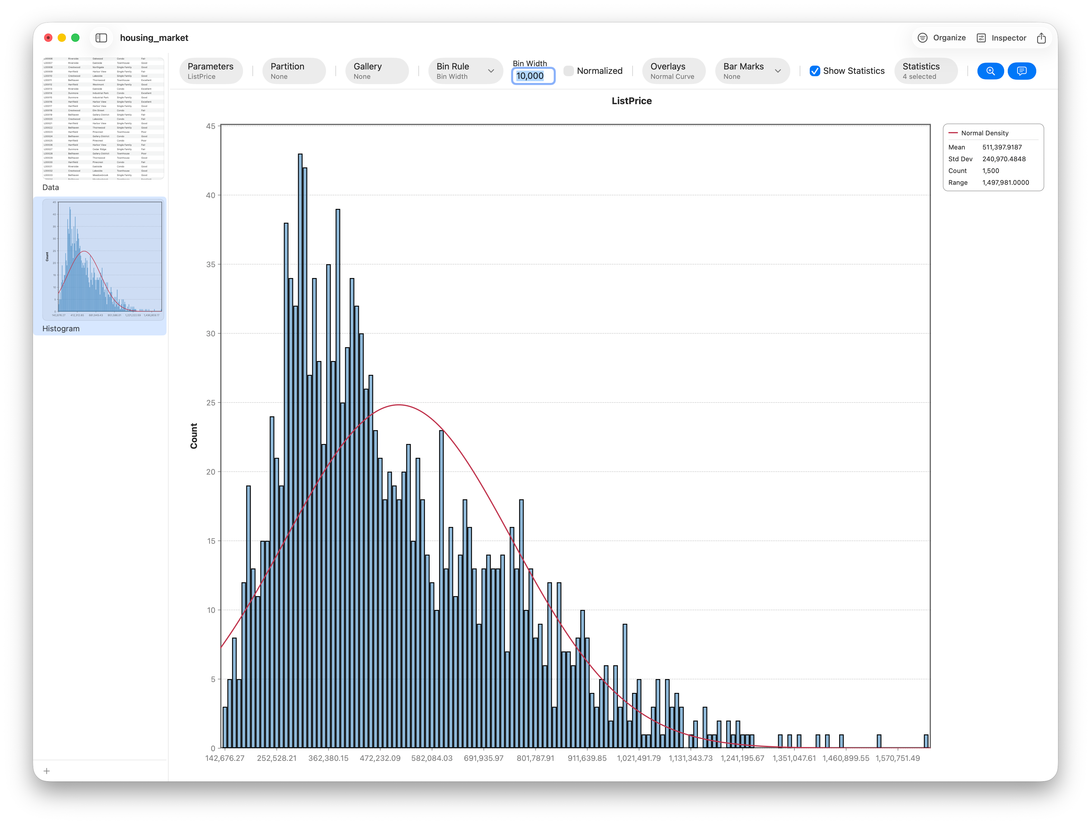
Reading the shape
Four shapes cover most data: bell-shaped (symmetric, normal-ish), right- or left-skewed (a long tail on one side — the signature of prices and incomes), bimodal (two peaks, often two hidden groups), and uniform (flat). Add a normal curve or a smooth KDE overlay to judge how close to normal it really is.
Export it
One click sends a clean PNG or PDF to your report. For the full walk-through — KDE bandwidth, group faceting, and overlays — see Lesson 5.
Frequently asked questions
What's the difference between a histogram and a bar chart?
A histogram shows the distribution of one numeric variable — the bars touch because the axis is a continuous number line. A bar chart compares separate categories, with gaps between the bars.
How do I choose the number of bins for a histogram?
Start with an automatic rule (Sturges or Freedman–Diaconis) and adjust. Too few bins hides structure; too many adds noise. Pick the bin width whose overall shape stays stable as you nudge it.
When should you not use a histogram?
With very few data points (the shape is unreliable), or for categorical data — use a bar chart or Pareto for categories. Histograms also hide individual values, so pair with a box plot when outliers matter.
Is a histogram the same as a frequency distribution?
Effectively yes — a histogram is the graph of a frequency distribution (counts per value-range). Stratum builds it straight from your raw data.