 Stratum
MANOVA, Chi-Square & Differences: Multivariate and Categorical Tests
Not every question has one number for an answer. Sometimes you measure several responses together; sometimes your variables are categories, not quantities. This lesson covers the three tests that handle exactly those cases — and a fourth that simply ranks what differs most.
So far we've compared groups on a single numeric response. But a process recipe doesn't just change film thickness — it might shift conductivity and resistivity too, and those three move together. And often the variables you care about aren't numbers at all: which tool produced a scrapped lot, or which plan a satisfied customer chose. Stratum has a purpose-built test for each situation.
MANOVA: several responses at once
You could run a separate ANOVA on thickness, on conductivity, and on resistivity — but that repeats the multiple-testing problem, and worse, it ignores that the three responses are correlated. MANOVA (Multivariate Analysis of Variance) tests them jointly. Open Analyze ▸ MANOVA, set Responses to Thickness_nm, Conductivity, and Resistivity, and Sub-Groups to Recipe: does the recipe shift the whole trio at once?

Instead of a single F, MANOVA reports four multivariate statistics — Wilk's Λ, Pillai's trace, Hotelling-Lawley, and Roy's largest root. Each summarizes how much the group means separate across all responses together, and converts to an approximate F and p-value. The payoff: a single, honest test that uses the correlations between responses instead of pretending they don't exist.
The chi-square test of independence
Now switch to categories. Are scrap dispositions related to which tool ran the lot — or are they independent? Open Analyze ▸ Contingency Table and set Sub-Group (Rows) to Tool and Parameter (Columns) to Disposition. The table cross-tabulates the two categorical variables, counting how many lots fall in each cell.
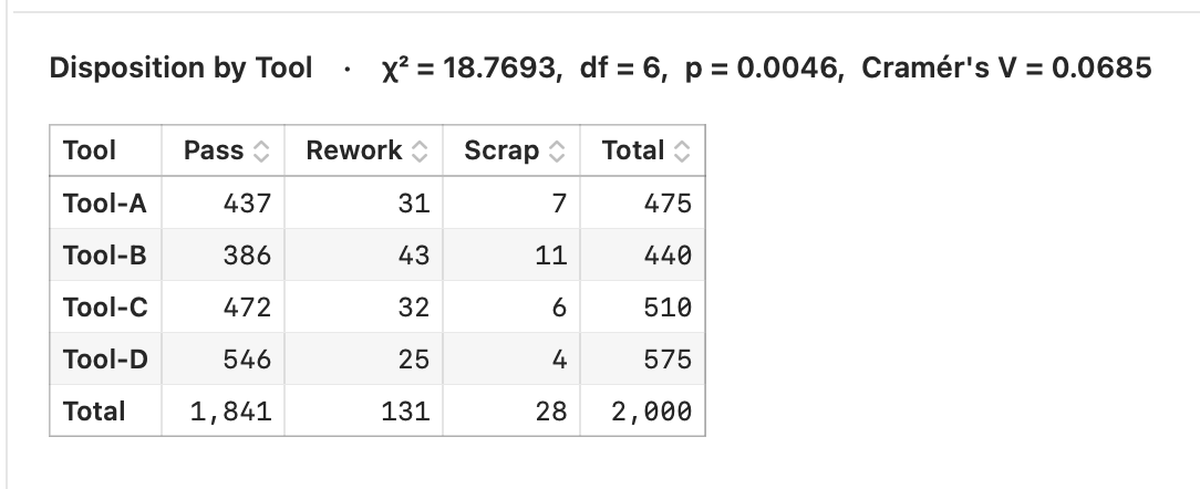
The chi-square test of independence asks whether those counts could plausibly arise if the two variables were unrelated. It compares the observed count in each cell to the expected count you'd predict under independence. The bigger the gap between observed and expected, the larger the chi-square statistic, and the smaller its p-value — evidence that tool and disposition really are linked.
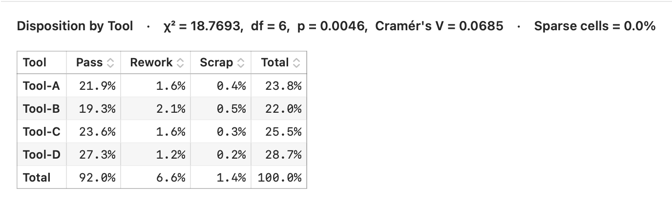
As with the t-test, significance isn't the whole story. Stratum reports Cramér's V as an effect size — a 0-to-1 measure of how strong the association is, independent of sample size. Here, tool and disposition are significant but only weakly associated (Cramér's V ≈ 0.07), a useful reminder that a small p-value doesn't guarantee a strong relationship. You can also turn on the Sparse Cell % toggle: when too many expected counts drop below about five, the chi-square approximation gets shaky, and you should read the result with caution.
Differences: rank what stands out
When you have many group-by-parameter combinations to screen, testing each one by hand is tedious. Stratum's Differences analysis runs the chi-square comparison across every Sub-Group and Parameter, then sorts the results most-significant-first — so the combinations that differ most float straight to the top.
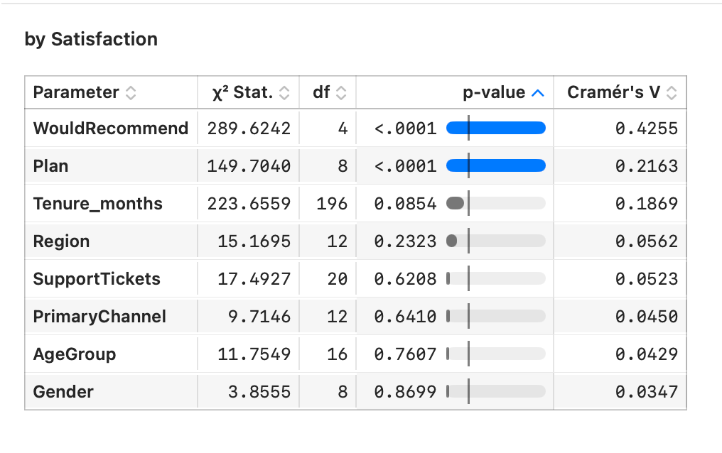
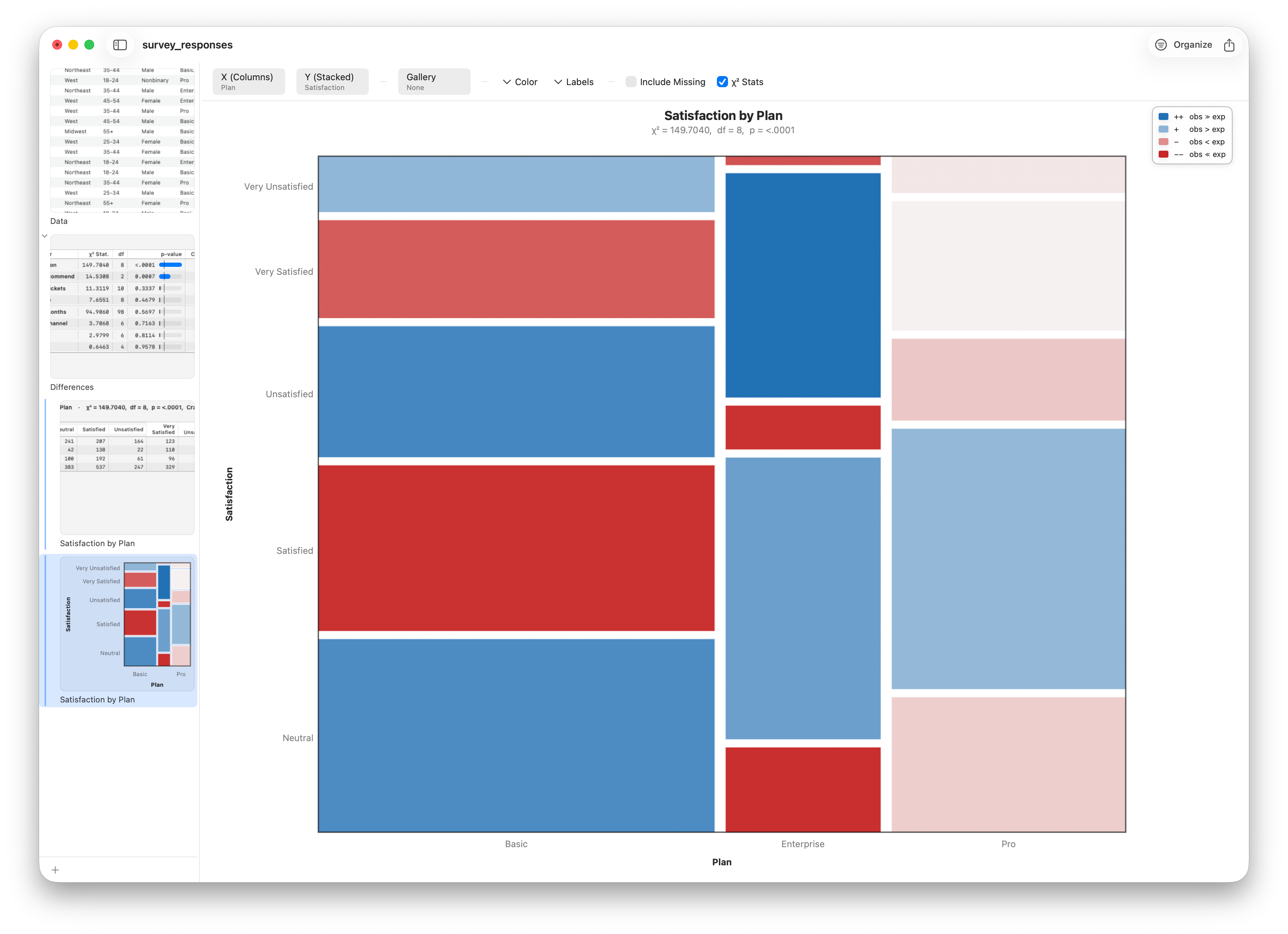
It's a triage tool: instead of staring at dozens of tables, you scan one ranked list. For a genuinely strong association, switch to the survey data — Plan against Satisfaction (Cramér's V ≈ 0.22), where Enterprise customers are clearly the most satisfied — and let that row lead you into the picture.
Drill down to a mosaic
Spot an interesting row and you'll want to see it. Right-click the Plan × Satisfaction row and choose Drill Down to Mosaic Plot — a tiled picture of the contingency table where each tile's size reflects its count — or Show Contingency Table for the raw counts. A number tells you something is there; the mosaic shows you what.
Follow along
- Datasets
- process_measurements.csv · survey_responses.csv
- You'll use
- MANOVA (three responses by recipe), a chi-square contingency table (tool by disposition), the Differences ranking, and mosaic drill-down
- Up next
- Lesson 17 — Linear Regression
We've now compared groups every way there is — two at a time, many at once, on one response or several, numbers or categories. Next we change the question entirely: instead of asking whether groups differ, we'll model how one variable predicts another, with linear regression.