 Stratum
PCA, Clustering & Parallel Coordinates: Reduce Dimensions and Find Groups
When a dataset has a dozen numeric columns, no single ordinary chart can show it all. A parallel coordinates plot lets you see every dimension at once; principal component analysis and clustering then compress those dimensions into a readable picture and find the natural groups hiding inside.
The UCI Wine dataset records thirteen chemical measurements for 178 wines. That's far too many axes to plot on the usual two, and eyeballing thirteen columns in a table for patterns is hopeless. There are two ways forward: show all thirteen axes at once and accept some clutter, or find a smaller set of axes that captures most of what matters. We'll do both — starting with the honest, everything-on-screen approach, then reaching for principal component analysis when it gets too busy.
Seeing every dimension at once: the parallel plot
A parallel coordinates plot refuses to throw anything away. It stands your variables up as a row of vertical axes, side by side, and draws each sample as a line that threads across them — passing through its value on every axis. Thirteen chemical measurements become thirteen parallel axes; each wine is one polyline crossing all of them. From Charts ▸ Parallel Plot, use Add Axis to lay down the thirteen numeric variables, then set Color By to Class, the cultivar label.
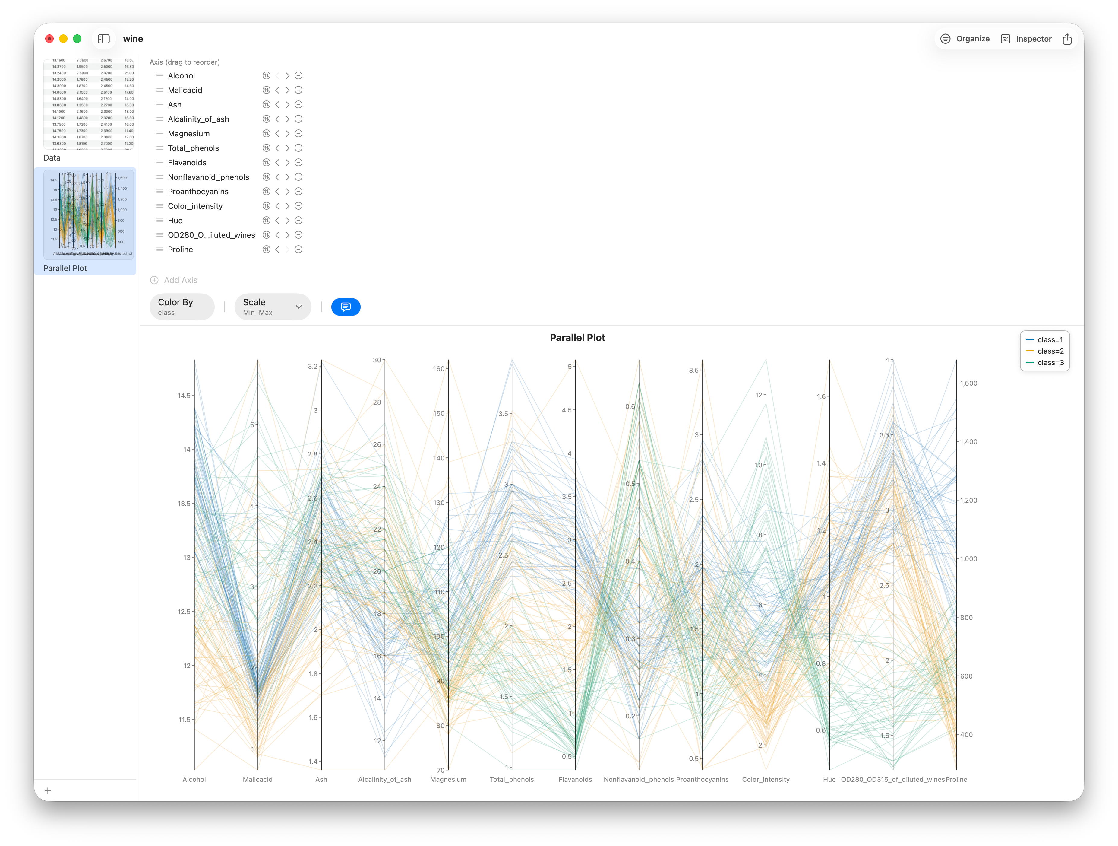
Because each axis is scaled to its own range, a variable in the hundreds and one in fractions sit comfortably side by side — the Scale control handles that normalization. Read the plot by looking for banding: where one color's lines sweep high while another sweeps low, that variable separates the cultivars. Drag the axes into a new order to bring related variables together, and the structure gets easier to see. It's a genuinely powerful exploratory view — but with 178 lines over thirteen axes it also gets dense fast, and that density is exactly the itch principal component analysis scratches: distilling thirteen axes down to the two or three that carry the most information.
What principal component analysis actually does
Principal component analysis builds new axes — components — out of weighted combinations of your original variables. The first component points in the direction of greatest variance in the data; the second points along the next-greatest variance at a right angle to the first; and so on. Because the early components soak up most of the variation, you can often keep just two or three and throw the rest away with little loss.
The scree plot: how many components to keep
The scree plot shows how much variance each component explains, in descending order. You're looking for the "elbow" — the point where the bars flatten out and additional components stop buying you much. Everything before the elbow is signal worth keeping; everything after is mostly noise.
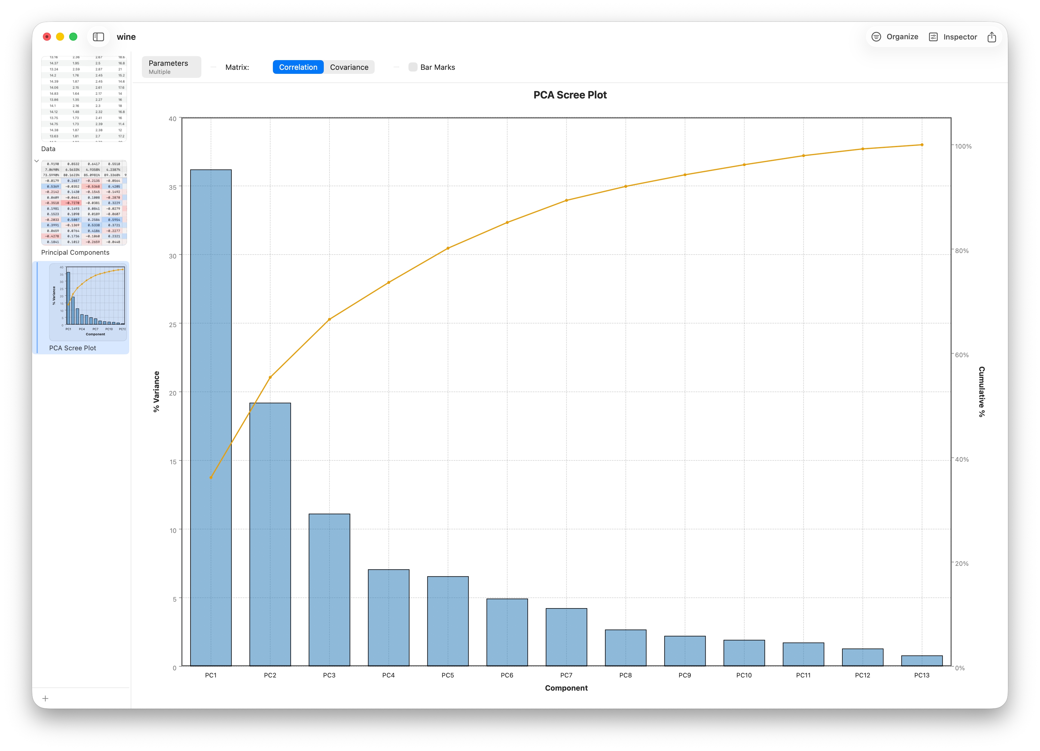
For the wine data, the first two or three components together explain the bulk of the variance — enough to plot the samples in two dimensions and trust that you're seeing the real structure.
Reading a biplot
The biplot is the payoff. It plots every sample as a point in the space of the first two components (the scores), and overlays an arrow for each original variable (the loadings). Together they let you read the data two ways at once.
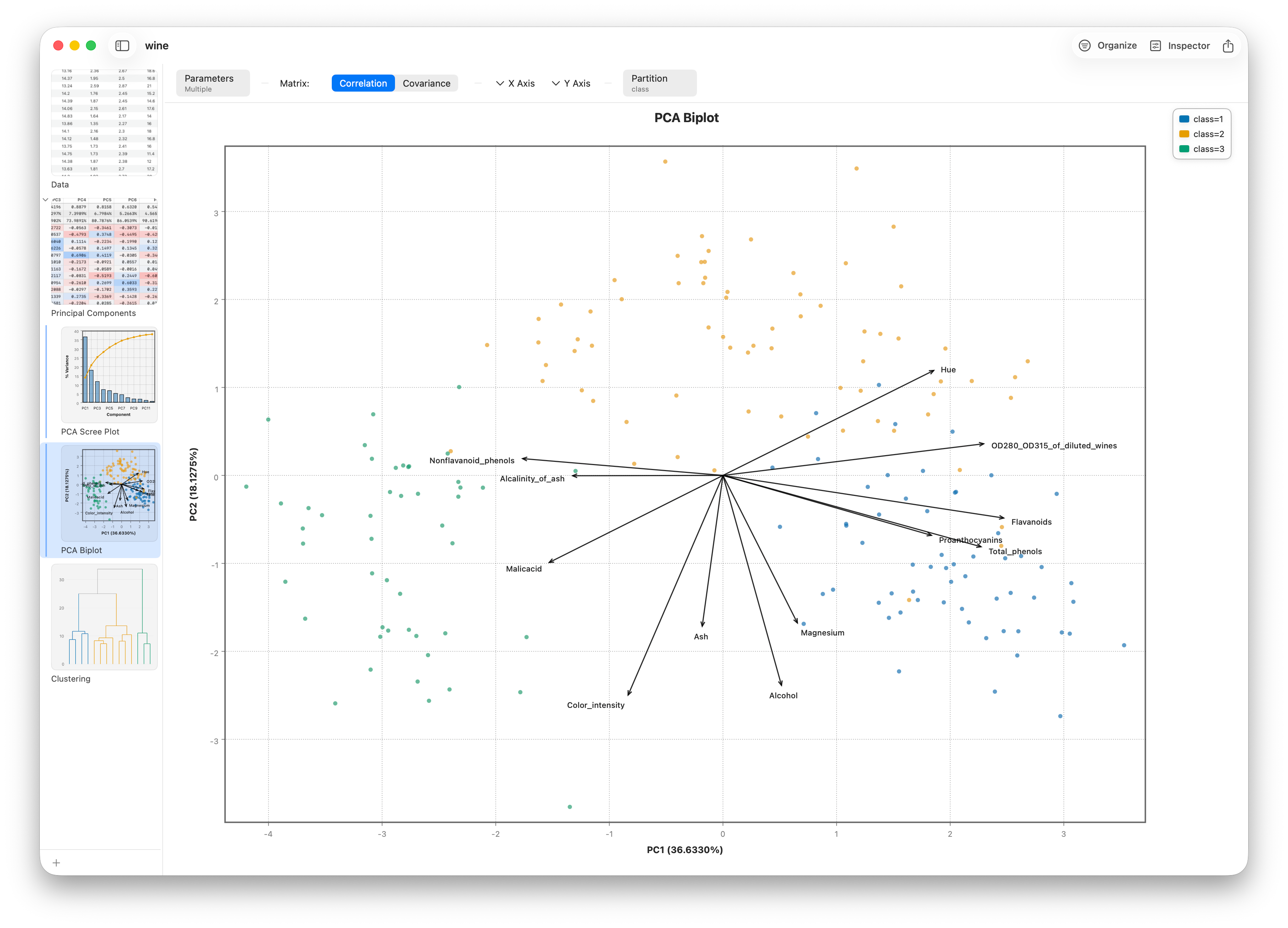
Points that cluster together are similar wines. An arrow's direction tells you which component a variable drives, and arrows pointing the same way represent correlated variables. A point far out along an arrow scores high on that variable. Colour the points by cultivar and the three wine types often separate cleanly — strong evidence that the chemistry really does distinguish them. It's the same separation the parallel plot hinted at, now compressed onto two axes instead of thirteen.
Loadings in detail
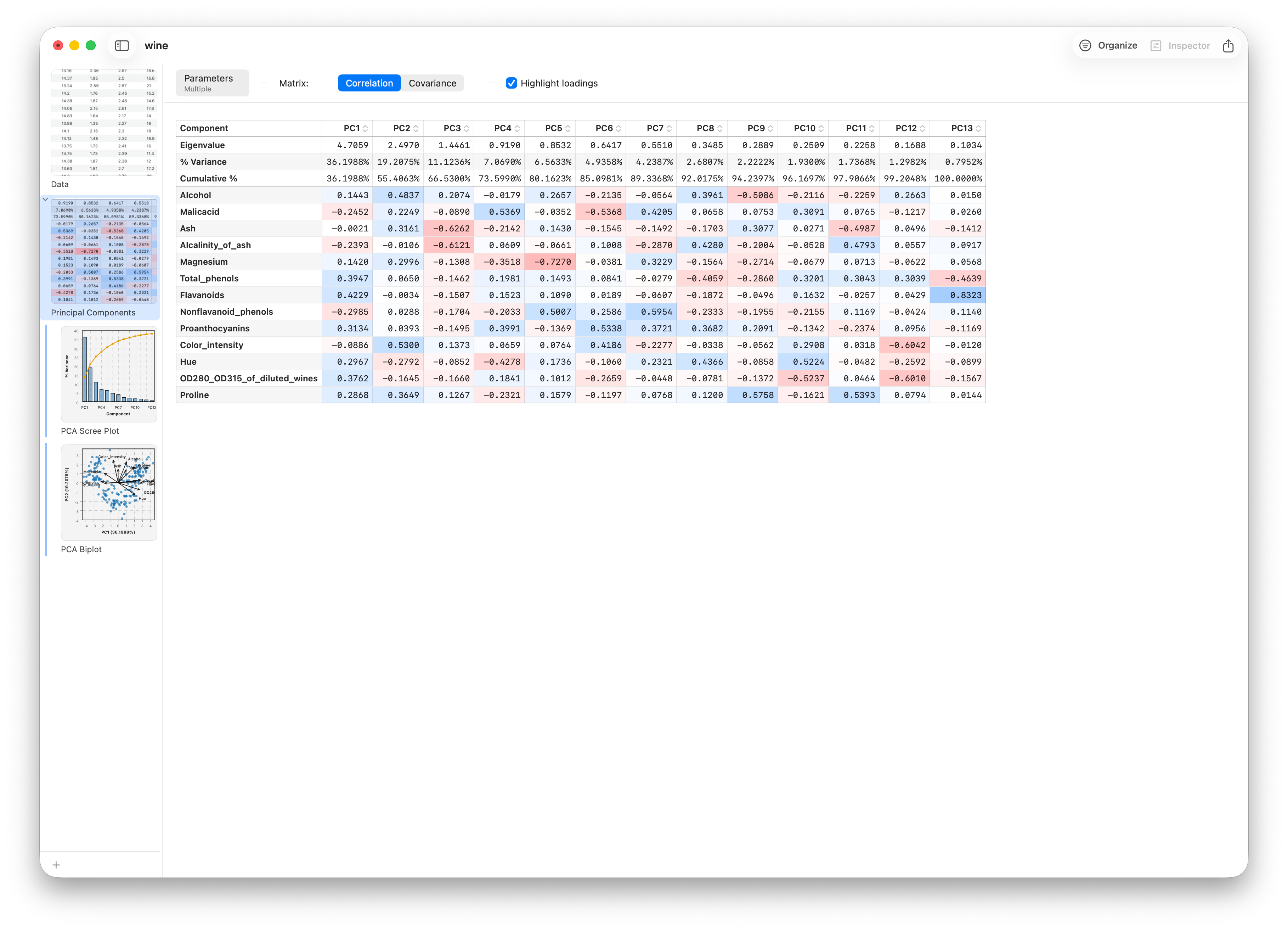
If you want the exact weights rather than arrows, the loadings are listed right in the PCA report — turn on Highlight loadings to bring those rows forward. They show how much each original variable contributes to each component: the numeric companion to the biplot, useful when you need to name what a component "means."
Clustering: finding groups without labels
Principal component analysis shows you the lay of the land; clustering draws the borders. It's unsupervised — you don't tell it the answer — and it partitions samples into groups so that members of a group are more like each other than like the rest.
K-means and choosing the cluster count
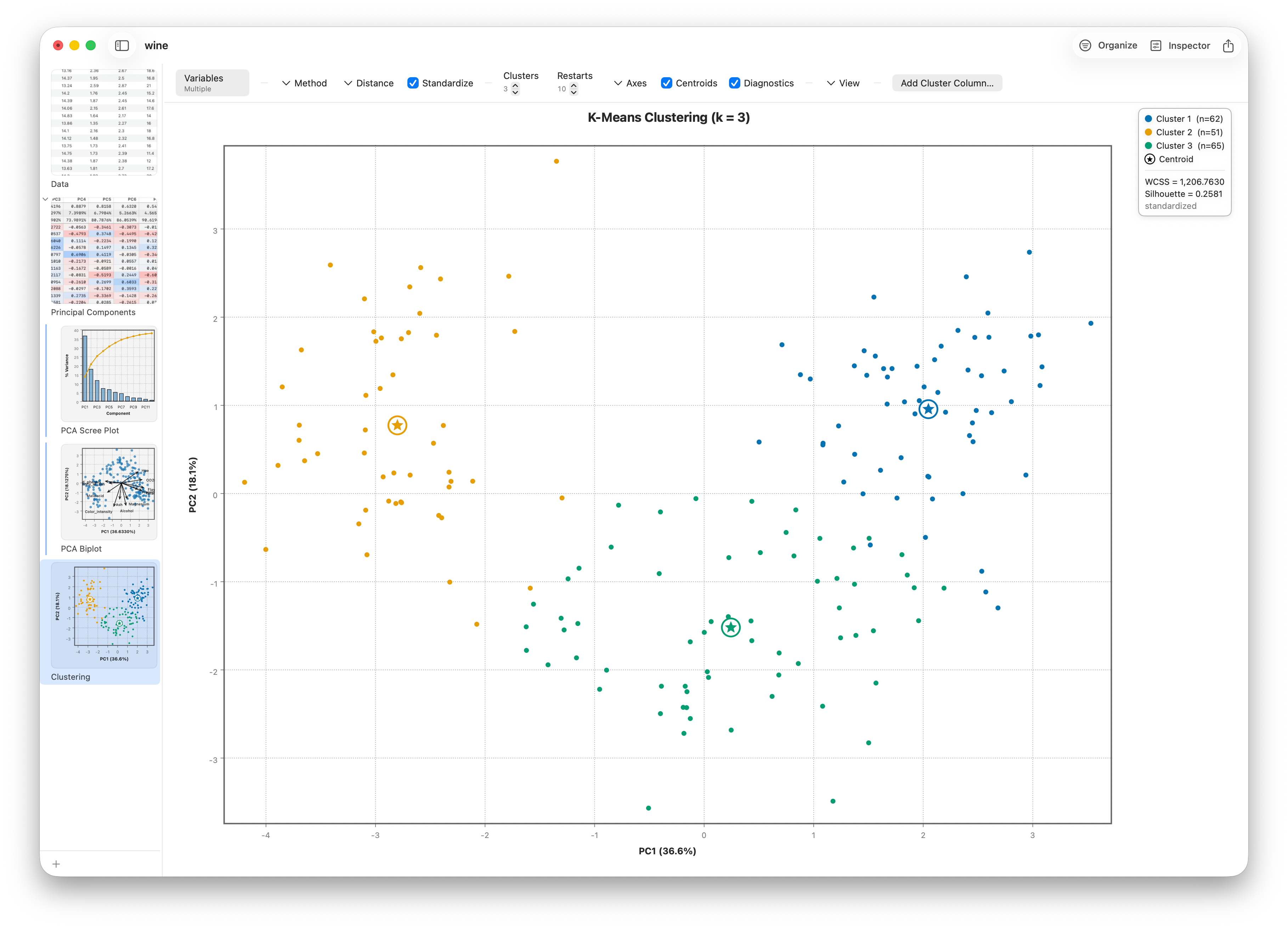
Open it from Analyze ▸ Data Mining ▸ Clustering and set Method to K-Means. K-means asks you for one thing up front: Clusters, the number of groups. It then places that many centres, assigns each point to its nearest centre, recomputes the centres, and repeats until things settle. Plot the result over the first two components and the groups jump out.
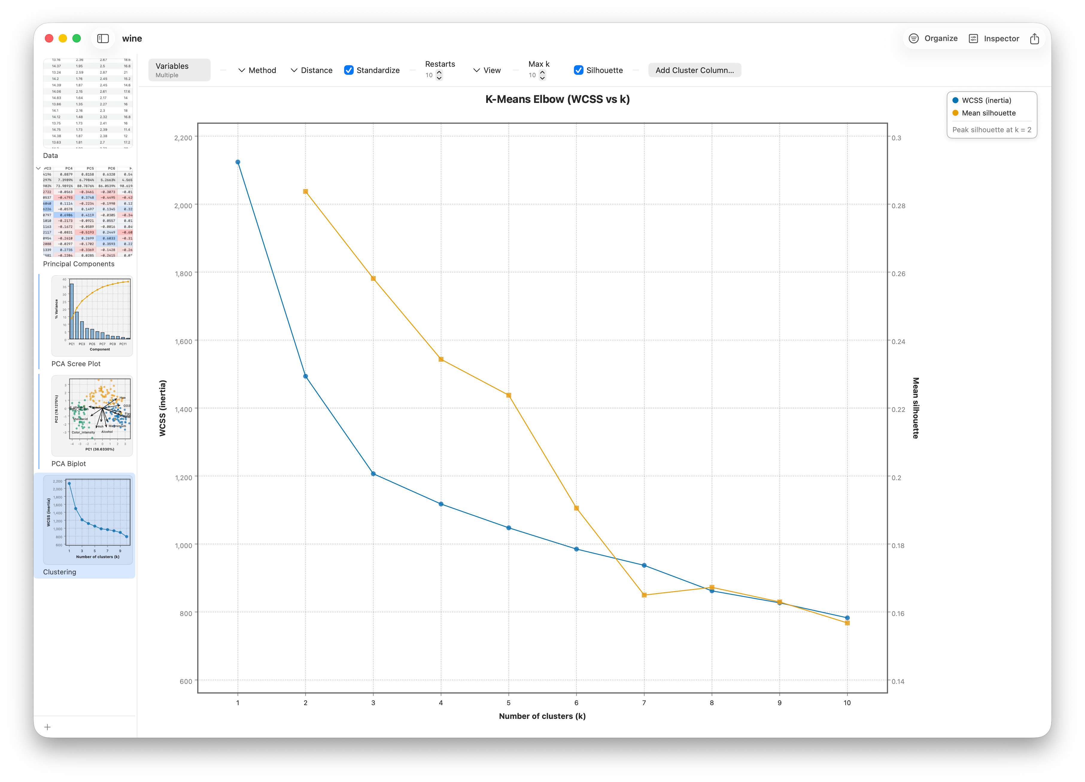
But how do you pick the count? Switch the View picker from Clusters to Elbow. Stratum re-runs k-means for every count from 1 up to Max k and plots the within-cluster scatter (WCSS) against the number of clusters. WCSS always falls as you add clusters, but with shrinking returns — and just like the scree plot earlier, the bend in the curve (the elbow) marks where extra clusters stop earning their place. Turn on the Silhouette overlay to add a cluster-quality score that peaks at the cleanest grouping. Read off the count, switch the View back to Clusters, and set it there.
Hierarchical clustering and the dendrogram
If you don't want to commit to a k in advance, hierarchical clustering builds a tree instead. It starts with every sample as its own cluster and repeatedly merges the two closest, recording each merge. The result is a dendrogram — a branching diagram you read from the bottom up.
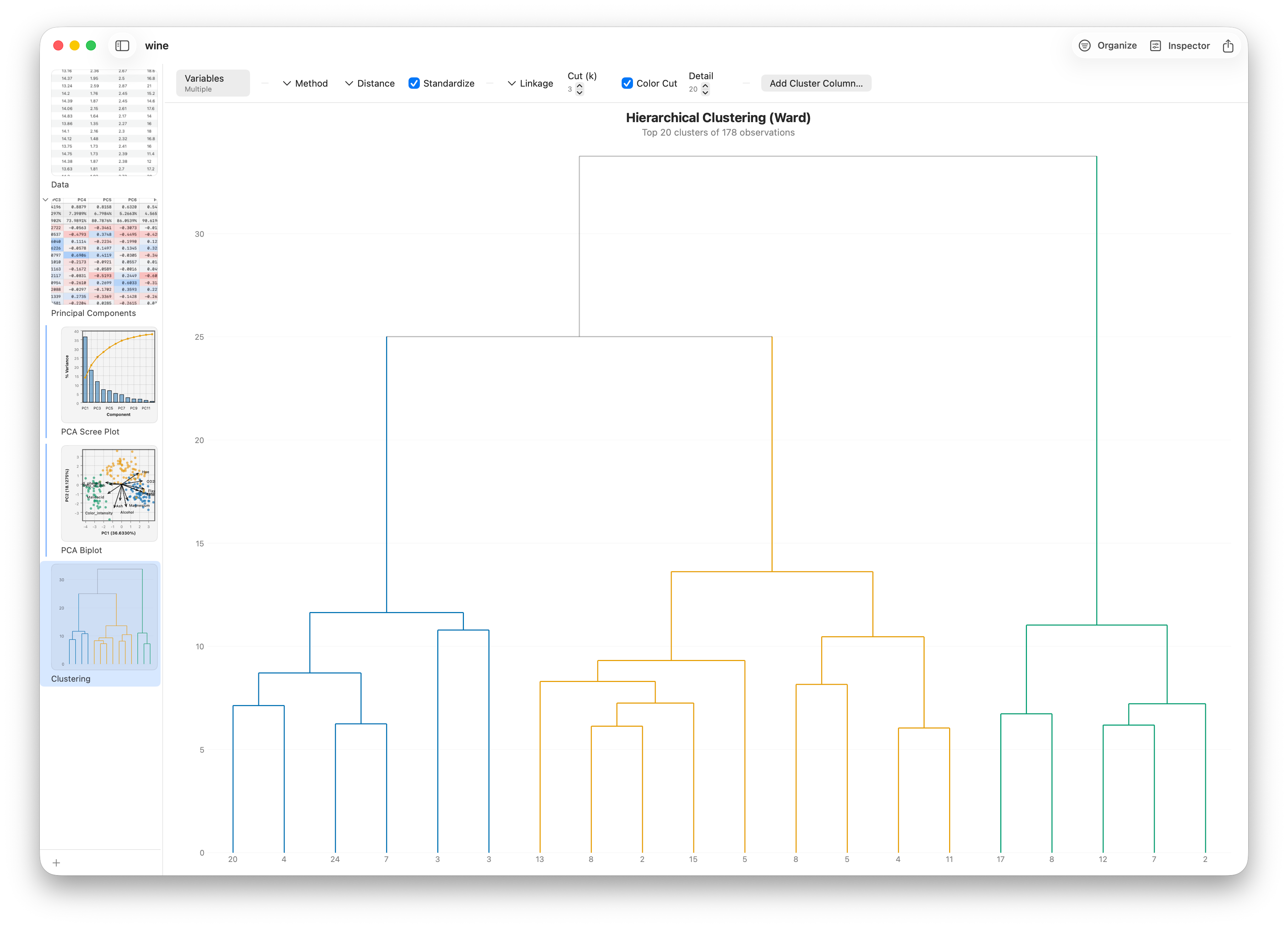
The height at which two branches join shows how different they are: low joins are tight, similar groups; high joins are distant ones. The Cut (k) stepper slices the tree into that many branches — so you choose the granularity after seeing the structure, not before.
Follow along
- Dataset
- UCI Wine — download it and add a header row (see the datasets README)
- You'll use
- A Parallel Plot (13 axes, Color By
Class), Principal Components (scree, biplot, loadings), and Clustering (K-means with the Elbow view — WCSS vs k plus a Silhouette overlay, hierarchical with the dendrogram) - Up next
- Lesson 23 — Decision Trees
Parallel coordinates, principal component analysis, and clustering find structure without being told the answer. Next we turn to prediction with a model you can actually read line by line — the decision tree.