Blog · Category
Plain-language explainers of the concepts behind the numbers, so the output of every analysis makes sense.

Both compare groups, but one shows summaries and the other shows shape.
Sep 18, 2026 · 6 min read
Read every pair's relationship at once, with the significant ones highlighted.
Sep 4, 2026 · 6 min read
R², VIF, Cook's distance and residual plots — whether to believe the model.
Sep 2, 2026 · 7 min read
Loadings tell you what a component means; scores tell you where each observation sits.
Aug 21, 2026 · 7 min read
How SPC tells ordinary variation from a real change — and what the Nelson rules detect.
Aug 14, 2026 · 7 min read
What correlation does and doesn't mean, and when to use Pearson vs Spearman.
Aug 5, 2026 · 7 min read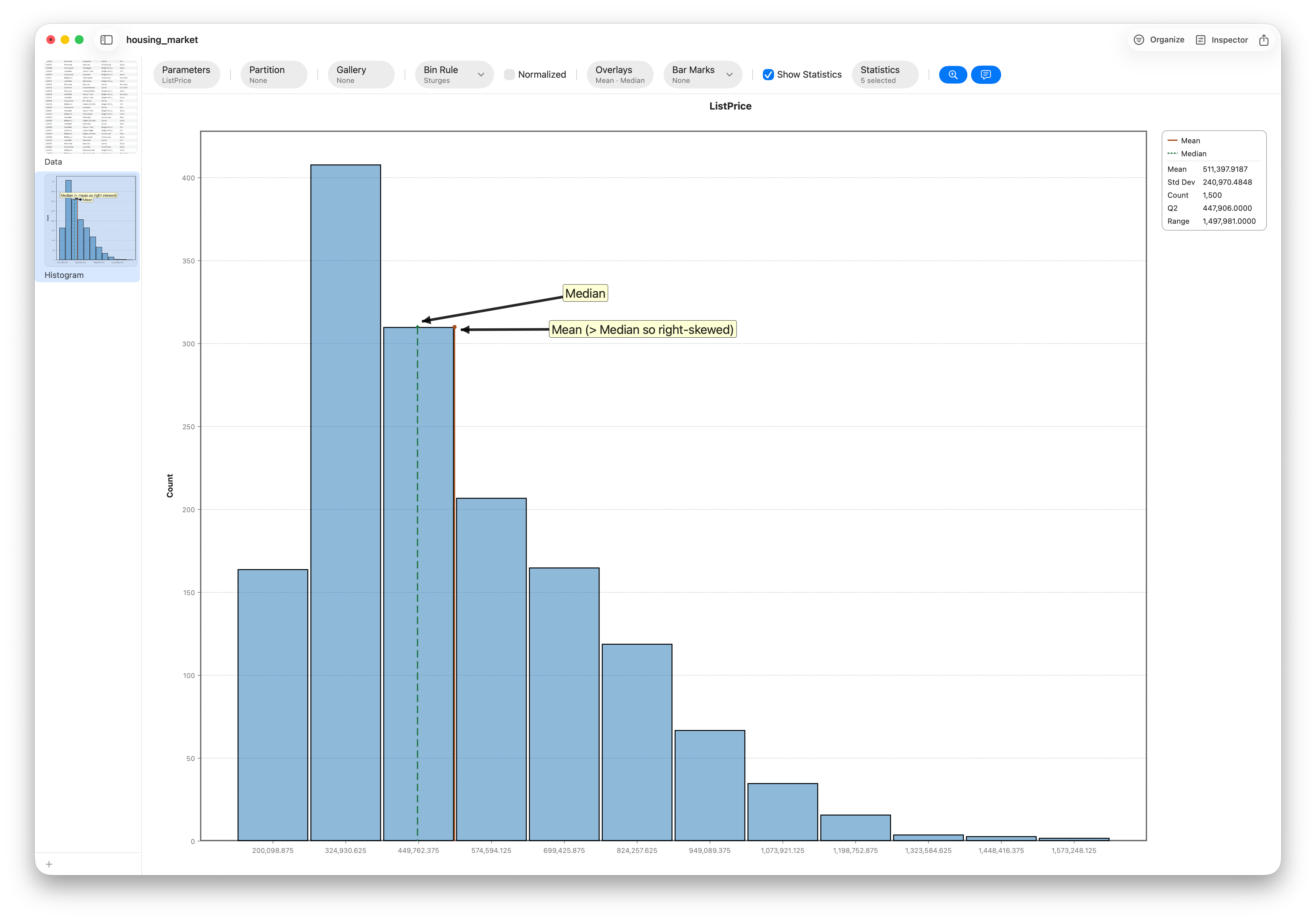
Two measures of center that agree for symmetric data and diverge for skewed data.
Jul 29, 2026 · 6 min read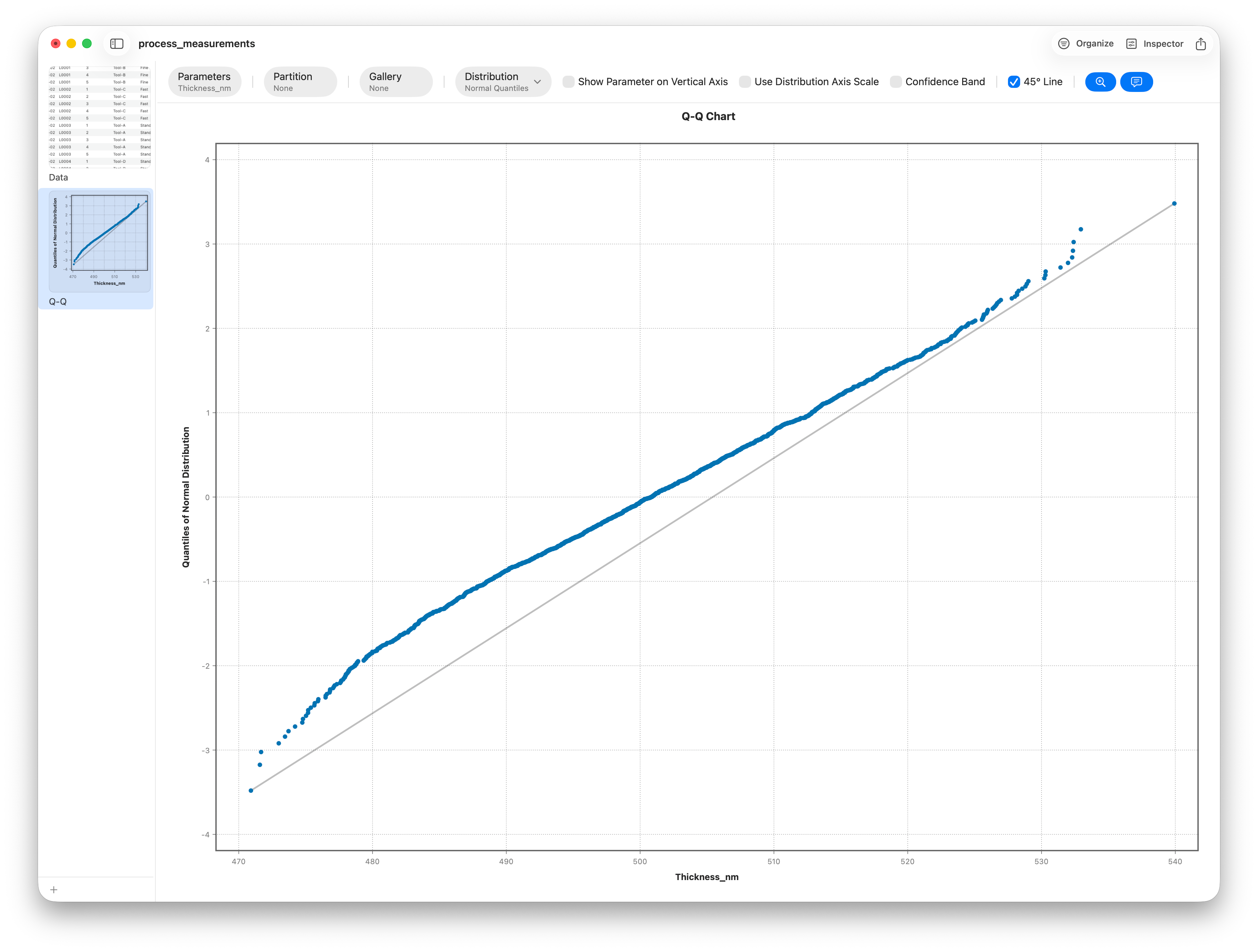
Normality, equal variance, independence — what each assumption means and how to check it.
Jul 17, 2026 · 9 min read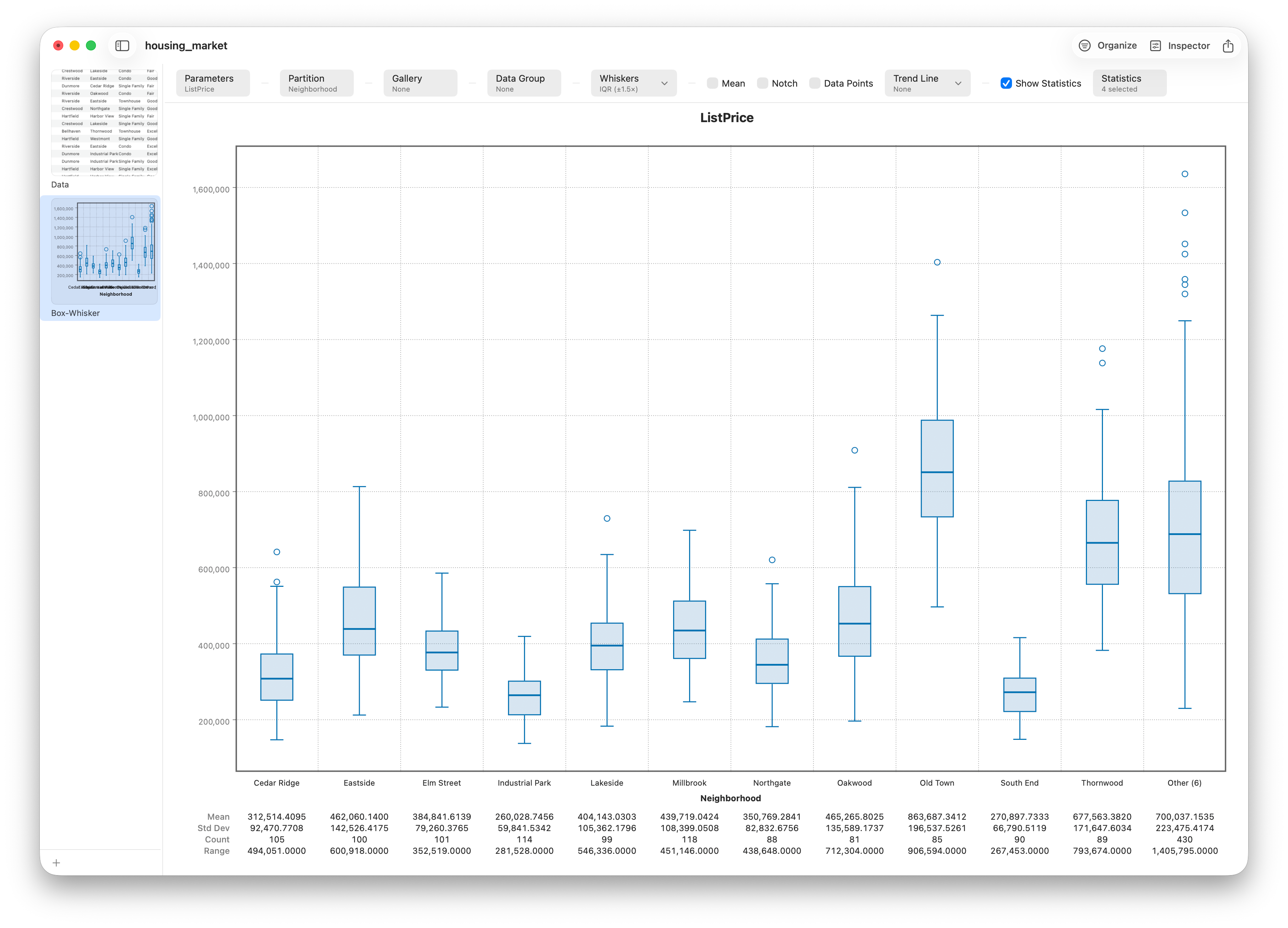
Median, quartiles, the IQR box, whiskers and outliers — read a box plot at a glance.
Jul 8, 2026 · 8 min read Stratum