 Stratum
Reading a PCA You Didn't Write
What principal components actually tell you — on 54,000 diamonds.
diamonds — 53,940 real diamonds (carat, cut, color, clarity, dimensions, price), the public ggplot2 dataset.
Download the CSV and open it in Stratum to reproduce every figure below.
Principal Component Analysis has a reputation for being abstract — "rotate the data into a new coordinate system," "eigenvectors of the covariance matrix." That framing hides how concretely useful it is. Here's a PCA on real data where the components turn out to have plain-English names, and together they explain a genuine mystery.
The setup
Diamonds come with six physical measurements: carat (weight), the three dimensions x, y, z, and two proportion percentages, depth and table. Six columns — but they're clearly not six independent things. Carat, x, y, and z are all really measuring the same underlying quantity: how big the stone is. So how many real dimensions of variation are hiding in these six columns? That's exactly the question PCA answers.
Reading the variance explained
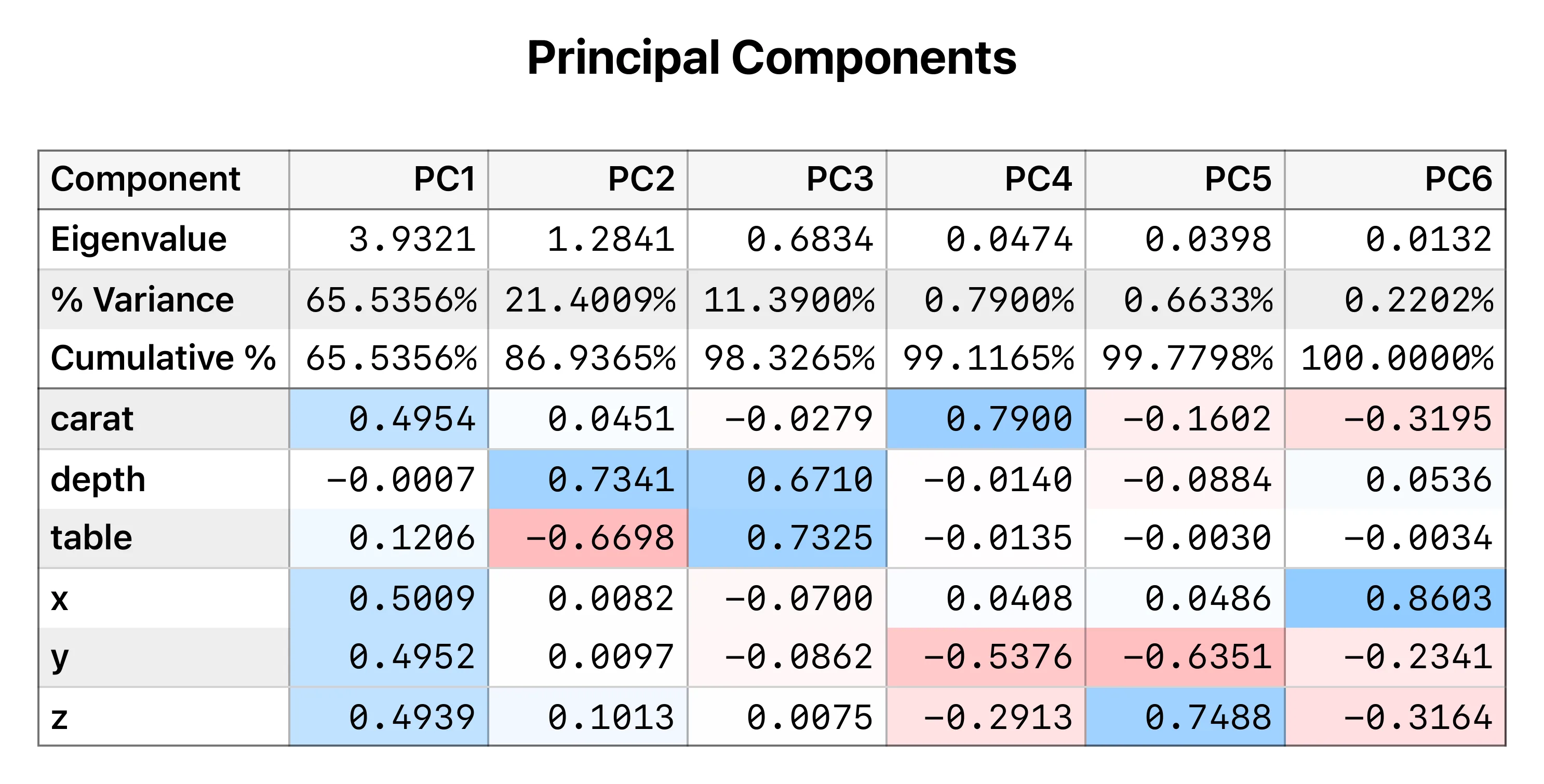
The first thing to read in any PCA is the variance explained by each component — how much of the total spread each new axis captures:
| Component | Variance explained |
|---|---|
| PC1 | 65.5% |
| PC2 | 21.4% |
| PC3 | 11.4% |
| PC4–PC6 | < 1% each |
Two components capture 87% of everything. The last three are essentially noise (rounding in the measurements). That alone is the headline: six columns, but really just two dimensions of information.
Reading the loadings — where the meaning lives
Variance explained tells you how many axes matter; the loadings tell you what each axis means. They're the weights showing how each original variable contributes to a component.
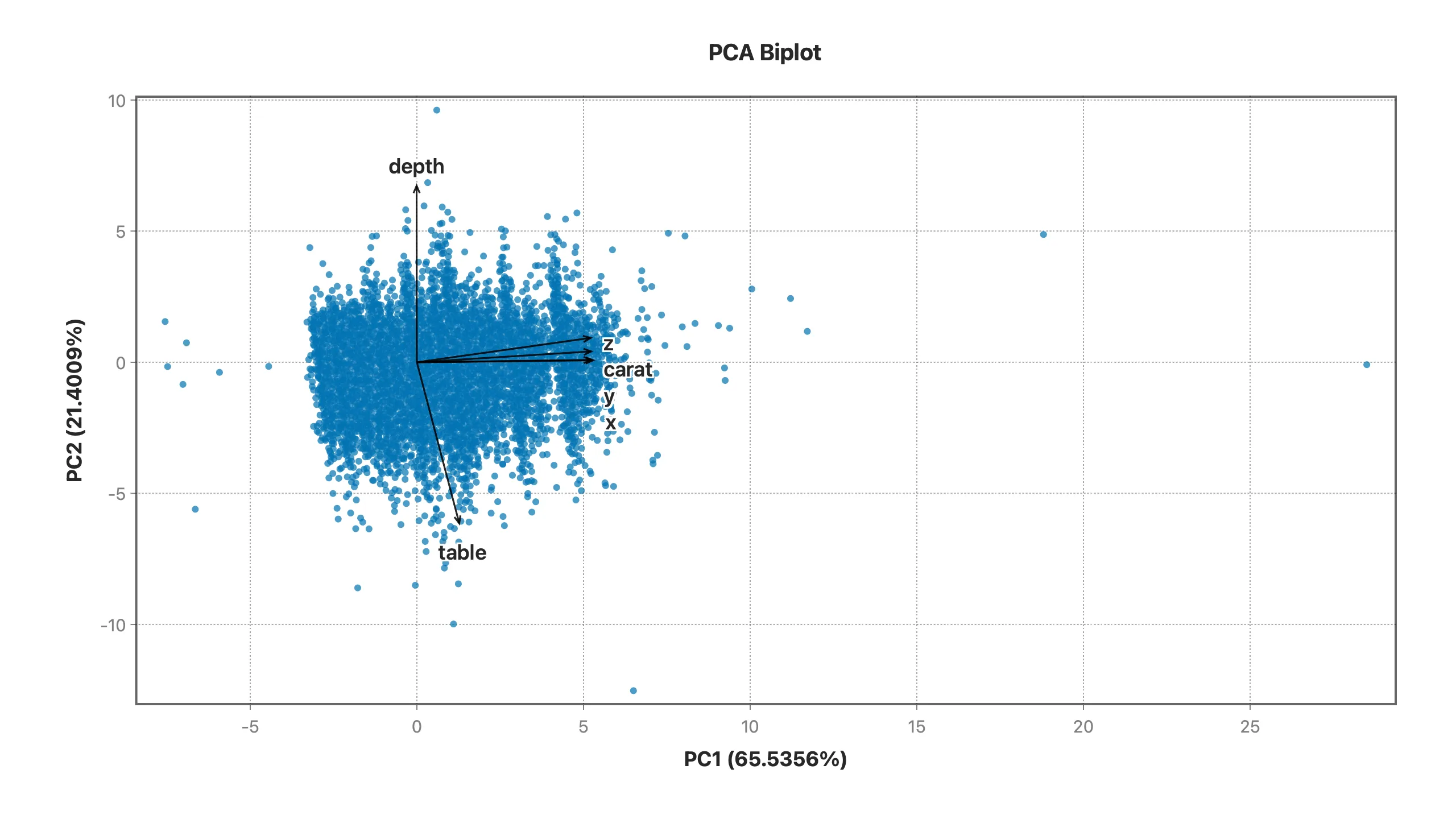
PC1 loads almost entirely and evenly on carat, x, y, and z (each ≈ 0.50), with depth and table near zero. Every size-related variable pulling together in one direction has an obvious name: PC1 is "size." PCA reconstructed the concept of bigness straight from the raw numbers, with no hint from us.
PC2 is the interesting one. It loads on just two variables, pushing in opposite directions: depth ≈ −0.73, table ≈ +0.67, with carat and the dimensions near zero. Depth and table are the proportions of the stone — and proportions are precisely what gemologists use to define cut quality. So PC2 is "cut geometry," an axis of shape that's mathematically independent of size.
Why this solves the mystery
The full diamond analysis opens with a paradox: better-cut diamonds appear cheaper. PCA explains why in one sentence. The data has two big independent axes — size (PC1) and cut proportions (PC2). Price is dominated by size. Quality lives mostly on the other axis. Grade a diamond on one axis, price it on the other, and the two will look uncorrelated — even negatively related — until you deliberately pull them apart. The confounder wasn't just present; PCA drew it as a coordinate axis and handed you its name.
How to read any PCA
The workflow generalizes to any dataset:
- Scree / variance explained — how many components are worth keeping? Look for where the values drop off (here, after PC2).
- Loadings — name each kept component by which variables load heavily and in which direction. A component with everything loading the same way is usually an "overall size/level" axis; a component with variables in opposition is usually a "contrast" or "shape" axis.
- Scores — plot the observations on PC1 vs PC2 (a biplot) to see clusters, gradients, and outliers in the reduced space.
PCA is at its best exactly when you didn't design the data — high-dimensional, correlated columns where you suspect a few latent factors are doing the real work. It tells you how many factors, and — through the loadings — what they are.
In Stratum, PCA is a menu away: it computes the components, the variance explained, the loadings table, and the biplot, and it stays linked to the rest of your analysis so you can carry a component straight into a regression or a chart. No code, no matrix algebra by hand.
Read the full Diamond Paradox analysis Watch the walkthrough Try Stratum free
Related: Decision Trees on Real Data → · Simpson's Paradox in the Wild →