 Stratum
When (and Why) to Log-Transform Skewed Data
The move that turned a curved diamond scatter into a straight line.
diamonds — 53,940 real diamonds (carat, cut, color, clarity, dimensions, price), the public ggplot2 dataset.
Download the CSV and open it in Stratum to reproduce every number below.
"Should I log-transform this?" is one of the most common questions in applied statistics, and it's usually answered with a vague "if it's skewed." Here's a concrete case, on real data, that shows when the transform earns its place and why it isn't just cosmetic.
The symptom
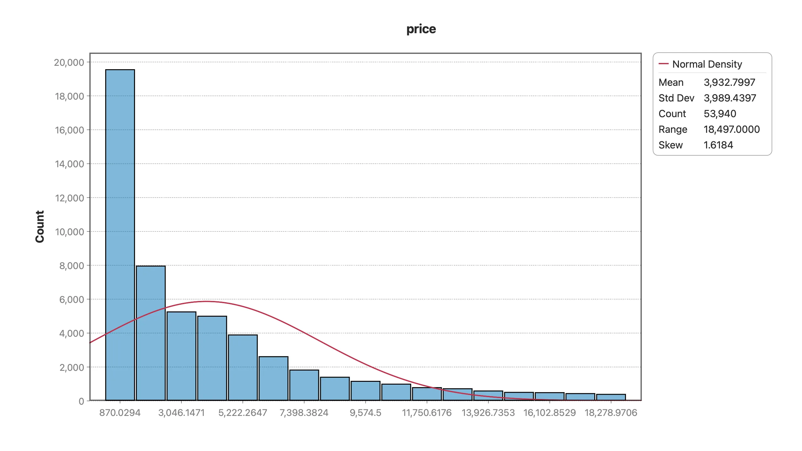
In a dataset of 53,940 diamonds, both price and carat are heavily right-skewed:
- Price skew ≈ 1.62 — a wall of affordable stones and a long tail of expensive ones.
- Carat skew ≈ 1.12 — same shape.
You can see it in the histogram (a spike on the left, a thin tail stretching right) and confirm it with one number: the mean sits well above the median, which is the arithmetic signature of a long upper tail.
Why raw skew breaks a linear model
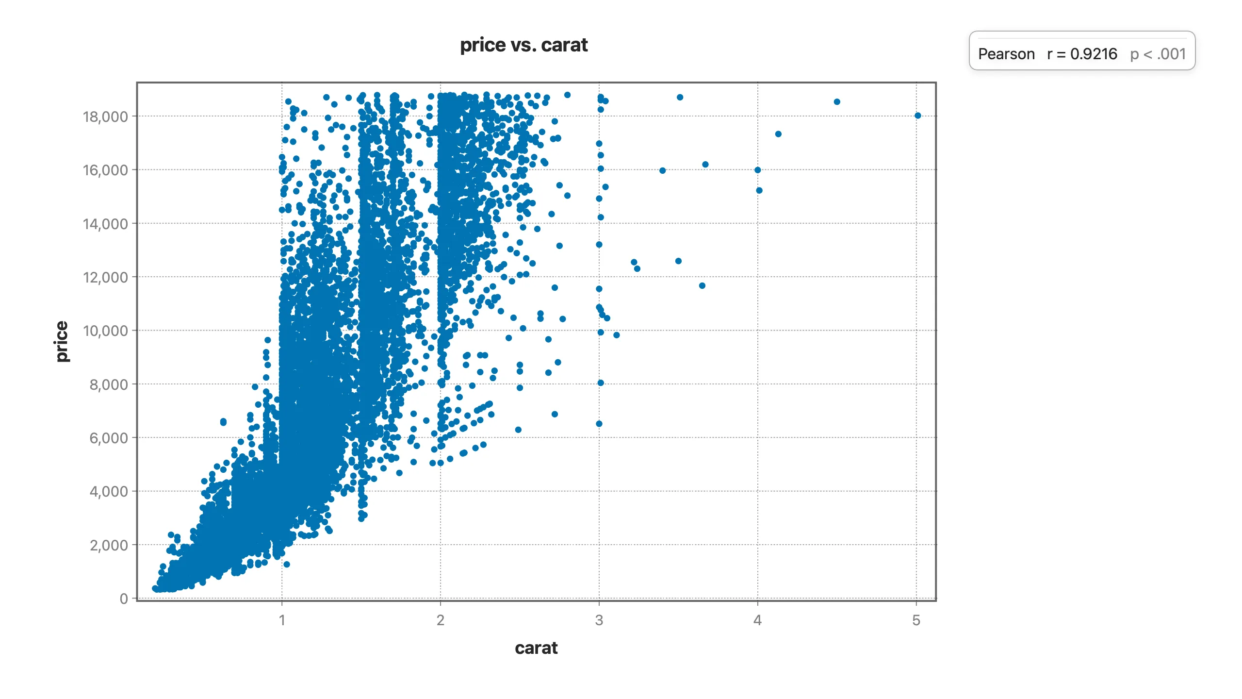
Plot carat against price and the cloud doesn't just rise — it curves and fans out. Small diamonds cluster tightly near the bottom-left; large ones explode upward and scatter widely. A straight-line model fit to that shape does two bad things:
- It misfits the curve — a line can't track a relationship that bends.
- It lets the giants dominate — a handful of huge, expensive stones pull the fit toward themselves, and the variance of the residuals grows with size (heteroscedasticity), which quietly invalidates the standard errors your p-values depend on.
Why the log fixes it — and it's not arbitrary
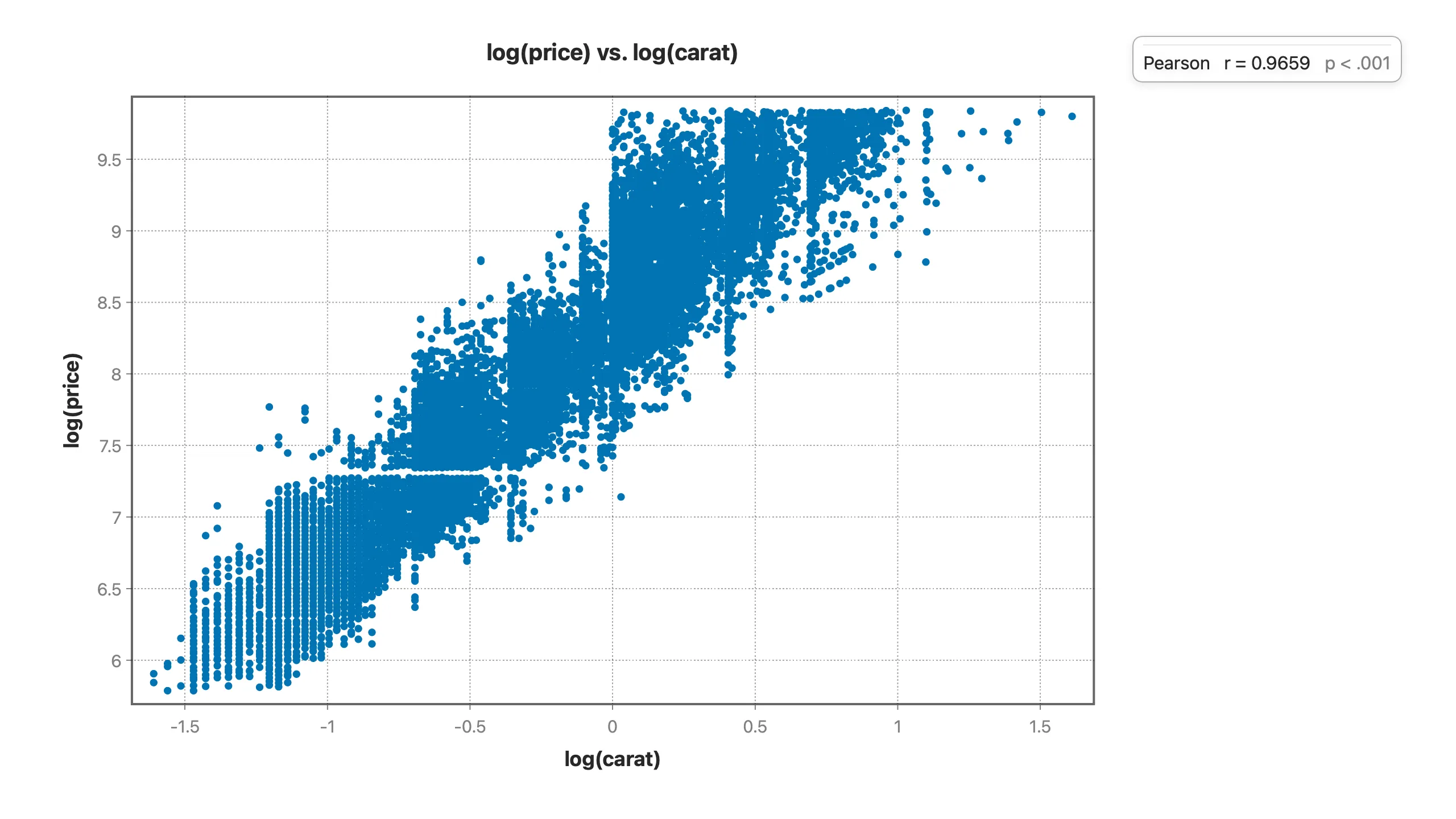
A diamond's price doesn't rise linearly with size; it rises roughly with size raised to a power. That's a power law, and the defining property of a power law is that taking the log of both sides turns it into a straight line:
price ≈ a · caratk⟶log(price) ≈ log(a) + k · log(carat)
So the log-log transform isn't a trick to "make the data look nicer" — it matches the actual mechanism generating the prices. And the payoff is dramatic:
- Raw correlation between carat and price: 0.922 (strong, but on a curved, fanning relationship).
- Log-log correlation: 0.966, and now the cloud collapses onto a genuinely straight, even band.
- Price skew drops from 1.62 to 0.12 — essentially symmetric, exactly what least-squares regression assumes.
A quick decision rule
Reach for a log transform when:
- The variable is positive and right-skewed (counts, prices, incomes, populations, concentrations, areas).
- You believe changes are multiplicative, not additive — "20% more expensive" is more natural than "$4,000 more expensive."
- A scatter against another variable curves upward and fans out.
- You care about ratios: log turns "twice as big" into a constant distance, so the model speaks in percentages.
Skip it when the variable can be zero or negative, when it's already roughly symmetric, or when interpretability in the original units matters more than model fit (a log₁₀ or a log1p can be a compromise).
What it buys you downstream
In the full diamond analysis, logging price is the hinge the whole story turns on. Once price and carat are on the log scale, the multivariable regression behaves: the residuals sit flat and even instead of fanning, so the coefficients — including the ones that finally reveal what cut, color, and clarity are really worth — are trustworthy. Interpreting a coefficient becomes clean too: on a log outcome, each coefficient reads directly as an approximate percentage effect.
A model built on skewed, untransformed data can produce a confident number that's simply wrong. Checking skew and transforming when the mechanism calls for it is thirty seconds of work that protects everything you build on top.
In Stratum it's one derived column in the formula engine — log(price), log(carat) — and every chart and regression downstream updates instantly. No code.
Read the full Diamond Paradox analysis → · ▶ Watch the walkthrough
Related: Simpson's Paradox in the Wild → · Multiple Regression That Isn't Fooled by Confounders →